Tag Archives: illustration

Louise Hill Design – Hong Kong’s a work of art

louise hill hong kong art 1

Proof that Facebook isn’t all bad: I discovered amazing artist Louise Hill through it!

Thanks to a couple of my friends liking Louise’s work, her Facebook Page popped up on my news feed one day, whereupon I immediately fell in love with her vibrant colourful designs – and now I’m showing them here in the knowledge that you will too!

louise hill hong kong art 2

Many of Louise’s pieces are inspired by her time in Hong Kong and I love the richness of detail that goes into each artwork – I’m forever noticing cool new elements and references in there, all of which transport me to certain memories, places and experiences in HK… which is exactly the idea. The Mister Softee van, the yummy dan tat (egg tarts – my favourite!), the old-school wet market red lamps… something new jumps out at you every time you look.

Continue reading

Chic like chocolate – Mathilde Brunelet’s beautiful Parisian artwork

Mathilde Brunelet comptoir du cacao chocolate

I’m a sucker for desserts… and a sucker for pretty packaging. Add the two together and you have Rach dropping hundreds of dollars on chocolate she never even wanted or needed in the first place!

Mathilde Brunelet champs elysee

So say hello to these uber pretty chocolate bars from French brand Comptoir du Cacao. They were about $50 each (*wince*) so I have to stick them on here to claim that as a blog investment, right?!

Continue reading

Oh, I say! Penhaligon’s guides to life…

penhaligon's guide to gentlemanly behaviour

I swear I’m not obsessed with them… OK, OK, maybe I am… but I am loving these cute postcards from British fragrance brand, Penhaligon’s!

Their Guides to Gentlemanly Behaviour and British Tea Drinking Etiquette are quirky, witty and fun; I’m a sucker for anything done in this vintage-style, which totally fits the heritage of their brand (over 100 years and counting, baby!).

Continue reading

I spy with my little eye… the gorgeous artwork of Miss Magpie Fashion Spy

miss magpie fashion spy chanel paul smith

Ever since joining Instagram, a whole new world of pretty things has been opened up before me – and one of my favourite discoveries has been the work of Miss Magpie Fashion Spy, aka UK fashion illustrator Niki Groom.

This type of drawing is everything that is totally up my street – my trademark favourite watercolour-esque sketchy style (see here… and here!), cute girls, gorgeous dresses and beautiful details peeking out of every corner.

Continue reading

I wish all atlases looked like this!

One of my favourite Pretty Things posts on here is still my blog on the gorgeous travel posters by Brazilian illustrator, Fernando Volken Togni – the colour, the detail, the style, everything! (And I updated it to feature his most recent additions to the series so do check it out!)

Inspired by these, and also the somewhat similar Scandinavian postcards I featured from Ikea, I wanted to share with you these lovely pictorial maps by Canadian artist, Marisa Seguin that I discovered via Design Work Life – and just as I wanted Togni’s work on my walls, I want Seguin’s right up there with it!

What sets these apart for me are the strict but stunning colour palettes she has used for each piece. Again, it’s hard to pick a favourite – the icy cool blues and purples of Vancouver, the strikingly vibrant pinks and turquoise of Venice, the dreamy romantic pastels of Paris, the vivid riot of brights that makes up San Francisco or the dusty sepia tones of Seguin’s current base, Milwaukee.

I also love the level of detail that’s gone into illustrating each of the landmarks; sadly, I haven’t visited any of the cities in question (apart from Paris, which I honestly think looks far more charming here than it does in real life!) but if I do, I’ll be toting one of these and navigating my way in style!

Hope you enjoy these as much as I did – and you can check out more of Seguin’s work on her website or buy these as prints from her Etsy shop.

And I loved the Jellyfish one so much, I couldn’t resist sticking it on here too!

Barbie: still the Best

Obviously, if I had known about this calendar instead, Heiner Meyer would be sitting gathering dust in a bookshop in Hong Kong.

For those of you too lazy to click the link, the coveted calendar in question is a Barbie one. No, wait, come back! Not just any old Barbie calendar but one featuring gorgeous fashion sketches of everyone’s favourite blonde bimbo. Except she’s not always blonde and her outfits are way too classy for anyone to be calling her the b-word. [Banner picture: 50th Anniversary Glamour and Generation Of Dreams Barbies – the latter’s skirt is a collage of images of Barbie throughout her fifty years.]

My absolute favourite – The Artist. Totally my colours, totally my style… If only I could look this good in a beret!

They’re by Robert Best, a former Project Runway contestant, who has been designing outfits for Barbara Millicent Roberts for the past 15 years. He is the main designer behind the highly coveted Silkstone Collection (also known as the Fashion Model Collection), which use the retro face, hair and make-up style of the original 1960s dolls, and the occasional special edition Barbie, like those in the banner picture, too. The beautiful couture outfits and attention-to-detail are amazing – these certainly aren’t dolls for practising your hair-cutting and decapitation skills on!

Violette & Tribute Barbie (celebrating the 10th Anniversary of the Silkstone Collection)

I am absolutely head over heels for these sketches. I tend to love the style of  girlie fashion sketches anyway but these are even more stunning than most. Firstly, the clothes are amazing and the detail is exquisite. You can feel every ruffle, see every flower. The sense of movement, texture and weight created by just pencil and watercolour (I think!) is astounding. We’re not just talking about the dresses though – it goes as far as fabrics, shoes, hair accessories, jewellery and just about everything else you could think of. Everything just goes together so wonderfully. I want Barbie’s wardrobe!

Second favourite – Market Day Barbie. Love the colours, love the flowers, love the eyeshadow!

Secondly, lots of fashion illustrations skimp on the face, often omitting eyes, nose and mouth all together. Not Best. As you can see from some of the gorgeous close-ups, there’s more expression going on in some of these sketches than in Nicole Kidman’s last few acting roles. A tilt of the head here, a seductive pout of the lips there, a sultry sweep of the eyes – these drawings give a better modelling masterclass than Tyra herself! I love how he even does matching eyeshadow too – Best does a better smoky eye than me!

I do have some history with Barbie (my parents were beginning to despair of the sight of her when I was ordering collectible ones on a near weekly basis from Ebay) but she has literally never looked better than when drawn with Best’s pencil. It’s something about the perfect slant of the eyes and the way their hair falls just so. In fact, I think most of the drawings look prettier than the dolls themselves and I’ve thrown in a few like-for-like comparisons for you to make up your own minds!

The Siren – drawing vs doll comparison

Finally, there’s just some magic about them. The below sketches of Hollywood Honey and Red Hot Review (“On The Set”) best epitomise how evocative Best’s work is; you just know these are glamorous divas from the Golden Age of Hollywood, with just a few strokes of the pencil. All of these sketches feel like they’re from some other time but without looking old and dated, settling for supremely classy and elegant instead.

I think I’ve banged on enough. All of these pictures are taken from mawphoto.com’s excellent Flickr set ‘Robert Best Illustrations’, where there are hundreds more drawings for your viewing pleasure. You could be a cheapo and frame pictures from the calendar once 2011 is over but if you can’t wait that long, you can buy framed limited edition prints here and here. Now I’ll try and keep schtum whilst you enjoy the rest of these beauties and remember to click for enlargements – it’s worth it!

Third favourite. This is getting silly now…

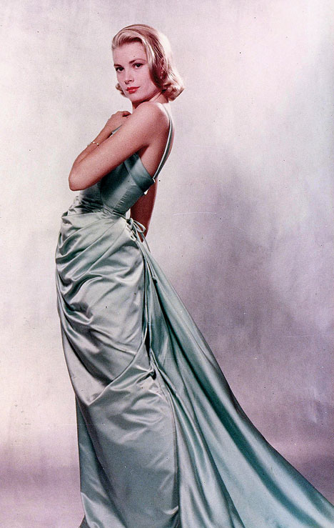
Delphine (the first proper Silkstone Barbie) from a sketchier drawing to a more polished one. This dress reminds me of the one Grace Kelly won her Oscar in.

Parisienne Pretty drawing vs doll, round 2. I want these shoes!

Haut Monde; Southern Belle

Garden Party & Barbie as Betty Draper from Mad Men (I can totally see Betty working the other look too!)

Secretary; Tout de Suite; Nurse. I really love how stylised all these looks are (and does anyone else think sexy Nurse looks a little Chinese?!)

Black Enchantment – this dress with Parisienne Pretty’s shoes. Please?!

Fashion Editor, Showgirl, Fashion Designer

Stolen Magic, In The Pink (hello Liz Taylor!), Stealing The Spotlight

Capucine in 3 ways

Congrats! You made it to the end of my most picture-heavy, time-consuming post since the Qi Pao. You have my permission to eat a chocolate digestive as reward.

Tan-tastic Pixar posters this way…

Movie website Slash Film churns out so many posts that amongst all the half-stories, rumours and non-news, there’s inevitably some pretty cool stuff too. If you know me, you’ll know I love all things Disney so these concept posters for various Pixar fims, by artist Eric Tan, are totally up my street.

Once I was redirected to his blog, I realised I was familiar with Tan’s work already – the two posters above were designed for Disney’s beautiful coffee table book, The Art Of The Disney Princess, which features various artists’ re-imaginings of Disney princesses in all sorts of styles, although it lacks much description of the inspirations and processes behind the artwork (expect to see many more Pretty Things posts taken from this in the future!). These pieces instantly stood out as I love these strong stylised graphics with a hint of retro behind them – I particularly love the super-cute fairies on the Sleeping Beauty poster and how Aurora’s hair is turning into licks of flames.

Tan’s posters are all based on the retro posters for Disney rides found in all Disney theme parks. They generally have a 50s/60s travel poster vibe (even the newer posters are designed to ape the old style) and are bright, simple but striking and immensely charming. These probably deserve a post all of their own but for now, you can check some out here, here and here.

Don’t get me started on how wonderful, beautiful and lovely Up is (I now manage to start crying even before the title-card, just because I know what’s coming) and the film itself has a very colour-saturated, whimsical feel to its artwork, which is totally captured within Tan’s posters too. They look dated in the best way possible, like they’ve been much loved over the years and could have come straight out of Ellie’s Adventure book – Tan has cleverly even drawn in fold-marks too!

The Incredibles is right up there on my list of favourite films ever, never mind favourite Pixar films, and these posters fit in perfectly with the retro superhero aesthetic that those superb opening credits instantly encapsulated (I’m now humming that bombastic score in my head as we speak!). I really love the strong dynamic colour palette used in these posters – have Jack Jack and Edna (in the banner) ever looked cuter?!

Meanwhile, the posters for Wall-E are retro-futurism at its best and could be added to the posters for Tomorrowland errr… tomorrow and not feel out of place. M-O was a bit of a scene-stealer for me so I can’t help but raise a smile on seeing his poster… a few more character-led posters might have been nice but you can’t help but appreciate the nature of the artwork itself.

Finally, Tan’s posters for Ratatouille. These were based on the artwork of A. M Cassandre, an artist I wasn’t familiar with by name but whose style is instantly recognisable in these prints. These are more reminiscent of vintage adverts for French food and drink but again, fit perfectly with the design and concept of the film itself (alas, not one of my favourites so I have slightly less love for these posters than the rest, hence my not featuring all of them – sorry Remy fans!).

Completely charming, highly creative and utterly delightful. Let’s just hope Tan gets to work his magic on every Disney/Pixar film in the foreseeable future!

Read my article about the Pixar: 25 Years of Animation Exhibition here

Dexter gets arty

These amazing fan-made posters for Dexter have been floating about the Interwebz for a while, but it’s never too late to show a little love.

If you’re gonna have fan-made artwork, it helps if they’re created by the head honcho at a design studio (Ty Mattson of Mattson Creative), right?! Certainly puts fan forums’ MS Paint efforts to shame!

You don’t have to be a Dexter diehard to appreciate the beautiful design. I love the strong graphic style of the artwork and that the same striking colour palette is kept throughout – choosing red was always going to be a no-brainer for depicting a serial killer! I’ve only recently got back into the show so it’s fresh in my mind and Mattson’s done a great job of picking out the iconic moments for each season and representing them in quirky, inspired ways. (As ever, click for enlargements).

Mattson was so taken with Dexter’s awesomeness (clearly a man of discerning tastes) that he created the posters as a little project in his free time. But after the blogosphere blew up with news of Mattson’s brilliance, Showtime (the channel that airs Dexter) got in touch to say they loved the posters, took Mattson on a tour of the set where he got to meet Dexter himself, and offered him a role as extra for next season! It’s enough to warm even a cold-blooded serial killer’s heart, isn’t it?

Oh, to be an artist and create stuff like this in your free time! I just get to write about it instead!

The posters are now available as limited edition prints on Showtime’s website, $49.95 USD.

(via designworklife)

Around the world in 10 travel posters

The Daily What is always good for a wander and just occasionally, it throws up something really rather spectacular. These gorgeous colour-soaked travel posters are the really rather spectacular that I’m thinking of.

fernado volken 24 hours in doha hanoi

Designed by Brazilian illustrator Fernando Volken Togni for Oryx Magazine (Qatar Airline’s in-flight read), they encapsulate ‘24 Hours In…’ various cities around the world. Bold, vibrant and bursting with energy, they’re like groovier Where’s Wally pictures – look closer and there’s all sorts of cute details hiding away. So there’s a Swiss Army knife in Zurich, a skyscraper-sized hamburger in New York and a panda poking out the trees in Shanghai.

It’s almost like Pick n’ Mix at your local sweet shop – impossible to pick a favourite, you just want to feast on them all! On the one hand, I love the ones that work with a particular colour palette – the lucky reds of Shanghai, the cool blues of Moscow, the faded vintage hues of Doha, the tricolour of Paris and the sun-soaked oranges of Madrid. But on the other, I also adore the vivid brights of New York and Barcelona, whilst there’s something about Casablanca’s colour scheme that feels so irresistibly Moroccan without me being able to quite put my finger on it. Wasn’t able to spot Humphrey Bogart lurking in any corners though!

Eagle-eyed viewers may spot a slight similarity with some other travel posters I went similarly goo-goo eyed for (from Ikea, of all places). Togni’s style is a little cuter and a lot more action-packed, but I still love them both. You can check out plenty more of his candy-coated artwork, all fabulous incidentally, on his website, which is where all the pictures are from (don’t forget to click for enlargements). He promises they will be for sale soon, leaving just one problem: which one to buy?!

Next stop… Hong Kong, please!

fernando volken 24 hours in sao paolo ngorongoro