Monthly Archives: December 2010

Australia’s Next Top Model, Cycle 6: Wrong winner, right everything else

By now, you probably all know about Australia’s Next Top Model, Cycle 6 – for all the wrong reasons! This was the season that made international headlines after host Sarah Murdoch announced the wrong winner, a huge shame for someone like me, who had been quietly and avidly following the show for weeks only to find massive unavoidable spoilers all over the Internet before I had even set eyes on the finale! It was also a huge shame for the show, which had enjoyed its strongest year yet and undoubtedly, it’s slickest live finale (lest we forget the car crash telly of Jodhi Meares’ face-palming Season 3). And yes, the cock-up of all cock-ups was even more cringeworthy when you watched the final in its entirety, where runner-up Kelsey Martinovich was allowed to celebrate winning for a good minute and a half whilst Murdoch’s face slowly turned a shade of green her Botox never thought it could manage.

ANYWAY. The downside of it being the best year contestant-wise was that, drama-wise, it was actually a little dull. The funniest moment was when the obligatory crew-cut at makeover, Sophie Van Der Akker (skin possibly entirely composed of foundation, below) attempted to re-attach her ratty hair extensions back at the house. So they cut her hair even shorter instead! Kudos also to the evil genius who decided to send the girls to Japan for their overseas trip, where they made bemused appearances on a ‘Super Kawaii!!!’ show, where they had to hop like bunnies and dress as schoolgirls and Lolitas, whilst their midget stylists burst into tears of happiness/sadness/randomness at every opportunity.

Drama came courtesy of the most beloved of all AusNTM tropes – the bogan (see Eboni Season 2, Leiden Season 4, Cassi Season 5). This year, it was Gold Coast Meter Maid (think Hooters girl, but in charge of parking fees) Kimberly Thrupp (above). Alternating between giving ‘110%’ and not being arsed, she objected to a shoot concept as, at the grand old age of 20, she ‘didn’t believe in true love’, swore during a presenting challenge and, despite saying her ‘butt’ was ‘grabbable’ at a jeans promo, took issue with having to model swimwear and flounced off to pack her bags (needless to say, she didn’t leave and instead continued to give ‘110%’ whilst admitting she wasn’t trying her hardest). Alex Perry called her ‘so annoying I want to stab myself so it can all be over’.

When she was finally given the boot for her attitude, renowned photographer (and AusNTM Nigel Barker-lite) Jez Smith tried to offer some encouragement about carrying on. Instead, dear Kimberly stuck her chin out, told everyone she wasn’t going to carry on modelling and was going to ‘do something with my life’. Renowned supermodel Sarah Murdoch told her she had ‘the goods to make it’, to which Kimberly maturely replied, ‘Don’t want to. Learnt enough… need to find something else to entertain myself with now’. Hear that sound, Murdoch? It’s a 20 year-old Gold Coast Meter Maid pissing all over your entire life’s work and career! Sadly, the cameraman had gone to sleep, too busy segueing to the moving elimination soundtrack, and was too late to capture the reactions of the panel (can you imagine how Alex Perry looked?!), allowing us to merely hear their ruminations about how they should have kept the previously-eliminated girls instead. Kimberly then refused to hug anyone (‘Is the car out back?’) and made her exit. Kimberly was last seen fishing around for a model agency.

kelsey martinovich ausntm mad men

Fortunately for the lack of drama in-house (the final two, Kelsey and Amanda, were both so sickeningly nice and beautiful that they make Elle Macpherson look like a troll) was that the judges were on top form. Despite a personnel change from the catty Jonathan Pease in the Mr Jay role, to former Banana In Pyjama, the superfluous Josh Flinn (main contribution: report cards that Sarah Murdoch made a big fuss of at panel before chucking away without a second glance, occasional bursts of tap dancing, alas not in banana/pyjama costume), there were plenty of great quotes like:

I would raise my eyebrow… if I could.

(On a photo) She’s competing with the couch… and I keep thinking to myself that’s quite a fabulous sofa.

(In reply to someone saying a photo had ‘a Dynasty look about it’) More like dysentery!

Hmmm… perhaps you had to be there, but Alex Perry and Charlotte Dawson took time out of their Facebook slanging matches to continue to be the best thing about the show. Alas, they had very little reason to get bitchy, as the photos were almost universally ridiculously strong. The majority of them looked like professional editorial or ad campaigns, especially in contrast to NZNTM’s amateurish second season (more of which later).

So onto the pretty things… and too many good ‘uns to pick from! As you may have worked out, my love for all things 50s inspired meant I was a sucker for the first week’s Mad Men-inspired photo-shoot, shot by Jez Smith. Gorgeous styling, beautiful make-up and a great atmosphere, albeit more Hitchcock heroine than Joan Holloway (cue girls wondering if Grace Kelly was a man * sigh *). I love how Jez Smith actually captures some emotion from the girls’ eyes (many shoots this series, although pretty, are simply that… just pretty), often a quiet pain or sadness that’s at odds with the flawless imagery. I’ve liberally scattered this post with my favourite photos, which are (top to bottom): Sophie, Kimberly, Joanna Broomfield (wistfully romantic – love this shot), Kelsey, Chantal Crocolo (Keira Knightley’s Egyptian half-sister), Alison Ware and Sally Geach (who both didn’t even make it through the first round!). Kathryn Lyons, meanwhile, looks simply beautiful, as she continued to do throughout.

Kathryn (above) was probably the most photogenic model I’ve seen yet on NTM. In VTs, she was an unassuming scrap of a thing, bony, bad skin, mousy; in photos, she somehow transformed into a gamine graceful goddess, a divine creature blessed with flawless skin and a beautiful bone structure, with a touch of the Audrey Hepburn about her. My favourite photo of her was from the swimwear shoot, which literally took my breath away. It’s just stellar – stunning, sensual with a gorgeous natural ease to it. Needless to say, it’s the banner picture.

Week 2 was a denim campaign, think glossier 80s Bananarama record sleeve (above)! Jessica Moloney’s could be published tomorrow (Jessica Stam and Lily Cole’s love child, given an emo makeover). I also love the use of body shapes and lighting in Amanda’s photo, and the steel tubes and industrial setting work well with the double-denim styling to give an edgy, cool feel.

Week 3 was beauty shot time, in the presence of Harper’s Bazaar editor Claudia Navonne. With an accent pitched somewhere between one of Roald Dahl’s witches and an East European madam, Claudia’s description of ‘POUFF! Magic happens!’ never fails to entertain. Kelsey’s tigress shot (above) is stunning – that fierce mane of hair, the sense of movement in a static image and eyes that connect and are saying very naughty things!

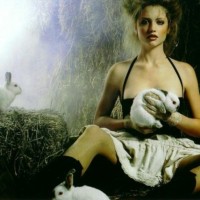
I love the whimsical feel of Week 6’s accessories shoot for Cosmo (above), with one very important accessory – a live animal! The real thought that had gone into matching the animal with the accessories is superb and works in different ways; whilst Amanda’s strong editorial look contrasts spectacularly with the cute little pig she’s holding, Jessica really captures the fun side of the shoot, interacting naturally with her Dalmatian and producing a really infectiously lovely photo.

Week 7 (are you bored yet?) and the usual NTM sadistic streak reared its head, getting models to sport lingerie in sub-zero temperatures (above). I love the vintage, Dr Zhivago-esque styling, whilst the scenery provides a stunning backdrop. The iciness really brings out the ethereal blue in Jessica’s eyes and I was banging on about how wonderful Kathryn’s photo was several days later. (Can you BELIEVE she got sent home that week?!?!).

kathryn lyons ausntm cruise

Finally, deep breath (are you worn out yet), a few moments for eventual winner Amanda Ware. A deserving winner in my eyes, who I’m proud to say I picked out right from the off, as she was about the only one in the opening credits who didn’t look either awful or unable to walk without looking drunk. Her best photo, for which Alex Perry ran out of synonyms and intensifiers for ‘expensive’, was shooting luxury brands on a luxury yacht. She looks long, lean, entirely above it all… and yes, ridiculously expensive (although as ever, Kathryn gave her a run for her money). In contrast, Tyra Banks much-mooted ‘High Fashion’ Cycle 15 of ANTM saw contestants defying belief and actually dressing up, often in drag, as famous fashion designers. Is there any question as to which series has more class, style and intrinsic understanding of how fashion should work?!

However, my favourite thing about the whole season was the promo. Are there many greater pleasures in life than seeing Charlotte Dawson waving wads of cash at the camera as a bookie (!), 16 pretty girls pretending to be racehorses/greyhounds (!!) wearing evening gowns and going face-first into the dirt (!!!) and Dame Alex Perry, complete with sunglasses and fur, lowering his binoculars to declare ‘Expensive’!!!! The answer (for NTM devotees anyway): no. Enjoy!

Incidentally, this post means I have now reviewed every season of Australia’s Next Top Model so far! That can only mean one thing – ranking time! So if you’re wondering where to start with AusNTM, here’s my take:

BEST TV:  Cycle 5 > Cycle 2 > Cycle 1 > Cycle 4 > Cycle 3 > Cycle 6

BEST PHOTOS/MODELS:  Cycle 6 > Cycle 5 > Cycle 2 > Cycle 3 (Alas, one Burdeu does not make up for a cast of shorties) > Cycle 1 > Cycle 4

The word cycle looks strange now. My work here is done.

Essie Playa del Platinum nail polish review

It’s one of life’s small but great pleasures when a nail varnish colour turns out better in the flesh than in the bottle. Such was the case with Essie’s Playa del Platinum polish.

Playa del Platinum was part of Essie’s 2010 Resort Collection and the neutral shade seemed a bit of an odd choice for summer, especially against the tropical turquoise, ocean blue and splashy fuchsia creams of the rest of the set. But on the nail, it suddenly makes perfect sense.

It’s a cloudy sandy colour that, whilst being a beautiful neutral that would work well for any season, is evocative of bleached beach-houses, smooth pebbles washed up on dusky shores and the kind of chunky oatmeal knitwear that pretty people wear in the similarly evocative Boden catalogues. In fact, think this advert for Jennifer Aniston’s new perfume and you’re pretty much there!

The first coat seems a little thin and streaky, yet it evens up to a gorgeously creamy opaque by the second. It’s a highly durable and wearable shade that goes with just about anything; a classic neutral that, with its subtle mix between dusty grey and biscuit beige, also taps into the current vogue for grungy greiges. Consequently, it looked fabulous with tips in Essie’s Island Hopping (from the 2007 It’s Better In The Bahamas collection) – a creamy murky mauve belonging to the similar summery but grungy family.

After a few less than stellar Essie choices I’ve made lately, it was great to be reminded why I fell in love with the brand in the first place. Easy to apply, easy to wear and a colour that you fall for gradually a little more each day. A platinum polish, indeed.

Looks great with: beach hair, chunky knitwear and just about everything else
Drying time: 5-10 mins
Coats required: 2-3
Chips: +7 days

Essie Playa del Platinum, Summer 2010 Resort Collection, $60, Cher2

Dexter gets arty

These amazing fan-made posters for Dexter have been floating about the Interwebz for a while, but it’s never too late to show a little love.

If you’re gonna have fan-made artwork, it helps if they’re created by the head honcho at a design studio (Ty Mattson of Mattson Creative), right?! Certainly puts fan forums’ MS Paint efforts to shame!

You don’t have to be a Dexter diehard to appreciate the beautiful design. I love the strong graphic style of the artwork and that the same striking colour palette is kept throughout – choosing red was always going to be a no-brainer for depicting a serial killer! I’ve only recently got back into the show so it’s fresh in my mind and Mattson’s done a great job of picking out the iconic moments for each season and representing them in quirky, inspired ways. (As ever, click for enlargements).

Mattson was so taken with Dexter’s awesomeness (clearly a man of discerning tastes) that he created the posters as a little project in his free time. But after the blogosphere blew up with news of Mattson’s brilliance, Showtime (the channel that airs Dexter) got in touch to say they loved the posters, took Mattson on a tour of the set where he got to meet Dexter himself, and offered him a role as extra for next season! It’s enough to warm even a cold-blooded serial killer’s heart, isn’t it?

Oh, to be an artist and create stuff like this in your free time! I just get to write about it instead!

The posters are now available as limited edition prints on Showtime’s website, $49.95 USD.

(via designworklife)

Pizza Hut pizza: still disgusting

So the shrimp-stuffed crusts of the Tapas Pizza weren’t disgusting enough for you? Well, Pizza Hut HK sees your Tapas Pizza and raises you one Scallop Cheesy Volcano just in time for the festive season.

Oh, that some poor, beautiful scallops had to die in vain to make this monstrosity. It seems Pizza Hut has so little respect for premium ingredients that seeing truffle-sprinkled caviar on their next special wouldn’t come as much of a surprise. And they’d still manage to make it look like a pre-schooler’s art project.

There are little cheese-stuffed balls bubbling out a lava of cheddar and mozzarella (creating the eponymous volcanos), encircling the creation menacingly and preventing the scallops from even thinking about any last-ditch attempts at escape. This is demo-ed in the advert by a lang-mo delicately squeezing said globule. Big bulbous thing oozing out unctuous yellow goo? I’m not thinking volcano… I’m thinking giant pus-filled spot. Gross.


Genki Sushi: the gills are alive…!

…Alas, not with the sound of music, but with the sound of human heartbeats.

For those of you that find sushi a difficult concept to stomach in the first place, your feelings will hardly be quelled by this bizarre advert for Genki Sushi that sees your salmon sashimi roll morphing into real live humans.

Obviously, I don’t understand Cantonese, so perhaps the narration provides some light bulb moment as to why we would want to eat sushi that shape-shifts into bemused looking male models.

This ad seems to be on constant rotation on the buses, proving that it isn’t just the still-life posters on public transport out here that have the potential to freak you out (to recap so far we’ve had: hands coming out of eyes, prawns in pizza crusts, children dressed as sperm and a serial killer lurking in your mineral water).

It certainly brings a whole new meaning to the term ‘man-eater’!

Orchard Garden Café & Restaurant review – bloomin’ marvellous?

If you thought the crockery at Crabtree & Evelyn’s Tearoom was pretty, be prepared for chintzy china overload at Orchard Garden Café & Restaurant. Fans of floral prints rejoice – this lot practically puts the Chelsea Flower Show to shame!

We popped into Orchard Garden Café on one of my frequent (as you’re rapidly discovering!) pit-stops for afternoon tea. The cuisine is Japanese Western and, yes, there were the as-usual bizarrely heavy tea set options, but their desserts and drinks menus appeared to be as long (if not longer) than the one for main meals – meaning it’s clearly my kinda place!

I’d already had the inkling that it would be my kind of place when my magpie instinct kicked in upon entering the premises. Similar to my experience at Pomme, I wanted to steal almost everything inside – from the sprigs of flowers on the tables to the colourful splashy artwork, the squishy white sofas to the telephone number of their interior designer. It almost makes the steep climb up several flights of stairs to get there worth it; amongst the mayhem of Mong Kok, it’s a refreshingly light bright modern space, best enjoyed in the quiet lull of the afternoon.

I chose my Honey Apple Tea ($35) simply because it had the prettiest crockery in the menu – a teacup and saucer emblazoned with royal purple pansies. I spent so long cooing over it that I barely had time to be impressed by the fact it was served with slices of genuine fresh fruit and a jar of golden runny honey (rather than being made with a shop-bought formula out a pot, a Hong Kong speciality). It was a sweet, summery tea, made all the more so by the delightful ware in which it was served. My auntie’s Ginger Lemon Tea ($32) was similarly splendid – an exquisitely decorated teacup, a dish of fresh fruit and a piping hot, fragrant cuppa.

Meanwhile, the size of the desserts (a vast array of waffles, pancakes and sundaes were available) was somewhat at odds with the dainty china; the portions seemed designed for hulking sweet-toothed giants whilst the crockery arrived straight from a pixie’s tea party. I went for the caramel custard (known by the more discerning diner as a crème caramel, $28) simply because it looked like the only dessert I could polish off on my own. That was true enough but on tasting it, I didn’t want to. Overly-sloppy, overly-sweet, a bobbing slobbery mass marooned in a sea of syrup with an odd powdery aftertaste to boot, it didn’t even have flowery crockery to redeem it.

Much better were my auntie’s Crispy Fruit Rolls ($48) – think sweet spring rolls and you’re halfway there. Crispy filo-pastry encasing a medley of fresh strawberries, blueberries, banana and mango with a squirt of whipped cream, served warm, with a bizarre dip of custard sauce. The flaky crunch of the golden pastry matched with the gooey fruity mess inside made for an inspired combination but it was still too big and too filling for even the pair of us to finish. On the plus side, the contemporary cornflower plate may have been my favourite yet.

Whack on a 10% service charge and it’s frankly a little too dear to justify not being more delicious (in fact, it cost more than our lunches combined, which can’t be good). It would probably be better if you’re sharing as a group… or if they installed a lift… or if they allowed you to simply purchase the pretty plates instead of the superfluous desserts that came with them!

See all Orchard Garden Café & Restaurant locations in Hong Kong here

Around the world in 10 travel posters

The Daily What is always good for a wander and just occasionally, it throws up something really rather spectacular. These gorgeous colour-soaked travel posters are the really rather spectacular that I’m thinking of.

fernado volken 24 hours in doha hanoi

Designed by Brazilian illustrator Fernando Volken Togni for Oryx Magazine (Qatar Airline’s in-flight read), they encapsulate ‘24 Hours In…’ various cities around the world. Bold, vibrant and bursting with energy, they’re like groovier Where’s Wally pictures – look closer and there’s all sorts of cute details hiding away. So there’s a Swiss Army knife in Zurich, a skyscraper-sized hamburger in New York and a panda poking out the trees in Shanghai.

It’s almost like Pick n’ Mix at your local sweet shop – impossible to pick a favourite, you just want to feast on them all! On the one hand, I love the ones that work with a particular colour palette – the lucky reds of Shanghai, the cool blues of Moscow, the faded vintage hues of Doha, the tricolour of Paris and the sun-soaked oranges of Madrid. But on the other, I also adore the vivid brights of New York and Barcelona, whilst there’s something about Casablanca’s colour scheme that feels so irresistibly Moroccan without me being able to quite put my finger on it. Wasn’t able to spot Humphrey Bogart lurking in any corners though!

Eagle-eyed viewers may spot a slight similarity with some other travel posters I went similarly goo-goo eyed for (from Ikea, of all places). Togni’s style is a little cuter and a lot more action-packed, but I still love them both. You can check out plenty more of his candy-coated artwork, all fabulous incidentally, on his website, which is where all the pictures are from (don’t forget to click for enlargements). He promises they will be for sale soon, leaving just one problem: which one to buy?!

Next stop… Hong Kong, please!

fernando volken 24 hours in sao paolo ngorongoro

OPI Suede Ink nail polish review

So here’s the rub of falling in love with a nail polish (OPI’s Lincoln Park After Dark Suede for those who’ve forgotten) – you feel compelled to buy the whole damn collection!

As soon as I’d fallen for the rich velvety finish and gorgeous glitter effect of Lincoln Park After Dark Suede, I found myself in Cher2 snapping up the rest of the set quicker than the varnish dries in the first place!

If Lincoln Park After Dark was the awesome amethyst in Suede’s crown, than Ink is the sparkling sapphire. If as a child you wondered exactly what indigo was and why this strange colour that was neither blue nor purple somehow deserved a place in the rainbow over pink, Ink is your answer. The exact in-between of those two colours (in a way that doesn’t quite come across in photos, where it looks much more blue), it’s practically the living definition of the shade.

A cloudy steel blue mixed with a deep royal purple, it’s another sophisticated yet stunning addition to the Suede collection. The muted metallic matte effect combined with the shot of shimmer makes it glitter with a grown-up glamour. Although I didn’t fall as instantly in love with it as I did with Lincoln Park, the interesting indigo shade subtly sucked me in over a few days of wear.

The same pros (quick-drying, great consistency, easy application) and the same cons (chips quicker than a Primark teacup) are still evident and, in common with many blues and indeed many glitters, it took a bit more elbow grease to remove.

As a more unusual colour, Ink may be a little difficult to match with other colours but you get your just rewards when it hits direct light. This mysterious murky indigo suddenly transforms into a sparkling night sky studded with silver stars and the results are dazzling. Twinkle, twinkle, indeed!

Looks great with: muted shades, tweed, glamour
Drying time: <1 mins
Coats required: 1
Chips: 1 day

OPI Suede Ink, Fall 2009 Suede Collection, $70, Cher2

Dessert of the day – get a Sift of that!

So you’ve already worked out my predilection towards afternoon tea and its cakey delights. Well, I’m not fussy. I can do afternoon tea in the comfort of my own home too!

However, given my cooking skills (I once exploded a bowl of rice in a microwave), I prefer to leave the baking to the professionals. I’d heard that Sift cupcakes were the best in town so decided to grab a few from their Wan Chai patisserie to devour back at the ranch.

Almost all the gush I’d heard had been for their Red Velvet cupcakes so they were top of my must-try list. As I weighed up my other options (there were over a dozen different varieties of cupcake to choose from, all $22), a girl giggled her way in, queue-jumped me and promptly pinched the last two Red Velvet cakes on display. Never mind red velvet, red smoke began flaring from my nostrils. ‘Are the cakes on display all you have?’ I asked counter girl #1. She informed me that this was the case. My growls probably reverberated all the way down Queen’s Road!

I was just about to do an indignant huff out of the shop, when counter girl #2 (i.e. competent counter girl) located a Red Velvet lurking round the back. I rounded up my order with a Luscious Chocolate and an Oreo (catering to my boyfriend’s specific pre-request of chocolate cake with vanilla frosting!) and skipped happily out of the shop, hoping that for $66, I was about to get the cupcake experience of my life. I wasn’t far wrong.

I’ve often found American-style cupcakes, toppling over with a top-heavy frosting to sponge ratio, have a tendency to be too heavy, too rich and simply too sickly-sweet. Indulgent paradise for the first few mouthfuls; claggy sticky death by cupcake towards the end. Sift’s, however, were none of the above. I have to complement their sponge the most – light, smooth and fluffy but moist and rich, the went down far too easily and quickly given the amount of calories involved!

The much-heralded Red Velvet (light chocolate cake dyed red, Madagascar Bourbon vanilla cream cheese frosting): The moist but feather-light sponge with a soft dainty chocolate taste was a delight but I wasn’t so keen on the topping. Admittedly, I wasn’t actually aware that it was cream cheese… An immediately potent punch of ultra-sweet, super-smooth cream, almost like custard, with a twangy tangy hit. Not my favourite but that’s purely personal taste.

Luscious Chocolate (Valrhona dark chocolate cake, dark chocolate buttercream frosting): In the words of Apprentice Season 4 winner, Lee McQueen – ‘That’s what I’m talking about!’ One for all the chocoholics out there (I’m a fully-paid, season-ticket holder), this was pure indulgence in a cupcake liner. The thicker consistency of the frosting was more what I expect of buttercream whilst the whole thing was rich, dense, dark heady hit after hit of intense chocolate flavour but without being overpowering. Yum.

Oreo (Valrhona dark chocolate cake, Madagascar Bourbon vanilla buttercream): Smells like an Oreo, tastes like an Oreo but apparently, not an Oreo… Again, the sponge was a decadent dream of deep chocolate whilst the topping was, by some strange cupcake sorcery, pure Oreo although it seems no Oreos were hurt in the making of this cake. The two sides complemented each other perfectly whilst the stiffer, more icing-like texture of the frosting made it a pleasantly less gooey gobble. The boyfriend was all smiles with this one.

So… orgasmic noises all round, much licking of chocolate-y smears from lips/fingers/plate, two cupcake-scented happy customers. Best cupcakes in Hong Kong? Definite contenders for the crown… and there’s a whole pantheon of other cakes, pastries and cookies to try yet! As long as giggling girl doesn’t thwart my plans, that is…!

Sift Patisserie, 43 Queen’s Road East, Wan Chai, Hong Kong, 2528 0084, closed Mondays

Pomme café review – the apple of my eye

As regular readers may have established (from here… or here… or even here!), I may have a bit of a sweet tooth. Everyone knows dessert occupies a different space in the stomach, right?! So it may come as no surprise to learn that one of my favourite “meals” of the day is afternoon tea.

Afternoon tea in Hong Kong can be a little strange; whilst many chan chan tengs do offer afternoon ‘tea sets’, these often include pork chops, chicken wings, bowls of macaroni and wedges of toast about the thickness of The Bible. Not exactly jam and scones, is it? So the rise of the Western coffee shop, and a mid-afternoon pit-stop to refuel after a hard day’s shopping, is something I wholeheartedly champion!

Pomme is exactly the sort of place that comes to mind. A little haven of Continental peace and quiet in bustling Wan Chai, it’s one of those places where I find myself wanting to buy not just everything on the menu, but everything decorating the place too!

I loved the colourful pretty prints of French shops on the wall. I loved the cabinet of antique copper teaware. I loved the door handle shaped like a whisk, the baby Eiffel tower made out of baguettes and the numerous ornaments inspired by their name (French for apple). Most of all, I loved their delectable range of cakes on display at the counter – great for hungry eyes to feast on, not so great for poor decision-makers (especially when your inner 5 year old wants to go for the signature cupcake decorated to look like a donkey)!

In the end, I settled for a chocolate hazelnut tart whilst my auntie went for lemon cheesecake (both $28). Thankfully, Pomme didn’t go for the cheat’s option of spreading the tart base with Nutella to achieve the chocolate hazelnut effect! Instead the filling was decadently rich, creamily smooth and with little crunch explosions of hazelnut pieces inside. However, although the tart shell was utterly buttery, it was a too hard and came away from the ganache-esque filling too easily.

The lemon cheesecake was a beauty. Light, tangy and neither too sweet, too tart or too heavy, it came complete with crumbly buttery biscuit base, silky smooth topping and just enough zing of lemon to keep things interesting. Textbook stuff.

Finally, a nice cuppa char to wash things down. I particularly liked how the menu told you which kind of teas were suited to which desserts – although I subsequently ignored all advice and went for the one with the prettiest name. My Vanilla Sencha (around $24) was delicately but not overwhelmingly sweet; a good clean fresh brew! I was rather taken with Pomme’s classy teacups – check out those fluid flowing lines!

Although a little pricey, it’s pretty much what I’d expect from a coffee shop in England and certainly no worse but far tastier than the likes of the dreaded Starbucks and Pacific Coffee. For the serene ambience, beautiful décor and an extensive menu I look forward to working my way through, Pomme is definitely deserving of ‘regular pit-stop’ status!

Pomme, G/F Southern Commercial Building, 11 Luard Road, Wan Chai, Hong Kong, 2527 9933