Tag Archives: Essie

Nails Of The Day: Essie Dive Bar & Essie Shine Of The Times manicure

essie shine of the times

Over the festive period, I was lucky enough to be invited to quite a few Christmas parties – so I felt it only right to put slightly more effort into my look than my usual pyjamas accessorised with cookie crumbs down the front… so hello new mani!

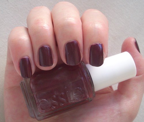
For Christmas party number one, I went with Essie Dive Bar, an inky blackened teal – very cool, very rock n’ roll, but darkly sophisticated with it. It’s one of those intriguing polish colours that looks black from far away, but reveals glittering depths on closer inspection. It’s super easy to use; like most Essie polishes, it flows onto the nail beautifully and is pretty much opaque in one coat (although I always seem to do two out of habit). I did find it dried a little dull for my tastes though, so I added a slick of top coat to give it a glossier finish. Amazingly enough for a polish this dark, it doesn’t stain either so well done Essie.

essie dive bar

Continue reading

Essie Your Hut Or Mine nail polish review

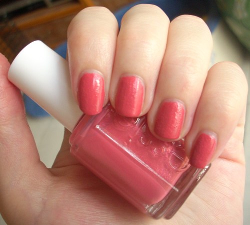
Remember my coral craze from a few months back? I covered super-sparkly coral (Zoya Rica), rainbow-holo coral (China Glaze TMI) and stunningly-saturated colour-popping coral (CND Poppyfield, as recently seen at New York Fashion Week – yes, that’s right, I’m a trend-setter, as if you didn’t already know!). Well now it’s time for a hangover post from my coral bingeEssie Your Hut Or Mine.

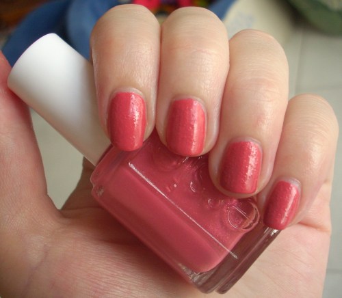
Your Hut Or Mine is a classic coral. It’s warm, floral and perhaps even a little old-fashioned looking, leaning more towards a dusky rose or honeysuckle than the juicy fruity melon hues of CND’s Poppyfield or Zoya’s Rica. It has Essie’s trademark secret shimmer hidden deep within – often so deep that you don’t really get a chance to peep it! Even so, its occasional glimmers of pink and gold keep it just that winning wink away from being too dull, less like a faded picnic cloth that got left out in the sun too long.

Even though it’s a summery colour, it’s warmth would also play well into autumn; I wore it with OPI Stranger Tides (a cool pale khaki) and I absolutely adored the colour combination, which looked modern, fresh and brought out the best in both shades.

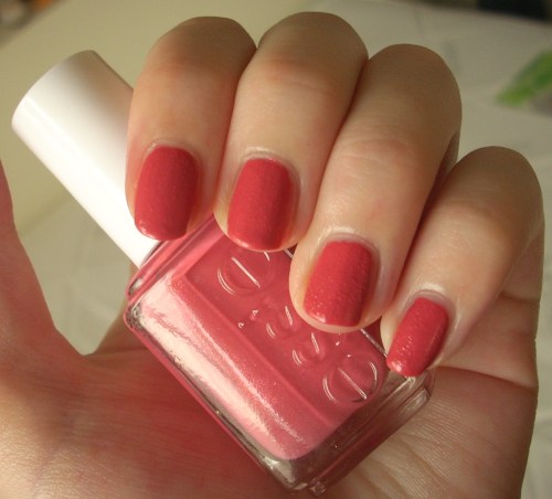
This had a smooth flowing consistency that made it super-easy to apply (like most Essie nail polishes I’ve tried) but I was surprised when air bubbles starting showing up once it had dried. Nothing as hideously bumpy as Orly Frisky but sadly, enough for me to know it was there. Hopefully I just shook the bottle too soon before application, as it’s not a problem I’ve had with Essie before – but it’s still a shame as otherwise, Your Hut Or Mine is a total gold-star performer.

I also stand by my previous comments that Essie’s smaller thinner brushes are far easier to control than the current fat brushes that are in vogue *cough OPI cough*. Those of you with smaller nails or who prefer having less to clean up at the end should enjoy using these skinnies as much as I do!

Bubbling issue aside, Your Hut Or Mine is a hard polish to have a problem with. I’m not entirely sure it suits my skin-tone (seems to bring out the pink in me) and wish the shimmer came out to play a little bit more, but I just love the warm prettiness of the colour. It reminds me of honeysuckle, picnics, barbeques, gingham and summer, which I reckon are all rather lovely associations to stir up.

So it ticks all my classic coral boxes… and judging by the fact it was sold out for quite a while at Cher2, it clearly ticks plenty of others’ – but how about yours? Let me know!

Looks good with: khaki, flowers, barbeques
Drying time: 3-5 mins
Coats required: 2
Chips: +5 days

Essie, Your Hut Or Mine, Summer 2011 Fair Game Resort Collection, $60, Cher2

Essie Rock Star Skinny nail polish review

Having finally cleared my Christmas backlog, here’s one from…  Autumn. Oops.

Essie’s Rock Star Skinny is a deep dark red, almost brown, with the merest sliver of silver shimmer. At the time (Winter 2008), the name proved a little controversial but I totally understand the vibe that Essie were going for – a sexy vampy colour, best worn with rock star attitude, guitar turned up to eleven, leopard skin skinnies optional – and it’s bang on.

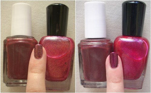
What does it say about me that all the best words I can use to describe this shade are alcoholic beverages?! Rock Star Skinny is a burnished burgundy, claret or sherry, which looks more crimson or brick brown depending on the angle and lighting. What it very rarely looks, however, is shimmery. The silvery glimmer is really noticeable in the bottle yet barely shows once it’s on the nails, only visible under very strong artificial lighting (which I’ve tried to show in the picture with the flash, below).

This was a shame as the hint of shimmer was one of the main reasons I opted for Rock Star Skinny in the first place. It gave it a bit of edge that set it apart from the countless other deep blood reds out there, so I was disappointed when it didn’t really come through. In fact, from certain angles, it looked decidedly dull and flat (see above). So I decided to rectify things myself by trying a few glittery topcoats – Zoya’s Gloria turns it into a gorgeous glowing russet (below left) whilst Zoya’s Allegra made it a hypnotic shade of magenta (below right). I loved how much richer, deeper and multi-faceted it became once a shimmer was added and it’s a shame Essie couldn’t find a way to make the silver threads show up more themselves.

That being said, I did find Rock Star Skinny to be a bit of a grower. I found myself liking it more with each passing day as it’s a mature, less showy take on red that works well with most colours and styles. It would be a decent alternative for those that want a change from black and could just about work for everyday working life.

Formula-wise, it felt a little thin and required three coats to get an even opaque colour, with the first coat a lot more obviously crimson than the third.

Rock Star Skinny does live up to its name, but it could have been so much more. Think of it as a very good first single with bags of potential… before Essie knock our socks off with an even more stellar album to come!

Looks good with: guitars, sunglasses worn indoors, bad gal attitude
Drying time: <5 mins
Coats required: 2-3
Chips: 3 days

Essie Rock Star Skinny nail polish, 2008 Winter Collection, $60, Cher2

Essie Silken Cord nail polish review

My final festive Beauty Spot belongs to Essie’s Silken Cord (the other three were China Glaze’s Midnight Kiss, Zoya’s Gloria and Essie’s Mint Candy Apple). I’d previously avoided red nail varnishes as I thought they were a bit obvious, a bit overdone, a bit old-fashioned yet along came Silken Cord and swept me away.

Silken Cord was actually the colour I sported through Christmas itself, as I just fell head over heels for its super-glossy finish and tangy crimson colour. It’s a bright bold red, with a hint of coral to it from some angles (see above, in softer lighting). It looks absolutely amazing with black (it couldn’t pop anymore without actually sitting up and smacking you in the face), gold and against pale skin – what I’m calling a very Snow White kind of colour combination, with skin white as snow, hair black as ebony, lips (or in this, case nails) red as the rose and all that. As such, it was exceptionally flattering to my colouring and my usual taste in clothing – and doesn’t it look just darling with my black fingerless gloves!

As with many Essie varnishes, the first coat is all kinds of thin and streaky. This beefs up to the beautiful bottle colour by the second or third coat but something about the formula still felt quite thin to me, a feeling vindicated by the fact this polish chipped much quicker than all the other Essies I’ve tried thus far.

But the pay-off is the intensity of the colour, a stark striking shade of scarlet, and the intense glossiness of the finish. In nail polish jargon, it’s almost a jelly finish, so shiny and reflective that it’s almost glassy. It’s just brilliant in every sense of the word. (I was also really impressed that a red this vibrant didn’t stain my nails afterwards!)

I was seriously smitten with Silken Cord. It’s such an eye-catching attention-grabbing shade that made me feel like a 50s film siren but without being too vampy for the everyday. Definitely enough to make me shake off my red polish inhibitions – but with a red this beautiful, do I even need any others in my collection?!

Looks good with: skin white as snow, hair black as ebony… and just about everything else too!
Drying time: 5 mins
Coats required: 2-3 (definitely better with 3 though)
Chips: 3 days

Essie Silken Cord nail polish, 2010 Winter Collection, $60, Cher2

Essie Mint Candy Apple nail polish review

I’m hoping you’re all of the opinion better late than never… because I’m only now getting round to showing you the rest of my nail polish picks for Christmas. I’ve already given you the lowdown on China Glaze’s Midnight Kiss and Zoya’s Gloria so now it’s time for a more unusual festive colour – Essie’s Mint Candy Apple.

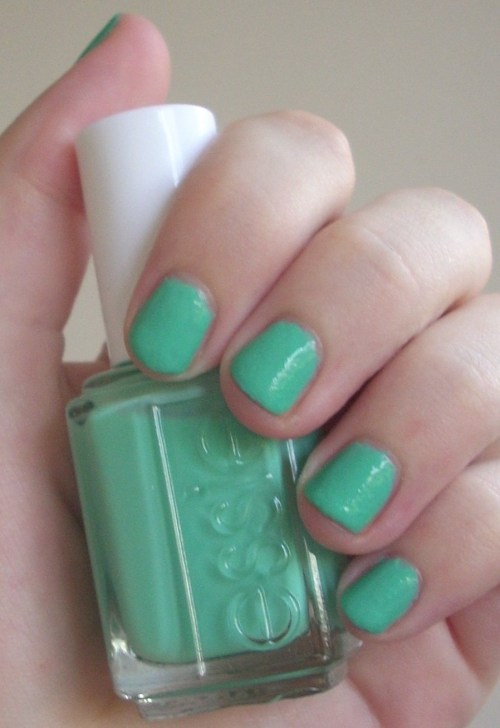
Pastel mint may not be everyone’s idea of a typical Christmassy colour yet it was released as part of Essie’s 2009 Sweet Time Of Year Holiday Collection and fast became one of its bestsellers and most talked-about products. I’ll admit I was slightly dubious too but once it’s on your nails, you’re sold. It’s an absolutely gorgeous creamy crème de menthe mint; cool but chic and yes, strangely festive (though it would work a treat for spring and summer too).

Why? Perhaps it’s because the cool pastel colour seems to perfectly suit the frosty climate. Or perhaps it’s because these pale shades that pop have emerged as a popular choice for more contemporary Christmas decorations (maybe because it looks amazing against silver, a great look for frost-dipped tips for your nails). Or perhaps it’s because it’s instantly reminiscent of those lip-smackingly scrumptious after-dinner mints that you’ll no doubt be porking out on over the festive period. Who knows! But somehow, Mint Candy Apple just does work. End of.

First application is worrying streaky and sheer but it becomes easily opaque within three coats, drying to a creamy dreamy finish. It’s a super-smooth, hard-wearing polish that I wore for at least a week without it showing even the slightest signs of wanting to chip – and the longer it stays, the more obsessed you become. By the seventh day, my boyfriend was beginning to tire of me waggling my fingers in his face and cooing ‘Aren’t they pretty?!’

Colour-wise, I just adored it. It reminded my boyfriend of Formica tables from 50s diners, me of spearmint toothpaste. Not the nicest descriptions I know, but they nail this fresh breezy colour completely. For a cuter comparison, it’s a mint choc chip ice-cream kind of colour, the kind of pastel you could imagine a My Little Pony being produced in. I was initially worried that it would be too similar to Essie’s Turquoise & Caicos to warrant purchase but whilst that was without doubt a true turquoise, this is just as easily the exact shade your mind’s eye conjures up when asked to think of the most delicious mint green. In short, it’s unique and it’s essential.

Mint Candy Apple is now riding yet another wave of popularity, owing to its similarity to the retro candy-coloured polish Beyonce sports in her Why Don’t You Love Me video. But it shouldn’t take a pop star, a seasonal trend, or even a special occasion like Christmas to convince you that Mint Candy Apple is something special. It manages that all on its own.

Looks great with: Christmas, spring, summer… whenever
Drying time: <5 mins
Coats required: 3
Chips: +7 days

Essie Mint Candy Apple nail polish, Winter 2009 Sweet Time Of Year Collection, $60, Cher2

Essie Playa del Platinum nail polish review

It’s one of life’s small but great pleasures when a nail varnish colour turns out better in the flesh than in the bottle. Such was the case with Essie’s Playa del Platinum polish.

Playa del Platinum was part of Essie’s 2010 Resort Collection and the neutral shade seemed a bit of an odd choice for summer, especially against the tropical turquoise, ocean blue and splashy fuchsia creams of the rest of the set. But on the nail, it suddenly makes perfect sense.

It’s a cloudy sandy colour that, whilst being a beautiful neutral that would work well for any season, is evocative of bleached beach-houses, smooth pebbles washed up on dusky shores and the kind of chunky oatmeal knitwear that pretty people wear in the similarly evocative Boden catalogues. In fact, think this advert for Jennifer Aniston’s new perfume and you’re pretty much there!

The first coat seems a little thin and streaky, yet it evens up to a gorgeously creamy opaque by the second. It’s a highly durable and wearable shade that goes with just about anything; a classic neutral that, with its subtle mix between dusty grey and biscuit beige, also taps into the current vogue for grungy greiges. Consequently, it looked fabulous with tips in Essie’s Island Hopping (from the 2007 It’s Better In The Bahamas collection) – a creamy murky mauve belonging to the similar summery but grungy family.

After a few less than stellar Essie choices I’ve made lately, it was great to be reminded why I fell in love with the brand in the first place. Easy to apply, easy to wear and a colour that you fall for gradually a little more each day. A platinum polish, indeed.

Looks great with: beach hair, chunky knitwear and just about everything else
Drying time: 5-10 mins
Coats required: 2-3
Chips: +7 days

Essie Playa del Platinum, Summer 2010 Resort Collection, $60, Cher2

Essie Sexy Divide nail polish review

MAC Cosmetics recently produced a collection called Venomous Villains, inspired by Disney’s most notorious baddies… And sorry to say, this isn’t a review of any of those products!

Great idea for a collection, gorgeous packaging but sadly, I wasn’t impressed with the execution. By the time I fought my way to a MAC counter, most of the products had sold out. I tried a few that had impressed me from photos – the Mineralize duo eye shadows were murky and dull, the glittery duochrome nail varnishes gritty, grotty and way too sheer (though I’ve since picked up a newer release of Mean & Green and it’s pretty badass). Oh well, at least I left with my wallet untouched – sadly, never an issue I have at my beloved Cher2!

So following on from nail polishes inspired by a Pixie Lott music video and an accidental finger in a photo, here’s my latest lacquer inspiration:

Isn’t she magnificent?! It’s no coincidence that her actual name, Maleficent, is only one syllable out. The most fierce of all Disney villains, primarily because she was evil just for the sake of it. No tortured childhood, no ulterior incentives, she decided to wreak havoc just because she was pissed she didn’t get a party invite. Fabulous.

So, given that MAC’s interpretation of Maleficent’s make-up didn’t impress me, I set about to find my own. Enter Essie, Sexy Divide, stage right.

A deep dark mysterious purple, it’s the kind of colour I could totally envisage coating Mal’s claws. Consistency was great, pigmentation strong and it dried quickly to a smooth glossy finish. It also had a gorgeous iridescence from some angles, a golden pinky shimmer that showed in either strong natural sunlight or bright artificial light (as I’ve tried to show in the photo with flash, above left; normal natural light, above right; click for enlargement).

However, from other angles or in the wrong lighting, it looked a little dull and flat. So whilst it was fun to vamp about in for a while, it probably won’t enter the pantheon of my favourite polishes. But here’s an evil cackle just for good measure: mwahahaha!

Looks good with: dark colours, bad girl attitude, a raven
Drying time: <5 mins
Coats required: 1-2
Chips: +7 days

Essie Sexy Divide nail polish, Winter 2008 Collection, $60, Cher2

Essie Fiesta nail polish review

What I wanted: a hot fuchsia cerise pink.
What I got: like I’d coloured my nails in with a Muji gel pen.

Essie’s Fiesta nail polish is bright. As in, should be highlighting my revision notes with it. If Essie’s Turquoise & Caicos makes me feel like Malibu Beach Barbie, then Fiesta makes me feel like straight-up Barbie herself, with pink obsession very much in tact. Admittedly, this would be a Barbie with crimped hair working some street style, rather than soft and pretty eveningwear Barbie with her hair up in a chignon. Fiesta would be way too vulgar for her!

Fiesta looked a lot duller in the photo, on the sample, in the bottle and on the brush (i.e. like the cerise I wanted) but somehow, seemed to develop neon properties on my nails. That’s not to say it’s a nice colour but it just wasn’t what I was expecting.

As for the nail varnish itself, I’ve already mentioned how much I prefer Essie’s thinner brush, which gets into all the nooks and crannies of your nails, is really easy to work with and gives great coverage. Fiesta is, perhaps unsurprisingly, very highly pigmented (so much so that even with a base coat, it stained my nails) and already gives you a very strong, bright colour with just one coat. However, it felt a bit thin on my nails, so I went for another coat… and alas, it continued to get even more fluorescent! But again, Essie acquits itself well in terms of both drying time and durability.

It’s a rather artificial E-Number-addled candy shade of pink, which looks really brash and, dare I say it, a bit tarty worn with black. Fiesta’s definitely not a shade for shrinking violets or wallflowers and doesn’t really work with colours that try to tone it down. Instead, I found it looked nicest against other jewel colours for it to pop against, particularly cobalt and (my turquoise obsession rearing its head again!) aqua.

Whilst it’s definitely not a shade for the everyday, it’s lots of fun and Essie’s quality still shines through. Now I’m off to go crimp my hair.

Looks great with: Jewel tones, fun times, not taking yourself too seriously
Drying time: <5 mins
Coats required: 2 (but you can get away with 1 in terms of colour)
Chips: 5 days

Essie Fiesta nail polish, $60, Cher2

Essie Turquoise & Caicos nail polish review

OK, so the taupe nail polish didn’t last long. But if I said I was so in love with OPI’s Over The Taupe, then I’m at a loss as to what superlatives to use for Essie’s Turquoise & Caicos. It’s pure love in a nail polish.

Lusting after someone else’s aqua nails was what set me off on the nail varnish road of discovery in the first place, so it was inevitable that sooner or later, I’d be turning my talons turquoise. And Essie’s Turquoise & Caicos is the truest tropical turquoise you could hope to find.

(Don’t be fooled by Essie’s own photo of Turquoise & Caicos, above, which makes it look dull, muddy and green. It’s none of above.)

Putting it on makes me feel like Malibu Beach Barbie. It gives an instant feeling of sun, sea and summer – especially great since now autumn is breezing in, I’m desperately trying to prolong that summer feeling. It’s a bright colour that never fails to pop whatever shades you pair it with, but does so without feeling too bold and brash. It’s cute, like a My Little Pony or a mint choc chip sundae, and fun, like a summer beach party. But it’s also surprisingly versatile and doesn’t instantly scream pre-school, like so many of the other ice-cream colours that were marketed this season. And it’s very very pretty.

As for the nail polish itself, I have to profess myself a greater fan of Essie than OPI. The dinky square-shaped bottle, with ‘essie’ embossed on the glass and the white cap with trademark ‘e’ on top, is a lot more aesthetically pleasing than OPI’s chunkier container. Similarly, Essie’s brush is smaller and thinner, which I found a lot easier to work with, and it dried a whole lot quicker and chipped a whole less sooner than OPI too.

However, the consistency of Turquoise & Caicos lets Essie down – the first application is thin, watery and streaky. The second application basically does what the first application should have, whilst a third application is necessary if you want a really consistent, even finish. Nevertheless, I was impressed with the creamy final finish, which was smoother and more self-levelling than OPI’s, even if it took a few more coats to get there. And the overall effect more than makes up for it – lushly gorgeous, it was like I’d dipped my fingers into a particularly beautiful ocean.

[One trick that works is if you don’t wipe much polish off the brush for the first application, so the initial coat is very wet and thick. This means that the colour is strong enough to get away with just two coats, although there can be a slight issue with air bubbles – but these get painted over effectively with the second application.]

If anyone had Crayola’s colouring pencils when they were little (I know my entire class seemed to!), it’s as if someone distilled the shade labelled simply ‘Turquoise’ into a bottle. And I have a feeling I’ll still be trying to re-capture that summer spirit by wearing Turquoise & Caicos well into winter. So meet me at the cocktail bar… I’ll be the one with the turquoise nails!

Looks great with: Denim, bright colours (especially hot pink), swimwear, summer!
Drying time: 5 mins
Coats required: 3
Chips: +7 days

You can also see a photo of me wearing Turquoise & Caicos in real-life at the end of this post!

Essie Turquoise & Caicos nail polish, Summer 2010 Resort Collection, $60, Cher2

Going Over The Taupe at Cher2: OPI nail polish review


The other day, I had lunch with a friend who was sporting turquoise nails and I developed a sudden finger fetish, quietly coveting her aqua talons all afternoon. Having not painted my nails in about ten years, it suddenly struck me that there was a whole rainbow-coloured world of make-up that I was wilfully neglecting – and I felt the need to rectify it immediately.

Not as easy as it sounds. Without my trusty Boots to fall back on, I headed to the local equivalents (Sasa, Bonjour, Colormix) and checked out their huge vats of pick n mix nail polish. They were cheap (average $15) but not so cheerful – colours already separating in the pots, brands I’d never heard of and signs imploring me not to try out the goods. When I sneakily opened one, the sad thin lacquer dripped down, morose and unloved. No thanks. I trusted the Revlon and Maybelline concessions more but their limited range of colours left a hole in my technicoloured heart and although I’d heard you could buy good stuff at salons that did manicures, I felt a little odd rocking up at one without wanting a treatment. So it was a case of Sassy Hong Kong to the rescue.

Through Sassy’s fantastic website, I found out about a shop called Cher2, a candyland of nail polish that stocked every colour under the sun. What’s more, this was real nail varnish, made by established brands OPI, Essie and China Glaze, but sold at nearly half the normal retail price. In Hong Kong, you come to rely on such tip-offs because these secret goldmines are invariably tucked away in shabby, unassuming office buildings with those scary lifts where you have to open the doors yourself. I felt like an explorer navigating these old and dusty corridors in search of the treasure trove – and this quiet haven with racks and racks of rainbow explosions was definitely some glorious treasure for a make-up mavens like me!

I’d taken my first tentative toe-dips of getting back in the nail polish groove by doing my thumbnail with a tester pot of ‘it-shade’ Particuliere in Chanel. Classy, I know. I’d selected that mould-colour out of curiosity more than anything else, but over the past few days it had grown on me… rather like mould, I suppose! Armed with painted thumb, I asked the Cher2 shop assistant for the most similar colour they had. The girl was brilliant, knowing her stock exhaustively and producing about five different variants, with us eventually settling for OPI’s Over The Taupe as the most accurate dupe. So here we are.

I’m so in love with this shade right now. I love how subtle it is, yet also how very grown-up. Mushroom, putty, greige, mink, taupe, mould, cloudy coffee, sludge – call it what you will but it’s a sophisticated and seriously arresting blend of brown, grey, beige and even a touch of pale purple. I’d also forgotten how great wearing nail varnish makes you feel, like you’ve made an effort even on off-days, and I keep staring at my pinkies in pleasure. Yes, the finger fetish is back!

As for the nail varnish itself, I found it a little thicker and gloopier than I was expecting. OPI’s fatter brush took a while to get used to and I found the Chanel one easier to apply but this is as much due to the deterioration of my nail painting skills over the intervening decade (when advising me on base coats, the Cher2 assistant told me I had healthy nails – probably because I hadn’t painted them in ten years!) as to any shortcomings of the lacquer itself.

Despite lack of skill, I’m sadly still a bit of a perfectionist. I’d paint, not be entirely happy, try and tidy it up with nail varnish remover but manage to get acetone on other nice nails, meaning I had to start all over again, several times! It also seemed to take an age to dry, possibly because I didn’t leave enough time between coats (and you definitely need two coats, just one is too streaky and uneven) – I was amazed that it was still tacky over an hour after application, causing me to perennially smear it on things, meaning the final finish wasn’t quite as smooth as I’d hoped. 90 minutes and three rounds later, I was practically high on nail varnish remover fumes – but I had beautiful nails. Well, from a distance anyway!

I think I need to go a few more rounds with OPI to decide whether the thicker polish and fat brush works for me, but I really adore the colour. Two days on and I’m still chip-free, which speaks highly of the quality, especially reasonable at Cher2 prices.

I’ll be back on the nail varnish wagon again soon with the other two shades I bought so watch out for reviews of them! In the meantime though, I’ll just stare lovingly at my fingers some more…

Looks great with: Black, cream, smart/casual look
Drying time: +10-15 mins
Coats required: 2
Chips: After 2 days

OPI Over The Taupe nail polish, Summer 2009 Bright Pair Collection, $70, Cher2

All Cher2 locations in Hong Kong:

– 1E Po Foo Building, 84-94 Percival Street/1 Foo Ming Street, Causeway Bay, Hong Kong, 2882 2528
– 809, Mong Kok City Centre, 74-84 Sai Yeung Choi Street, Mong Kok, Hong Kong, 2886 1132
– 1202A Century Square, 1-13 D’Aguilar Street, Central, Hong Kong, 2810 0171
– 607 Kowloon Centre, 29-39 Ashley Road, Tsim Sha Tsui, Hong Kong, 2730 0701

http://www.cher2.com