Tag Archives: coral

Shu Uemura Laque Supreme in Chu Chu Coral and Wild Rose review – baby got laque!

shu uemura laque supreme

The arrival of Shu Uemura’s latest lip product = this baby’s got laque!

Oh come on, you know I can never resist a good pun… and nor can I resist a good lippie. Shu Uemura’s Laque Supreme is a gorgeous halfway house between a lipstick and a lip gloss – but there certainly isn’t anything half-hearted about the final results!

Inspired by the high shine and rich colours of Japanese lacquerware, Laque Supreme essentially marries the consistency of a lip gloss with the intense pigmentation of a lipstick. But actually, it’s even better than that.

shu uemura laque supreme swatches wn02 cr01
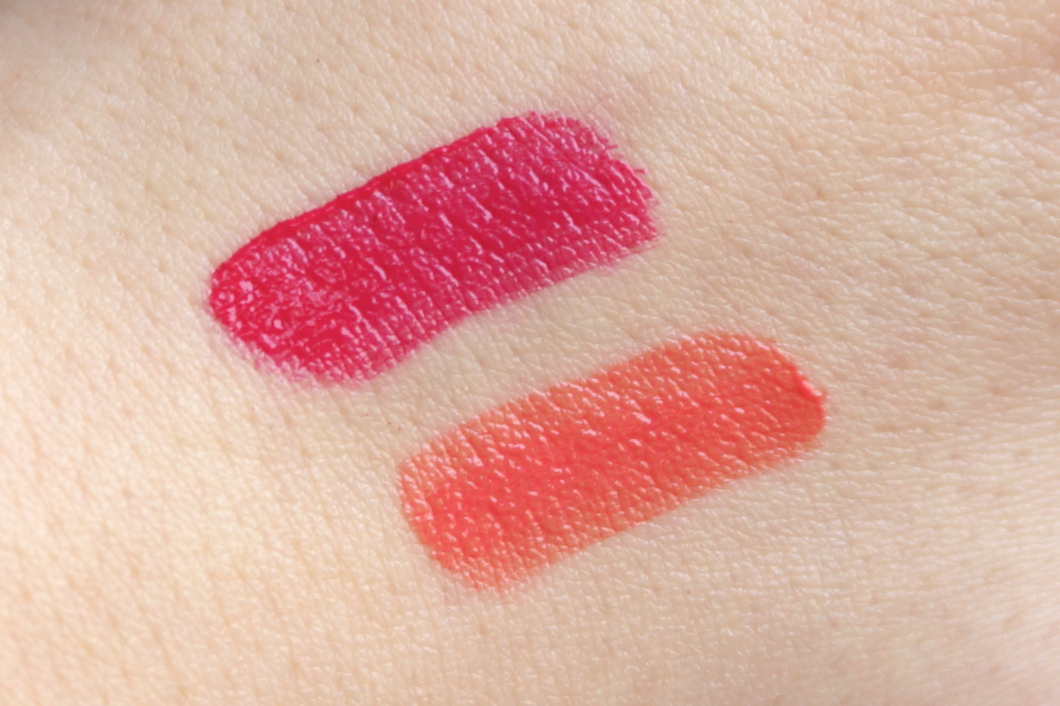
Top to bottom: Wild Rose/Wild Fuchsia (WN02), Chu Chu Coral (CR01)

Continue reading

MAC Mineralize Rich Lipsticks in Be A Lady and Lady At Play review – drinking the coral Kool-Aid

mac mineralize rich lipsticks lady at play and be a lady

Cometh the summer… cometh the coral.

In some weird beauty blogger version of Pavlov’s Dogs, as soon as the sun starts poking its head out for any prolonged period, I find my fingers automatically itching towards my stash of coral lipsticks – and usually, the brighter the better! There’s just something about coral in the summer… It feels younger and more fun than red, breezier and easier to pull off than orange, and juicier and happier than pink – instead being some exotic, eternally flattering love-child of all three.

mac lady at play and be a lady mineralize rich lipsticks

This summer, MAC’s Mineralize Rich Lipsticks in Lady At Play (above left) and Be A Lady (above right) have been on higher rotation in my make-up routine than One Direction and Taylor Swift on a tweenager’s Spotify playlist. These lipstick ladies are definitely for turning… turning heads that is!

Continue reading

Shu Uemura Baby Flame Rouge Unlimited lipstick review

shu uemura baby flame rouge unlimited lipstick

I was once told by a commenter online that Asian girls shouldn’t wear red lips – and my reply, being the spiteful so-and-so I am, was that people telling me I shouldn’t wear it only made me wear it even more! So let me practice what I preach by showing you Shu Uemura’s Baby Flame Rouge Unlimited Lipstick, from their new Sweet Red Collection.

shu uemura baby flame rouge unlimited sweet red collectionLeft to right: Shu Uemura Rouge Unlimited lipsticks in Dolly Red, Laquer Red, Mon Shu Red, Baby Flame

The Sweet Red Collection comprises six varying shades of… yes, how did you guess… red lippie! Red lipstick should be a weapon in every woman’s make-up arsenal, but the nice thing about Shu’s shades here are that they’re good entry level reds – they all have a sweet translucent shine to them rather than a strong matte look, and amongst the six, there should be a shade for everyone.

Continue reading

MAC Stay By Me Pro Longwear Blush & Coral Bliss Cremesheen Lipstick review – going coral cray-cray!

There are a couple of colours that I think you all know I’m obsessed with. Turquoise. Purple. Glitter (oh wait… glitter isn’t a colour?!). However, there is one minor obsession that I had managed to keep under the carpet – until now! Step forward, coral!

Coral is my unsung hero. I wear it nearly every day in the form of Benefit’s pale peachy and sadly discontinued Georgia blusher, a little box of powder that takes me from rough to radiant in a matter of seconds. I have worn it occasionally on my nails (see here… and here). And over summer, I wore the hell out of it on my lips (reviews for which will filter through eventually, but basically MAC’s Watch Me Simmer = WIN). So I think it’s finally time to give coral some love on my blog with this all coral look, courtesy of MAC’s Stay By Me Pro Longwear Blush and Coral Bliss Cremesheen Lipstick.

Continue reading

American Apparel Neon Coral nail polish review

It is officially summer in the 852 , which means I get even more insane with my make-up than usual! Being my usual stupidly-prepared self, I bagged myself the hottest most searing neon nail polish money could buy around three months ago, thanks to Stateside make-up mule Nunu. First up to give my nails a dose of radioactive summer was American Apparel Neon Coral.

Well, it does what it says on the tin! It is neon. It is coral. BUT IT IS SO MUCH MORE.

Continue reading

Beauty Spot: Becca Skin Perfecting Make-Up System Makeover review

I usually approach makeovers at make-up counters with wariness.

Take advice from overly orange sales assistants who seem to think the best way of advertising their products is to wear as much on their face as possible? No thanks! And, when I have succumbed, it’s been a case of too too much – plastered on like a mask (and feeling almost as heavy as one!) in whacked-out colours and with an emphasis on whatever products they’re currently trying to promote, regardless of whether they suit your skin tone.

However, I bring you one notable exception to the rule – Becca.

Too too much is a notion that isn’t really in this Aussie cosmetics brand’s arsenal. They’re all about natural, effortless beauty – admittedly not much use if you’re seeking crazy colours and glitzy glitters, but great for your go-to day-to-day make-up. Becca wasn’t around where I used to live in the UK but as soon as I came over, I made my way over to one of their counters quick-start – and the fact I’m now onto my third bottle of their Tinted Moisturiser should tell you all you need to know!

The guy in charge of my Skin Perfecting Make-Up System Makeover was the very lovely Jan. Ladies, ask for him and you need never fear of the makeover foundation force-field again! He asked about my general make-up look, what colours I preferred and paid close attention to my skin (verdict: good but after a really poor facial, currently extremely sensitive) and skin-tone. I’m vampire levels of fair but Jan picked and applied all my products expertly to create a light, natural make-up look that I was really happy with!

I think you’ve seen enough pictures of me on here to know my general look by now so you’ll have to make do with the after shots only – and the pout is more through effort of trying to take a decent photo of myself, rather than through model aspirations, trust me!

As I knew I was getting made over, I only applied a quick base with SPF and a slick of eyeliner (I rarely leave my neighbourhood without it!) so the first stage was a quick make-up removal. ‘Wow, this eyeliner is good!’ Jan commented, as he moved onto his third cotton wool square for just my left eye… of course, it was a good old Urban Decay’s 24/7 Eye Pencil, one of my bona fide make-up miracles. Jan had heard of Urban Decay’s magical mystical properties but, UD not being sold in HK, had never tried them, so I told him to recruit someone to go haul for him in Sinagpore’s Sephora… and the rest of the makeover breezed by in make-up gossip and easy chatting!

First, there was a primer, then onto their Luminous Colour Tinted Moisturiser, one of my favourite Becca products. It has a really gorgeous consistency and applies silkily smooth, whilst also offering pretty good coverage for a tinted moisturiser (which often tend to be on the sheer side). The best thing about Becca’s Tinted Moisturiser is that it comes in 13 different shades – so you’re bound to find one that matches and blends in seamlessly with your skin-tone, rather than making do with one of the regulation ‘light, medium or dark’ that most brands (and BB Creams) manage. Factor in an SPF of 25, a light and dreamy texture and that a little goes a long way (one bottle generally lasts me around 18 months), and it’s no surprise this is a total stalwart in my make-up bag!

I also loved what Jan did with my eyes, a slightly smoky look but still subtle enough for day-to-day wear. He used a matte taupe shadow from the Lost Weekend Palette and then added extra depth with an eye pencil, but without going heavy on the waterline – and I am absolutely loving those flicks (no Benefit Get Bent Brush required!)!

What’s more – Jan didn’t use mascara. Is he my guardian make-up angel or what?! My eyes are pretty sensitive as the best of times, but following crap facial, have been bugging out more than ever. He took one look and, rather than ploughing on regardless, said there was no way he was using mascara (and even then, went light and gentle with the rest of my eye make-up). You’ll know it’s a super-special occasion if you see me in my mascara, that’s how much I hate wearing it (it always makes my eyes feel heavy, they invariably start watering at some stage and the hassle of taking it off is enough to kill the ‘oooo fluttery’ joy of initial application) so this really cemented it as a perfect make-up look for me.

After finding out I preferred corals to pinks, he went that way for the rest of my look. He used one of Becca’s best-selling Lip & Cheek Crèmes as a blush (Tuberose I think) and I was really surprised with the results. Cream blushes often come off rather intense and feel heavy on my skin-tone yet with Jan’s dab hands, he managed to create a pretty, delicate and effortless coral flush!  I only wish I had enough confidence in myself to know I could work it just as well at home!

IFC’s toilets – home to decent lighting!

After trying a few lip looks, we eventually settled on one I really loved using another cult Becca product, Beach Tint in Grapefruit, a pretty pinky-coral. I’d heard lots of good things about their Beach Tints, which can be used on both lips and cheeks, and because of that, had been expecting them to have the same kind of watery liquid stain consistency as Benefit’s Benetint/Posietint/Cha Cha Tint/whatever new Tint retread they’ve brought out. Actually, the Becca Beach Tint is more like a light cream (intensely bright out the tube but easily blended in) and in my books, work far better as a lip tint than Benetint’s moisture-sapping stain ever did!

I absolutely loved the light coral colour, plus the deliciously unexpected fresh fruity scent, but what I loved even more was the finish. It’s pretty much the most natural lip finish I’ve seen, but which still made an obvious colour difference to my smackers. It’s definitely not a gloss, glaze or satin finish but definitely far away from being a matte or balm look either; basically, it’s a totally gorgeous, natural lip look, the ultimate ‘my lips but better’ and has immediately gone down on my wish-list!

Finally, a few judicious dabs of concealer for any red patches, a finishing powder (another Becca best-seller with a feather-light texture and radiant finish) and a highlighter and I was good to go!

Do not fear… I will be getting a new camera soon!

I absolutely loved my makeover – and Jan! It’s a really natural but pretty make-up look that totally suits my lifestyle, which for me, is exactly what a good makeover should be – one that took into account my style and my needs, rather than those of the make-up assistant! This is a look that I would wear without hesitation in my day-to-day life; I loved how light and non caked-on it felt and it stayed picture-perfect for a good eight hours, with the eye make-up holding up especially well. Plus, with Jan talking me through it the entire way, it’s one I feel I could manage to do myself too.

Proof positive that this makeover was a good ‘un through and through? I, control freak and beauty addict, would happily entrust Becca and Jan with my make-up again… and again… and again…!

Becca counters are available at Times Square, Pacific Place and IFC Lane Crawford.

Essie Your Hut Or Mine nail polish review

Remember my coral craze from a few months back? I covered super-sparkly coral (Zoya Rica), rainbow-holo coral (China Glaze TMI) and stunningly-saturated colour-popping coral (CND Poppyfield, as recently seen at New York Fashion Week – yes, that’s right, I’m a trend-setter, as if you didn’t already know!). Well now it’s time for a hangover post from my coral bingeEssie Your Hut Or Mine.

Your Hut Or Mine is a classic coral. It’s warm, floral and perhaps even a little old-fashioned looking, leaning more towards a dusky rose or honeysuckle than the juicy fruity melon hues of CND’s Poppyfield or Zoya’s Rica. It has Essie’s trademark secret shimmer hidden deep within – often so deep that you don’t really get a chance to peep it! Even so, its occasional glimmers of pink and gold keep it just that winning wink away from being too dull, less like a faded picnic cloth that got left out in the sun too long.

Even though it’s a summery colour, it’s warmth would also play well into autumn; I wore it with OPI Stranger Tides (a cool pale khaki) and I absolutely adored the colour combination, which looked modern, fresh and brought out the best in both shades.

This had a smooth flowing consistency that made it super-easy to apply (like most Essie nail polishes I’ve tried) but I was surprised when air bubbles starting showing up once it had dried. Nothing as hideously bumpy as Orly Frisky but sadly, enough for me to know it was there. Hopefully I just shook the bottle too soon before application, as it’s not a problem I’ve had with Essie before – but it’s still a shame as otherwise, Your Hut Or Mine is a total gold-star performer.

I also stand by my previous comments that Essie’s smaller thinner brushes are far easier to control than the current fat brushes that are in vogue *cough OPI cough*. Those of you with smaller nails or who prefer having less to clean up at the end should enjoy using these skinnies as much as I do!

Bubbling issue aside, Your Hut Or Mine is a hard polish to have a problem with. I’m not entirely sure it suits my skin-tone (seems to bring out the pink in me) and wish the shimmer came out to play a little bit more, but I just love the warm prettiness of the colour. It reminds me of honeysuckle, picnics, barbeques, gingham and summer, which I reckon are all rather lovely associations to stir up.

So it ticks all my classic coral boxes… and judging by the fact it was sold out for quite a while at Cher2, it clearly ticks plenty of others’ – but how about yours? Let me know!

Looks good with: khaki, flowers, barbeques
Drying time: 3-5 mins
Coats required: 2
Chips: +5 days

Essie, Your Hut Or Mine, Summer 2011 Fair Game Resort Collection, $60, Cher2

Zoya Rica nail polish review

You may have worked out that I’ve been on a bit of a coral binge lately. And whilst probably not the truest coral in the colour wheel, Zoya’s Rica is too amazing not to include.

Rica didn’t even register with me when I looked at Zoya’s 2011 Sunshine Collection online. Yet in person, on a hot summer’s day, it proved irresistible. I don’t think it could get more summery unless it came wearing shades!

Rica is a super-sparkly, super-summery, super-super pink-tinged sunny orange topped off with a liberal dose of golden sunshine glitter. It just about fits into the coral scheme of things but when I gazed at its loveliness, all I could think of were ripe mouth-watering summer fruits. It’s like someone squeezed together the juiciest aspects of a watermelon, grapefruit, tangerine, apricot and mango, and the result was Rica.

Meanwhile, that golden sunshine sparkle is the trademark Zoya way of doing glitter. You can see further examples of it in my posts on Charla and Gloria, but it’s basically a very fine glitter that positively saturates the polish, but completely evenly and consistently, giving it an almost foil-like effect. It’s completely smooth to the touch and as such, is a very grown-up take on glitter – unmistakeably Zoya and unmistakeably awesome.

Such is the awesome sunshine of Rica, it practically glows in the dark! As you can see from this photo in the shade, that glitter really does look like sparkle directly transplanted from the sun – the sun shining down on a luscious tropical island, I think you’ll agree! In the shade, it definitely leans more towards a golden orange that reminded me of a goldfish!

As with most Zoyas, it was fantastically easy to apply; at first, the consistency seems a little thin but it’s easy to work with and I had a beautiful smooth even colour after just two coats. As ever with Zoya, it also wears like iron – totally chip-free after over a week.

I honestly don’t think I can sing Rica’s praises enough. It’s gloriously golden, fantastically fruity and so so stunningly summery that it could probably brighten things up in the depths of darkest Antarctica (or, as it’s usually known, a typical British summer in the UK!). Pure sunshine in a bottle – what more could you ask for?!

Looks good with: SUNSHINE, ice lollies, summer prints
Drying time: 5-7 mins
Coats required: 2
Chips: +7 days

Zoya Rica nail polish, Summer 2011 Sunshine Collection, $80, Cher2

China Glaze TMI nail polish review

As you know, I’m really digging coral this season – so what could possibly be better than the eye-popping coral crème that was CND’s Poppyfield? Well, a holographic coral, of course! Skip forward, China Glaze’s TMI.

Yes, it’s another one of those oh-so-awesome colours from the OMG Collection. TMI is from the warmer end of the spectrum, a lovely pinky coral that glows in natural sunlight. Those enchanting entrancing rainbow-reflecting properties are still very much present (albeit slightly weaker than the other OMG colours I’ve tried to date), but this time it’s very much the summer end of the rainbow that gleams back at you – all golds, pinks, oranges and red.

For me, TMI is very much an instant winner in the daylight. It’s a really gorgeous colour, very flattering and there’s something about that rosy pink-toned coral that gives you the warm fuzzies inside. However, where it comes unstuck is in the shade or in yellow artificial light, where it turns into a weird dusty salmon, leaning towards rusty orange, which I found really rather nasty. Oh well, you gotta take the rough with the smooth and trust me, that first flush of rosy coral loveliness is definitely worth it.

More rainbows reveal themselves under white artificial light

Application-wise, I found TMI to be a little trickier than the rest of its OMG cousins. The consistency was a tad gloopier and coverage was initially difficult to get even. However, it’s worth remembering that these polishes are now a few years old and when I found TMI, it was sitting unloved, unclean and with a formula that had separated many moons ago, so all this could well be a factor. Add some TLC to TMI and after a careful two coats, it looked fine.

Although TMI is definitely not my favourite from the OMG Collection as it’s definitely a little tamer than its brothers and sisters, that might actually work in its favour for those of you who’d prefer an easily wearable, flattering colour that still boasts that holographic awesomeness. And let’s face it, rainbows are just irresistible, aren’t they?!

Looks good with: summer, natural sunlight
Drying time: <2 mins
Coats required: 2
Chips: 2-3 days

China Glaze TMI nail polish, Spring 2008 OMG Collection, $80, Nail Concept Company

CND Poppyfield nail polish review

The sun has got its hat on, hip hip hooray, the sun has got its hat on, CND Poppyfield’s coming out to play.

Isn’t coral just such a fabulous summer colour? I’ve been searching for a great coral all year in anticipation of sunny days, blue skies and beach dreams but it wasn’t as easy as I’d thought it would be! A good coral should be the perfect blend of pink, orange and red; you know it’s perfect when it’s definitely not identifiable as being solely any of the colours above but cries out to be called coral! It’s also one of those colours that depends on skintone and surroundings to pull it in different directions, so one woman’s ultimate coral can easily be another’s crash and burn.

Poppyfield’s name doesn’t really do it justice. When I think of poppies, I think of a cheerful bright red, which this polish clearly ain’t. It’s a tangy mostly orange-leaning red that pops with more gusto than an Andy Warhol painting. A Californian poppy at a push, but much more likely a nasturtium, geranium or hibiscus if you must go down the garden path (yes, I did a lot of gardening as a child, what of it?!). In real life, there is a detectable melon sorbet pink tone in there too, but my camera clearly preferred the orange instead (you can see it more in the bottle). So what’s that – mentions of red, orange AND pink? Clear coral territory, for sure.

Poppyfield was the first CND nail polish I’ve tried – and I’m definitely going to be back for more! Unfortunately, Creative Nail Design (to use their full moniker) underwent a revamp a few years back, which overhauled their bottle design for the better, but severely stunted their range of colours in the process. It’s now a mostly uninspiring collection seemingly based on the boring racks in Essie i.e. traditional colours in red, pink and neutral shades.

Such a shame as the formula on this was brilliant. Smooth, creamy, easily opaque in two coats, a high-shine glossy finish and chip-free after well over seven days. I also loved the rubber cap of these bottles, which made such a difference to getting that extra bit of grip and security (my polish-stained blanket bears testament to the number of plastic caps that have slipped through my fingers!). The brush itself was not too memorable (I’d compare it to China Glaze’s in terms of size and thickness) and judging by how relatively neat my nails look here, it must have been pretty good to use.

Poppyfield is a coral that doesn’t just smile – it positively sings. It looks A-MA-ZING (emphasis on the zing) paired with summer brights and it’s the kind of polish that brightens up your whole look. Together with the fabulous formula, Poppyfield is a no-brainer. Flash but not brash, it’s definitely one for your summer stash. Yes, I do rhymes here too.

Looks good with: summer brights, sunnies, shorts
Drying time: 5-7 minutes
Coats required: 2-3
Chips: +7 days

CND Poppyfield nail polish, $60, Nail Concept Company