Monthly Archives: April 2011

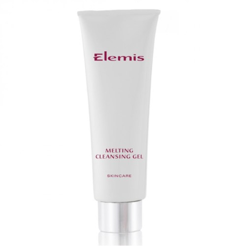
Elemis Melting Cleansing Gel cleanser review

I was recently lucky enough to be sent some small sample sachets for a brand new product to Hong Kong – Elemis Melting Cleansing Gel.

I love the concept of this ‘dual-phase’ product. It starts life as a thick luxurious translucent gel, which glides silkily smooth onto the face. Next, massage it into your skin with wet fingertips, thus melting it into a milky creamy emulsion. Finally, wipe or rinse it off and you’re left with deeply-cleansed, super-soft and ultra-radiant skin.

The Melting Cleansing Gel also contains one of the current ‘It ingredients’ for cosmetics, Argan oil, which comes stuffed with naturally-occurring minerals and is renowned for its restorative and nutritive properties. Other high-achieving ingredients include rice silk (to mattify and eliminate shine), assai fruit (an antioxidant that prevents the skin from drying out) and rosemary leaf (a purifying antioxidant).

Even though I only had enough of the stuff to last around four days, I was bowled over. Elemis, much like one of my favourite skincare brands Bliss, originated from spa treatments and therapies and the Melting Cleansing Gel has a similarly amazing luxurious feel to it. I’m used to cleansers feeling very workaday so it was a lovely way to inject a little bit of luxury to my daily routine. The texture really is meltingly beautiful, gooey gliding goodness – as if someone made the softest cashmere, silk and velvet into gel form.

The results are instantly noticeable. My skin felt deeply cleansed without any of those familiar feelings of tightness or dryness and I was instead left feeling refreshed, relaxed and with supremely soft skin to boot. My complexion definitely seemed brighter and lighter too. Other reviews have commented on a pleasant citrus scent but oops, I was clearly enjoying the gel to cream transition to notice!

Because the Elemis Melting Cleansing Gel offers such a deep clean that feels more moisturising rather than stripping, I think it would be ideal for sensitive skin. Despite the whole melting dual-phase technology, it’s not especially time-consuming and can easily fit into your everyday skincare routine.

With just enough sample for four uses, I can’t really comment on the product’s long-term effects or how long it lasts for and it might be a little bit pricey to make it into everyone’s daily regime. However, what I can say is that I was so impressed by the Melting Cleansing Gel that I would definitely recommend it to others and would even give it a full-time trial myself!

Elemis Melting Cleansing Gel, $380 for 125ml, available from Elemis Day Spa in Central and Elemis counters at Lane Crawford and Joyce Beauty.

Estessimo Tins The Splash Blue nail polish review

Time for another glitterbomb, courtesy of Estessimo Tins The Splash Blue.

Remember that gorgeous frosty ‘Blue Fairy’ look I created by layering China Glaze White Cap and OPI Last Friday Night over China Glaze Sea Spray? Well, The Splash Blue is essentially that but better – and without having to go to the trouble of four coats of different polishes!

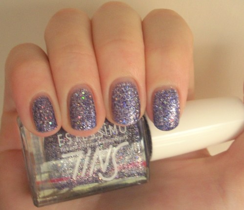
It’s an icy baby blue swirled with the trademark Estessimo Tins magic mixture of silver and holographic glitter. Unlike The Nepture, whose glitter seemed to reflect a whole galaxy of colours, this time the effect is much cooler – a palette of opalescent blues, greens and silvers that twinkle like a shaken up snow globe.

I love this dreamier approach to glitter for nail polish (file alongside OPI’s Teenage Dream), which is often categorised as being brash and in your face. Unfortunately, despite being exceedingly desperately pretty, it also seemed to bring out the red in my skin tone – making for those hideous blotchy fingers you see in the photos!

Sadly, my experience with The Splash Blue wasn’t as good as the one I had with The Neptune either. The formula felt much grittier and thicker and application was more difficult as it seemed a bit bumpy and lumpy. But once again, only two coats were required to get a fully opaque finish and although drying time is average, wear-time, as with The Neptune, was fantastic.

Other than Pinocchio’s Blue Fairy, the other thing this glittering glacial blue reminds me of are cute candy-coloured sorbets or ice-creams – topped with a sprinkling of fairy dust, of course! If you can put up with the slightly troublesome application, polishes probably don’t get much more magical than The Splash Blue!

Looks good with: pastels, soft shades, pretty summer frocks
Drying time: 5-7 mins
Coats required: 2
Chips: +7 days

Estessimo TINS 016 The Splash Blue nail polish, Spring 2004 Sweet Go Happy Collection, $85, Nail Concept Company

Bliss Triple Oxygen Instant Energising Eye Masks review

The third and final element of Bliss Spa’s Triple Oxygen trinity are their Triple Oxygen Instant Energising Eye Masks, sold in boxes of four. Bliss reckons that they’re like ‘an energy drink for the eye’ and they’re certainly more stylish than a DIY cucumber job, but are the results any more effective?

Bliss claim that the Triple O eye masks will brighten dark circles, de-puff under-eye bags (or in my case, should that be rucksacks?) and soften fine lines – all from one strip of fabric in just 15 minutes. The magic ingredients that make this possible? Three forms of ‘glow-inducing oxygenisation’, the antioxidant vitamin C and ‘puff-pummelling’ cucumber extract, all delivered via a liquid solution that you yourself soak into soft marine collagen pads via the super-innovative packaging.

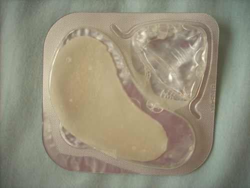
The snazzy packing is definitely the most unique aspect of these masks. There are two compartments – one containing a pad to go under each eye, the other filled with a clear liquid solution. Bliss states that this keeps the active ingredients in their purest form, meaning they have ‘maximum potency’ once released onto your face.

All you have to do is press down on the fluid chamber until it pops, releasing the liquid onto the masks and saturating them until they look something like this:

Others have reported packs popping their contents all over their bathroom sinks, but I found it simple and fuss-free. You then peel away the foil back and place the pads under your eyes. Be warned – the soaking wet fabric is very soft and can tear easily, so be delicate! Instructions are printed both on the box and on the back of each pack so there’s no chance of forgetting what to do.

The pads themselves are also infused with all sorts of vitamins and minerals and freeze-dried to lock these goodies in – at the Bliss Spa evening, we were told that a huge percentage of people noticed a difference just by using the masks on their own without soaking in any of the solution.

The pads are so saturated that they drip quite a lot, so you really have no other option than to lie back, close your eyes and relax! I would also advise that you don’t use these immediately after you’ve applied moisturiser or any other product to your face, as the solution trickles down and you’ll end up wanting to rinse it all off afterwards. I’ve also found that if I place the pads too near your lashline, it irritates my eyes – it could just be the result of my sensitive eyes, whilst others have suggested it’s the active ingredients working their magic but either way, you may end up needing to adjust the placement a little.

There is no doubt that these Triple Oxygen eye masks are ultra, uber-refreshing. I store mine in the fridge, meaning that they’re even more deliciously cool and invigorating! It’s also surprising that even though they’re only for under your eyes unlike the more conventional masks on the market, they definitely leave your whole eye area feeling recharged and ready-to-go.

However, I honestly didn’t notice any difference to my dark circles, which remained as resolutely panda-like as ever, and only a minimal and temporary difference to under-eye puffiness. As yet (*frantically touching wood*), I don’t have any noticeable fine lines under my eyes so can’t really comment on that either, although my skin did feel softer. Although Bliss reckons the Triple O masks are a quick and easy solution for faking a full eight hours sleep, I’m unconvinced that the results are any better than getting a good dose of some serious shut-eye – or indeed a bout with any other conventional eye masks that you might have hibernating in your fridge.

Where these eye masks are a definite winner is in terms of pure relaxation. Unlike the Triple O face mask, which you can wear whilst still going about your daily chores (even if you might scare your boyfriend in the process!), the drippy nature of the eye pads really forces you to take some time out. Whether or not you view this as a positive or negative depends on your lifestyle as much as anything else but the cooling sensation is so refreshing and energising that it really deserves to be wallowed in and enjoyed!

For me, the eye masks are the least essential of Bliss’ Triple Oxygen products – the face mask is one of my make-up miracles whilst I was also mightily impressed with the moisturising cream – and, for the price, they’re more of a luxury than a must-have. However, if you’re in need of adding some extra zing to your peepers and fancy treating your indulgent side, these might just be ‘eye’deal!

Bliss Triple Oxygen Instant Energising Eye Masks, available from Bliss Spa @ W Hotel, Kowloon, or Bliss counters at Faces and Lane Crawford.

Estessimo Tins The Neptune nail polish review

‘They’ve got SNILs!’ Boyfriend told me, as I continued to hunt around a shop for nail polish. I, of course, ignored him. What the hell are SNILs?! Probably some football-related nonsense. But he kept repeating himself until I was finally dragged over to see the ‘SNILs’, which were in fact Estessimo TINS, a Japanese nail polish brand renowned for their glitters that I had declared an interest in but days ago.

Most of their polish names begin with an entirely irrelevant and unnecessary ‘The’, which many find amusing but I find sort of charming and quirkily cool. Plus, the definite article implies special-ness and individuality, which these polishes have in spades. And good on them for not going down the boring names and numbers route so beloved of Asian cosmetics companies – hi Majolica Majorca V1494 and Sasatinnie FCGL002!

So here we have The Neptune, from their All Night Stars Collection, which was named entirely after planets. Perfectly-named, may I add, because these heady hits of colour and glitter send you shooting straight to the stars.

The Neptune is a mid-toned indigo shot through with silver glitter and larger round holographic glitter particles. In short, it’s total starry-studded night sky stuff. One coat gives you a pale pretty lilac kind of colour, two is the lovely shade of not-quite-blue not-quite-purple that’s pictured and three intensifies it to a deeper, darker colour that’s heading more towards midnight yet all look like they’ve come from a galaxy far far away. A galaxy that’s been hit with a shed-load of glitter, of course.

For those that love their glitterbombs, look no further. The Neptune is practically dripping in sparkle. And even though it’s saturated in silver glitter and bouncing off the ceiling with those bigger rainbow-reflecting particles, enough of that lovely base colour still shines through. Glitter may as well be Estessimo Tins middle name.

Application was easy, the brush was medium-sized leaning more towards the thin and it was pretty opaque in just the one coat. Yes, you’re hearing that right – ONE. Normally, glitters have to be built up to two coats on a good day but usually at least three or four to get any decent coverage of the sparkly stuff yet this has more glitter going on in one swipe than most polishes manage in a lifetime.

That amount of glitter obviously means you don’t get a finish that feels smooth yet it looks smooth and not at all gritty, which is, in glitter terms, practically as good as it gets. It stayed chip-free for an age… or should that be a light year… and what’s more, unlike OPI’s Sparkle-licious, it wasn’t utterly nightmarish to remove. I even managed it with a non-acetone remover without rubbing my skin off in the process!

I also loved the base colour of The Neptune. I mentioned in my review of OPI’s Ink how many nail bloggers seemed to have forgotten the term indigo existed, instead making up the word ‘blurple’, and I’ve also detailed how difficult a colour it can be to pitch right (remember the inky dull disaster that was Zoya’s Pinta). But The Neptune manages to nail (ho ho ho) even that! The perfect little bear portion of blue and purple, it would be a pretty dreamy colour on its own, and that’s before you’ve mixed in a solar system’s worth of sparkly stuff.

Seriously, look how prettily those particles glow against that indigo backdrop! Red, pink, blue, green, gold, copper, purple – they’ve got it all. Astronauts would probably be disappointed with how the real galaxy looks in comparison once they’ve seen this baby.

The Neptune was so impressive that it’s got me seriously wondering if I’ll ever bother with other brand’s glitters again. Even if I’ll never be able to think of Estessimo Tins as anything other but SNILs ever again!

Estessimo TINS 023 The Neptune nail polish, Winter 2003 All Night Stars Collection, $85, Nail Concept Company

Looks good with: Black, constellations, star-gazing
Drying time: 5-7 mins
Coats required: 2
Chips: +7 days

Here comes the bride…

Traditional but modern, simple but extravagant, classic but youthful, a homage to Diana but absolutely nothing like Diana’s at all… it seems like everyone has an opinion on what THE dress should be like. THE dress being (obviously! what else!) Kate Middleton’s wedding gown.

As you might already know, I am impossibly excited about the Royal Wedding – seriously, I’ve been welling up just watching the archive stuff in the documentaries that every channel over here is showing – and I can’t wait to see what Princess Catherine will be wearing down the aisle. It seems I’m not the only one though; there have been dozens of designers queuing up to offer their take on a suitable outfit – well, I guess it’s not every day you get to dress a real princess!

Two of my favourites by Alberta Ferretti and Valentino (inspired by a Botticellian Venus)

Since you know I’m also a fan of pretty things, dress sketches (like those gorgeous Robert Best Barbie ones), weddings and the idea of being a princess in general, these wedding dress drawings are like a culmination of everything that gets me cooing with pleasure. Some were done for a feature on WWD, others by Project Runway alumni for My Lifetime.com (the folk behind William & Kate: The Movie), others for The Times fashion section (scanned in thanks to the paywall, sorry for the quality) and Mad Men designer Janie Bryant (banner picture) seems to have done it solely for her own pleasure!

There were some wacky ones – black, yellow, red, Gothic, futuristic, Boudicca-inspired, denim, feathers, knitwear – and some interpretations of Princess Kate’s face leave a little to be desired but these are a collection of my favourites. Enjoy!

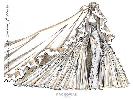
Series of three amazing gowns designed by Pronovias from Confetti.co.uk

From the WWD feature (see all dresses here)

Two of my favourites, J. Mendel and Jason Wu

Two of the most romantic designs by Nina Ricci and Lela Rose

‘A patchwork lace dress reminds us all that a true princess can mend and make do!’ Nanette Lepore

Yigal Azrouel, Tommy Hilfilger


Tory Burch, Lyn Devon (one of the more successful minimalist designs), Rachel Roy

Reem Acra, Rebecca Taylor

Monique Lhuillier

Doo.Ri, Vera Wang (whose bride looks angry! I found Vera’s a bit disappointing as she’s renowned for her bridalwear)

Prabal Gurung

Chado Ralph Rucci (‘NO GLITTER!’), Maria Grachvogel (from The Times)

From the My Lifetime.com feature (see all dresses here)

Simone Le Blanc, Ivy Higa

Irina Shabayeva (more of a runway dress but still stunning) and Carol Hannah Whitfield, which features a removable overskirt for the ‘par-tay!’

Mila Hermanovski with my favourite minimal design of the lot, Leanne Marshall (I love how it looks like a blooming flower or like it’s rising from the ocean froth)

Heidi Nora, Shirin Askari

Two of the more conceptual dresses that actually worked, even if I can’t imagine Kate actually wearing them! Gordana Gelhausen’s Maid Marian-esque gown and Michael Drummond’s fusion between ‘ancient folklore’ and two of his favourite British fashion houses, Marchesa and McQueen

Wesley Nault, Vincent Libretti (love that abstract drawing style, even if the design itself doesn’t amount to much!)

Daniel Franco, Christopher Collins (that skirt looks like a butterfly wing!)

Scanned from The Times

Suzanne Neville, Mark Fast (famous for his use of knitwear)

Viktor & Rolf: quirky and obviously not suitable, but too cute not to include!

Pixar: 25 Years Of Animation exhibition @ Hong Kong Heritage Museum review

Every so often, I do try and escape the confines of my nail polish packed bedroom and see the real world. Previous escapes have included seeing a waterfall, a load of beautiful qipao, a load of quirky lanterns, a silent Hitchcock film and most recently, a stunning array of Spring flowers. My latest venture – a trip to Hong Kong Heritage Museum’s special exhibition, Pixar: 25 Years Of Animation.

The Hong Kong Heritage Museum is quite a trek away, up in Sha Tin near the Shing Mun river (get off at Che Kung Temple Station on the brown KCR line for a shorter walk), so any exhibition that has me making the long slog up there had better be a good one! The last time I visited was for the Golden Age Of Couture dress exhibition, held in conjunction with London’s V&A Museum, which was utterly spectacular (and which I will get around to writing about some time, promise!). Meanwhile, the fact that I am a Disney/Pixar geek of the highest order – prone to parroting facts learnt from audio commentaries whilst my boyfriend tries to watch and breaking into Under The Sea on public transport are specialities – meant the omens seemed good.

The Pixar: 25 Years Of Animation exhibition showcases various types of conceptual and character art done by the studio’s artists for all of Pixar’s work, giving some artistic insight into the painstaking process that goes into making their much-loved CGI films. Taking in over 400 items, from early pencil sketches to storyboards, maquettes (small scale models) and exclusive specially-designed media installations, it features some never-before-seen-outside-the-studio artwork, with Hong Kong’s Heritage Museum the first stop on a global tour. A similar exhibition toured five years ago (including a stop in Singapore) but it has been refreshed and reinvigorated with the addition of new items, such as a large and extremely popular section dedicated to Toy Story 3. There’s also the amazing Toy Story Zoetrope (which you can also see at Hong Kong Disneyland), featuring rotating sculptures of characters that seem to magically come to life before your eyes.

We arrived early afternoon on a non-school holiday weekday and the queue was the biggest I have ever seen for a museum in HK. Having seen some photos taken by people who went on Easter Holiday weekend showing 300-strong queues, thank God we went when we did! Much of the artwork shown was obviously never intended to be displayed in a gallery and as such, there’s a limit on how huge a crowd can cluster around an A4 sized drawing and get much out of the experience.

Picture from Pixar artist Lou Romano’s blog, where you can also see his entire colour script for Up

There are two galleries devoted to the exhibition, the first dealing with character and the second with environment and scene-setting. The huge number of children visiting will obviously enjoy the Woody, Buzz, Sully and Mike models that greet you at the museum’s entrance, yet whether they have much appreciation for conceptual artwork of, say, Parisian landscapes in Ratatouille remains to be seen. Sure enough, the first exhibition gallery, which boasts the large Toy Story 3 section, a fairly big selection of Monsters Inc stuff (poor old Wall-E, one of my favourite Pixar films, sadly only gets about a quarter of a wall!) and lots of maquettes of characters, is the more family-friendly and consequently, much busier and noisier. Meanwhile, the second gallery is a much more tranquil and sedate experience!

As a full-blown Disney geek who exhaustively watches all the making-of features on her DVDs (or did before they started moving them to Blu-Ray only), some of the artwork was familiar to me already, especially for the earlier films, and I’m not entirely sure you garner that much more from looking at the originals rather than digital copies. Some art (particularly storyboards and colour scripts) have even been enlarged to suit the gallery experience more, in which case you’re looking at reprints anyway!

[By the way, you’re not meant to take photos inside the exhibition galleries. Not that this stops many HK folk. But I play fair, meaning the photos in this post are either taken outside or by scouring the net to find the pictures I’m referring to! (Further proof, incidentally, that lots of it may already be familiar to us geeks.)]

Pictures from Hong Kong Heritage Museum and Oakland Museum Of California

Nevertheless, the artwork itself is brilliant. What part of the exhibition you enjoy the most is strictly down to taste but my favourites were the wistful colourful designs for Up and its dreamy South American landscapes (you get to see a life-size version of the Paradise Falls mural that Ellie and Carl paint above their fireplace in the film) and the spiky dynamic work by Lou Romano for The Incredibles (the style seen in the film’s credits) – looking at the art, I could practically hear that exhilarating thrilling score pumping into my head!

A few interesting titbits to note: some character studies are annotated with comprehensive notes seemingly from John Lasseter himself (‘Dot is not so cute with 4 arms!’, ‘No antenna here’), with some Finding Nemo sketches stamped with a fish bearing John Lasseter’s head saying ‘I guess it’s alright’, whilst others are marked as checked by the man himself with a doodle-like representation of Lasseter’s face!

I’m also in awe of the fact that so much life comes out of these pencil sketches alone. Just a few lines manage to create a sense of motion and vitality even before the mammoth digitalisation process begins. I love this one of Russell, above, which totally captures his bustling sense of movement – Disney geek-dom ahoy, the character’s original name was changed to the onomatopoeic Russell to reflect his inquisitive nature. There’s also two maquettes of Russell where each and every Explorer Badge has been sculpted, with different designs on every single one!

The Up storyboards and colour scripts are also fascinating. There’s one storyboard just of that first 10-minute dialogue-free segment ‘Married Life’ and, in just a few small still-life pictures, it still managed to make me well up! Truly powerful stuff.

The second ‘environment’ gallery feels a lot more abstract in comparison to the ‘character’ one. You enter a room where the walls are covered with animations of the doors from Monsters Inc and the effect is quite hypnotic. I really loved some of the (at times, surprisingly dark) concept art for the settings of Monsters Inc, whilst all the pictures involving those huge cascades of doors are just wildly imaginative and wonderful. This gallery also contains, for me, the absolute highlight: Artscape.

Artscape is a highly-immersive, richly-detailed wide-screen projection that takes you inside the artists’ sketchbooks and experience environments from all the films in first-person. Frankly, it’s more 3D than most 3D movies. It’s indescribable and something you just have to experience for yourself. You feel like you’re swooping through the jungle and dashing across water in the chase sequence from The Incredibles, that you’re ant-size amongst the blades of grass, leaves and army of workers in A Bug’s Life or that you’re hurtling through the galaxies in Wall-E (oh ok, that one did feel a little like a Windows 95 screensaver!). I particularly fell for the Parisian scenes from Ratatouille – one of my least favourite Pixars – which felt like you were flying above the rooftops, looking down and around the city in all its romantic glory. This is all done by some trademark Pixar magic that manages to turn 2D drawings and paintings into a 3D visceral experience. Stunning.

Pictures from The Art Of Ratatouille book, featured on Pixar Talk

Despite the cutesy Pixar characters, Pixar: 25 Years Of Animation was definitely not designed with small children, nor I suspect the HK hoards, in mind (for example, there are kiosks where you can watch interviews with animators that can only be used one person at a time, whilst I struggled to see the small screens showing early Pixar shorts in just the small crowd that day). Whilst I enjoyed it, if I’d have seen queues of hundreds, I’d have definitely turned back round – I just don’t think you can give the artwork the attention it deserves if you’re having to elbow your way in or become absorbed in the detail if you can barely hear yourself think.

Pixar: 25 Years Of Animation is a largely captivating exhibition, although one which requires you to appreciate the animators’ work as art rather than pure entertainment. It makes you recognise the scale of Pixar’s achievements and value the dedication and talent of their artists even more. This is stuff that deserves to be on walls rather than hidden away in dusty backrooms and I would love to see a similar exhibition for Disney films (some of the concept art for their older films, as seen on DVDs, is just stunning). So, yes, worth the trek to Sha Tin. Make it on a week day, though!

Check out some more fun Pixar artwork here

Pixar: 25 Years Of Animation, 28 March-11 July 2011, Hong Kong Heritage Museum, 1 Man Lam Road, Sha Tin, 2180 8188

$20 admission, $10 on Weds, including free memo gift pad containing money-off vouchers. Opening hours: 10am-6pm, 7pm on Sunday and public holidays. Closed Tuesdays.

Make-Up Miracles: Bliss Triple Oxygen Instant Energising Mask review

You may remember, about a year ago, I had one of the best days of my life thanks to a bag full of Bliss goodies sent by the lovely folk at Flare Communications. Yes, the way to my heart is paved with free make-up. As if Flare (and in particular, the gorgeous Bastian) hadn’t been generous enough, they sent me ANOTHER package to see in Chinese New Year. Wonderful wonderful people indeed. Once my gleeful dancing had subsided, I realised I hadn’t reviewed nearly enough Bliss products on here, so here’s a Make-Up Miracle that’s been a long time coming – the Bliss Triple Oxygen Instant Energising Mask.

I think I left it so long for purely selfish reasons; basically, I didn’t want to let the rest of the world in on this stunning skincare secret! The Triple Oxygen Mask delivers spa-fresh skin in five minutes all from the comfort of your own home – ok, that home may not be quite as comfortable as Bliss Spa (bring on the brownie buffet) but, for a fraction of the price, the results are almost as spectacular as the famous Triple Oxygen facial itself.

I was recommended the Triple Oxygen Mask by the Bliss therapist who did my facial, who said it would help prevent the bacteria that caused spots. These invariably hang around looking red and angry on my pale skin long after the pimple itself had done its worst and she reckoned the mask would help restore my fair skin to its natural blemish-free radiance (well, I’m sure it’s lurking somewhere!). Give the woman a pay rise because she was so so right.

The mask comes out the pump dispenser as a pale peach gel with a light fresh fruity scent to it (the same apricot-esque aroma as the Triple Oxygen Energising Cream), which you then massage onto damp skin. You have to work reasonably quickly, as this is what happens (be warned, immense ugliness follows):

It foams! And then it foams some more! Be warned, it tickles! This, I presume, is the oxygen part happening right before your eyes – and Bliss says, it’s this that creates a hostile environment for those evil blemish-causing bacteria, which are anaerobic and thus can’t survive in the presence of some good old O2. The formula also contains Vitamin C, which lightens and tightens the skin, plus antioxidants that protect against damage from those pesky free radicals.

The foaming dies down after about five minutes, leaving a sticky residue that you rinse off and follow with your favourite moisturiser. And that’s all there is to it!

For something so quick easy and fuss-free (it’s really no more work than a good cleanser), the results are nothing short of miraculous. Well, this section *is* called Make-Up Miracles! Your skin looks instantly rejuvenated, fresher, brighter and more radiant. What’s more, this gorgeous glow doesn’t disappear as quickly as the foam itself – you’re certain to still see the effects for at least a few days afterwards. Those oxygen bubbles must deliver one hell of a pep talk to dull sallow skin!

The Bliss Triple Oxygen Energising Mask may seem a little pricey at first yet it has effectively wiped out my previous expenditure on monthly facials – quite simply, the results from this at-home treatment were more obviously and instantly radiant than from the work of my local beauticians. I also think that the noticeable glow lasts long enough to ensure you wouldn’t really need to use it more than once a week anyway and certainly not every day, so one bottle lasts for quite a while.

The Triple Oxygen Mask works really well as an impact treatment, when your skin just looks sucky and continues to do so no matter what you do and however many Glee songs you sing. One application and five minutes later and your complexion is so invigorated that it may as well come complete with a sparkling sound effect!

In short, it does everything you’d expect a Make-Up Miracle to do. Hence why it’s here. Obvious really!

Check out my review of another great face mask (that smells like chocolate!) here

Bliss Triple Oxygen Instant Energising Mask, available in Hong Kong via Bliss Spa @ W Hong Kong in Kowloon, or Bliss counters at Faces and Lane Crawford

Simplylife Bakery Café restaurant review – a tea set down to a tee

I’m sure you must be sick of posts starting with ‘another thing I love about Hong Kong’ but ANOTHER thing I love about Hong Kong is the humble tea set. Usually served between 2.30-6pm at upscale restaurants and chan chaan dengs alike, they generally consist of a drink and snack-type main that’s a little lighter than the ones available at lunch – and at around half the price! Obviously, this is because most normal people are beavering away at work but for layabouts like me, living the life of leisure and not seeing daylight before 12pm anyway, it’s a perfect brunch-style compromise! And the tea set at Simplylife Bakery Café is one of the best around.

In fact, I’d go as far as to say it’s nicer than both their lunch and dinner menus! I’ve eaten at Simplylife many times and enjoy their laidback casual café style but, despite an emphasis on quality ingredients, generous portion sizes and decent value, the meals themselves tend to be a bit hit-and-miss. Their European-based cuisine sounds great on paper, with healthy-sounding salads and pastas and hearty but modern meat and veg combinations dominating, yet all too often the food itself is slightly bland and underwhelming. However, their tea set is the tops.

Continue reading

Sweet Valley High just got sweeter!

What’s this – photographs not taken during a season of Next Top Model making the pages of my Pretty Things section?! Yes, you read right, but this summer ad campaign for American brand Wildfox is too delish not to drool over.

It’s based on 90s teen book and tv series Sweet Valley High – I know, awesome already, right?! It’s all sleepovers, crushes, sunshine and secrets, basically an all-American summer encapsulated in one photoshoot by Henrik Purienne. Rather than delivering the typical ‘buying these clothes might make me as pretty as the models’ aspirational campaigns that many brands go for (cough Abercrombie & Fitch cough), there’s a sense of ease and fun to these images that means the models look like genuine BFFs.

I particularly love the sun-bleached look these photos have – you can practically feel the heat radiating off them! – and it all adds to a slightly vintage feel (check out that retro Pepsi can!) that makes you feel like you’re flicking through an old family album. Admittedly, one in which the girls seem particularly ill-disposed to wearing anything over their underpants (it’s a shoot for tees, who can blame them?!).

My favourite photos are the ones with the phone (above), which instantly make me think of racking up my parents’ phone bill on late night calls to my bessies It also reminds me of this amazing 90s board game called Dream Phone where you had a giant pink phone that played voice recordings of boys, so you could work out who had a crush on you (‘You’re right! I really like you!) – very apt, given the slogan on the tee!

I also love the pizza ones above, which call back to all those sleepovers where you all end up in hysterical laughter about nothing in particular, and the models perfectly capture that conspiratorial sense of fun in a way that just looks effortless.

So grab your sunnies, shorts and SPF – summer is here! [Wildfox tee optional]

Photos from Wildfox’s blog via Rock N Rose HK blog

Sasatinnie Intergalactic Wow nail polish review

Having given you time to mull over my first flakie nail polish, it’s time for another review from my Sasa haul. So following hot on the glittery-pretty heels of FCGL001, it’s… Sasatinnie FCGL002! Imaginative, right?

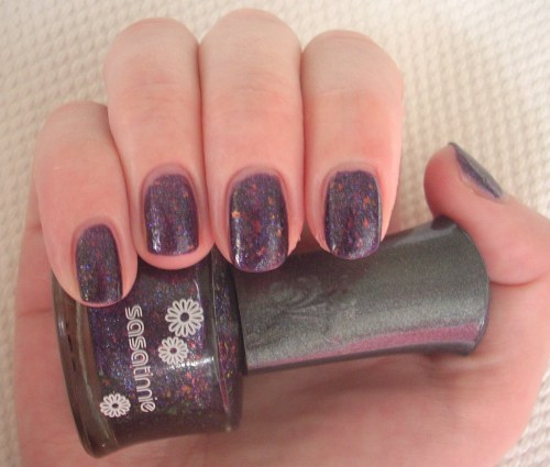
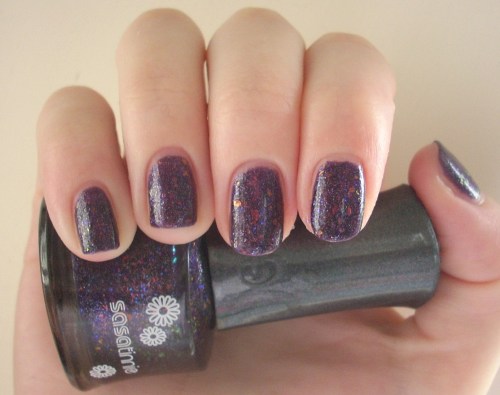
FCGL002 is waaaay too beautiful to be known by a string of letters and numbers that make it sound more like a hazardous chemical than a thing of wonder, so I’ve renamed it Intergalactic Wow. It’s a deep deadly nightshade purple swirled with silver micro-glitter and an abundance of glowing coppery-pinky-purply opalescent shreds, with such a mesmerising magic about it that you do feel like you’re being sucked into another galaxy. In case you’re in any doubt, it is 100% totally gorgeous.

Out of all three Sasatinnie flakies I bought, Intergalactic Wow had by far the biggest and the most ‘amazing shreds of rainbow awesomeness’ (I’m thinking of patenting the term). Again, there was a thin watery first coat and a somewhat toxic stink, but once you’ve layered on two to three coats of this lovely, you get a colour with such depth and richness to its shimmers and glimmers that you can barely remember your own name let alone whatever minor hardships it took to achieve. It reminded me of the photos you see from outer space – those vivid and multi-textured hues of a planet’s surface, topped off with starry sprinkles and flaming comets – hence the name I gave it. By now, the ‘Wow’ part should be pretty self-explanatory!

Hunting around the web, it looks like Intergalactic Wow may even be a dupe (nail polish jargon for identical twin) for OPI’s Merry Midnight, a colour from its 2009 Holiday Wishes Collection and long since discontinued. It certainly has the same red-based plum base colour, although from some photos, it looks like Sasatinnie’s polish may have even more flakie goodness going on! And for a fraction of the price to boot!

Intergalactic Wow was, unsurprisingly, my favourite of all the Sasatinnie lacquers I purchased. That it only cost $24 is nothing short of incredible; it easily outshines many of the other premium polishes I own, in terms of drying time, staying power and the most importantly, that magnificent colour pay-off. After all, why else would I have put ‘Wow’ in the name?!

Looks good with: black, star-gazing, cosmic wonder
Drying time: <2 mins
Coats required: 2-3
Chips: +5 days

Sasatinnie FCGL002 “Intergalactic Wow” nail polish, Super Dolly Fantasy Quick Dry Collection, $24, Sasa