Monthly Archives: May 2011

CND Poppyfield nail polish review

The sun has got its hat on, hip hip hooray, the sun has got its hat on, CND Poppyfield’s coming out to play.

Isn’t coral just such a fabulous summer colour? I’ve been searching for a great coral all year in anticipation of sunny days, blue skies and beach dreams but it wasn’t as easy as I’d thought it would be! A good coral should be the perfect blend of pink, orange and red; you know it’s perfect when it’s definitely not identifiable as being solely any of the colours above but cries out to be called coral! It’s also one of those colours that depends on skintone and surroundings to pull it in different directions, so one woman’s ultimate coral can easily be another’s crash and burn.

Poppyfield’s name doesn’t really do it justice. When I think of poppies, I think of a cheerful bright red, which this polish clearly ain’t. It’s a tangy mostly orange-leaning red that pops with more gusto than an Andy Warhol painting. A Californian poppy at a push, but much more likely a nasturtium, geranium or hibiscus if you must go down the garden path (yes, I did a lot of gardening as a child, what of it?!). In real life, there is a detectable melon sorbet pink tone in there too, but my camera clearly preferred the orange instead (you can see it more in the bottle). So what’s that – mentions of red, orange AND pink? Clear coral territory, for sure.

Poppyfield was the first CND nail polish I’ve tried – and I’m definitely going to be back for more! Unfortunately, Creative Nail Design (to use their full moniker) underwent a revamp a few years back, which overhauled their bottle design for the better, but severely stunted their range of colours in the process. It’s now a mostly uninspiring collection seemingly based on the boring racks in Essie i.e. traditional colours in red, pink and neutral shades.

Such a shame as the formula on this was brilliant. Smooth, creamy, easily opaque in two coats, a high-shine glossy finish and chip-free after well over seven days. I also loved the rubber cap of these bottles, which made such a difference to getting that extra bit of grip and security (my polish-stained blanket bears testament to the number of plastic caps that have slipped through my fingers!). The brush itself was not too memorable (I’d compare it to China Glaze’s in terms of size and thickness) and judging by how relatively neat my nails look here, it must have been pretty good to use.

Poppyfield is a coral that doesn’t just smile – it positively sings. It looks A-MA-ZING (emphasis on the zing) paired with summer brights and it’s the kind of polish that brightens up your whole look. Together with the fabulous formula, Poppyfield is a no-brainer. Flash but not brash, it’s definitely one for your summer stash. Yes, I do rhymes here too.

Looks good with: summer brights, sunnies, shorts
Drying time: 5-7 minutes
Coats required: 2-3
Chips: +7 days

CND Poppyfield nail polish, $60, Nail Concept Company

Retail Therapy Rach-style

I love buying make-up. No, like really, LOVE. So who wants to see some high quality make-up porn photos then? [God knows how many weird Google searches that will send my way!]

Firstly, I had a wonderful surprise again from the GORGEOUS Bastian at Flare, who sent me a goodie bag of SK II products. She always sends me a lovely little card as well… love the personal touch! (Check out the hummingbird seal – so cute!) Don’t these products look haute?!

Here’s a close-up of the products – a bottle of SK II’s Facial Treatment Essence (dubbed ‘miracle water’ by some), 10 Facial Treatment Masks (as famously sported by Demi Moore on Twitter) and a super-cute hi-tech bottle of Cellumination Essence (the bottle has this gorgeous pearlescent opalised finish which I’m in love with already). After reading loads of raves for SK II and having never tried anything of theirs before, I can’t wait to bust these out! Stay tuned for more reviews… and not just on Through The Looking Glass either (hmmm… cryptic right?!)

My friend Mirander went to Singapore recently so I asked if she wouldn’t mind looking for some Urban Decay things for me – and lovely girl that she is, she agreed! Seriously, Urban Decay is my most missed cosmetics brand out here – as you already know, their 24/7 Glide-On Eye Pencils are one of my make-up miracles and I love their range of exciting edgy colours together with their commitment to awesome quality, which (for me) is unmatched. Of the things I asked Mir to find, only the 24/7 Glide-On Shadow Pencils were in stock, so she grabbed me a few of these.

Firstly, let’s admire the cool iridescent packages. Ooooh… shiny… like a super-sexy oil slick.

Appetite whet, here they are in all their glory, from top to bottom: Delinquent, Morphine, Narc, Midnight Cowboy and Sin. They’re basically big fat versions of my beloved eye pencils (which I’ll admit to sometimes using as shadows, probably very naughty of me); Midnight Cowboy and Sin are absolutely fabulous neutrals that are anything but boring beiges, proper reviews to come!

Sadly, the infamous Naked Palette and the 15 Year Anniversary 24/7 Glide-On Eye Pencil set that I also asked for were sold out in Singapore. However, as you all know by now, when I decide I want something, I’ll hunt them down with more persistence than a trained assassin… or something like that. One morning, I woke up really early and after perusing Urban Decay’s Facebook page, noticed some folk saying both of these items were in stock at Debenhams. Unfortunately, Debehams doesn’t deliver to Hong Kong… but Mum Post does! So I snagged these before they sold out yet again and my mum was great enough to forward them on to me… and they are so worth it!

As you know already, I love me my 24/7 Glide On Eye Pencils. This limited edition 15 Year Anniversary 24/7 Glide-On Eye Pencil set contains 15 amazing eyeliners (most of which I own already), including six new shades that are exclusive to this set. So obviously I HAD to have it! There’s also a sharpener and given that the pencils usually retail for £13 and this contains 15 full-sized ones for only £60, this is an amazing deal. Love.

The Naked Palette is probably one of the most raved about sets on the web; every girl needs some sophisticated neutrals set aside for a rainy day, right? This includes twelve shades of shadow, plus a brush and a travel-sized bottle of Urban Decay’s cult favourite primer potion.

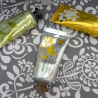
My other favourite make-up brand is Clinique – see here and here are why, for the uninitiated! I saw these Chubby Sticks advertised and loved the cute playful look of them, and once I got in the store, I loved the feel of them too. I’m a lip balm freak, always seen smearing Vaseline on my smackers, and generally go for stronger eye make-up with bare lips, meaning these tinted moisturising lip balms are perfect and ultra-convenient for on the go.

I started off wanting one shade only – Super Strawberry. Then I took a liking to Whole Lotta Honey too and wanted them both, but Strawberry was sold out. Over the next few days, I somehow ended up bagging Woppin’ Watermelon and Mega Melon too… oops… and desperately seeking Strawberry, which is apparently sold out in HK. Proper reviews to come (top to bottom: Honey, Melon, Watermelon) but for now, suffice to say, they’re brilliant.

I also picked up some Clinique Quick Eyes Cream Shadows whilst I was there. HK seemed to only have a limited range of colours so I went for the only two that took my fancy – Rock Violet, a shimmery lavender, and Kiwi, a glowing green-gold. I normally use powder shadows and have heard good things about how crease-free these are, so am looking forward to reporting back!

My boyfriend need some new razors so popped in for what he thought would be quick in-and-out shop in Mannings. But as you know, this isn’t really in my vocab. He was persuaded into buying me some My Beauty Diary face masks (an exclusive to Mannings Cupid’s Love Set, featuring a mix of Chocolate and White Rose ones) and an adorable Mini Teatime Set, that includes a Strawberry Yoghurt Amino Acid Cleanser, Vanilla Soufflé Face Scrub and one Chocolate Truffle and one Earl Grey Tea & Macaroon Sheet Mask. The gift box seemed ridiculously cheap (just over $30); don’t these look and sound good enough to eat?! I’ll be disappointed if they don’t smell amazing although I’ll admit I mostly picked them because they looked pretty!

Of course, no make-up haul of mine is complete without nail polish. Firstly, here are some pretty pictures of the glitterbomb extraordinaires that are my collection of Estessimo Tins. Some, dare I say it, even have a touch of the holographic about them… squee!!!

Left to right: The Neptune (already reviewed here), The Splash Blue (reviewed here), The Relax Mint, The Snow Love, The Spicy Pinwheel.

Left to right and some holographic rainbow goodness: Rich Topaz, Bon Bon Savon, Seductive Amethyst, Alluring Aquamarine, Passionate Ruby.

I also finally found some Deborah Lippmann nail polishes, much raved-about on the Interwebz. These were very pricey (over 3x the price of my usual Cher2 buys!) so I kept it down to two very special unique glitters – Across The Universe and Today Was A Fairytale, which allegedly contains Virgin Diamond Powder. Well, for that price, I bloody hope so! At least some money was spent on packaging I guess!

So, as you can see, I love make-up. I worry for the number of excited exclamation marks that pepper this post. Keep ‘em peeled for proper reviews Retail Therapy Rach-stylesoon!

(My Mum is probably shaking her head in disgust right now. Sorry Mum.)

China Glaze Passion In The Pacific nail polish review

Whilst I was desperately seeking Turned Up Turquoise, I ended up buying a bottle of China Glaze’s Passion In The Pacific to fill the tropical turquoise void in my life. Well, you know, the one that hadn’t already been filled by Essie’s Turquoise & Caicos.

I initially thought Passion In The Pacific would be a shimmery zingy emerald to Turned Up Turquoise’s true turquoise hue – but in fact, they ended up as much closer cousins than I would have imagined. Just like Turned Up Turquoise, Passion In The Pacific becomes a lush jewel-toned turquoise in the brightest artificial white light and just like Turned Up Turquoise, it’s a standard summery palm tree green practically any time otherwise.

The main difference is the finish. Whilst Turned Up Turquoise has that trademark semi-matte finish of most neons, Passion In The Pacific is a definite ocean-in-the-sunlight shimmer. I’d even be tempted to call it a frost, if it didn’t seem utterly strange calling a colour evocative of beaches, summer and sarongs something so cold, stark and wintry.

I had all kinds of problems with it though. I don’t know if this is because Passion In The Pacific is an older polish so has a different formula than the China Glazes I know and love or if I just got a dodgy bottle, but it was dishearteningly difficult to work with. Extremely thin, watery and streaky, prone to air bubbles, looooong drying time and brush-strokey finish when dry. I hated it. As usual with polishes I hate, that meant it decided to stay with a vengeance – I managed a full week chip-free before I finally caved in and ditched those mocking air bubbles.

Under bright artificial light (plus flash)

The colour pay-off is a nice summer bright but probably not that unique – if I’d have known that it was so similar to Turned Up Turquoise, indeed if I’d have known I’d find Turned Up Turquoise in the first place, I probably wouldn’t have bothered. After all, there are enough top coats in the world that could probably recreate that oceanic shimmer, except without all the application problems and maybe look even better.

In short, Passion In The Pacific is a great summer colour – but only if you can’t find any other similar alternatives! Looks like he’ll be enjoying his beach-side cocktail on his own!

Looks good with: tropical brights, bikinis, cocktails with umbrellas in
Drying time: 10 mins
Coats required: 3-4
Chips: +7 days

China Glaze Passion In The Pacific nail polish, Spring/Summer 2006 Fiji Fling Collection, $60, Cher2

Red Pepper restaurant review – the spice of life

Ask my boyfriend what his favourite restaurant in Hong Kong is and his answer may well be Red Pepper.

Red Pepper has been a staple of Hong Kong’s dining scene for years. It’s the kind of place that old-timers in HK for flying visits make a point of visiting, the kind of place businessmen take clients for impressive banquets and the kind of place that tourists get told to try. Consequently, some of my local friends shake their heads and complain it’s only for ‘gweilos and expats’, with its Sichuan dishes geared towards Western tastes. Oh well, leave it to the gweilos and expats then, as that means more prawns for us!

Continue reading

Sweet like Chocolate Rain

I promised you more Chocolate Rain cuteness after my post on Hong Kong Creative Ecologies and whaddya know… it doesn’t just rain here but it pours!

The mall in Olympian City (yes, named after the Olympics) had a super-kawaii installation dedicated to Chocolate Rain and I couldn’t resist taking some photos, much to my boyfriend’s annoyance (‘You’re so local’).

I’m more used to shopping centres in the UK too depressing to even warrant a George A Romero-style zombie stampede but malls in HK are a totally different ball game. [Remember that awesome Lane Crawford installation in Pacific Place?]

What’s more, there are so many malls here that it’s a competitive game, especially during Christmas and other special occasions, where they all attempt to out-do each other with special decorations, performances, giveaways and exhibits – HK folk do love their photo opps, after all! Hence the Chocolate Rain one here, called Olympian City’s Easter Dream Brûlée.

I just love artist Prudence Mak’s distinctive patchwork style for Chocolate Rain – absolutely lovely and just that little bit quirky too – and I love that a locally-designed brand can challenge the cute character powerhouse that is Sanrio. But most of all, as you know, I just love pretty things! And this delivered pretty things in abundance.

The Fatina doll character was dressed in colourful costumes inspired by different ice-cream flavours whilst the centrepiece was a 30-foot banana boat. Overall, it felt like I’d wandered into a village straight from a fairytale!

Truly scrumptious!

China Glaze Turned Up Turquoise nail polish review

Have you cottoned onto the fact that I like turquoise – a lot – yet? It should come as no surprise then that, after seeing pictures of China Glaze’s Turned Up Turquoise on some blogs, I just knew I had to claim that turquoise for my own too!

Part of the Summer 2008 Ink Collection, which were somewhat bizarrely based on the hues of tattoos, it proved pretty difficult to track down – but as you know with me, the journey is half of the fun… or something like that (see tracking down Gosh Cosmetics, flakies and even Waterball Bay for further evidence!). The whole collection is made up of bright buzzing neons that practically jolt you to attention and Turned Up Turquoise is no exception. It’s an intense saturated turquoise colour that floods the senses with its zing. So far, so amazing.

But unlike Essie’s Turquoise & Caicos, I don’t think I can describe this as true turquoise. It’s simply not content to be just one colour! Turned Up Turquoise is a bit of a tropical chameleon in a way that I don’t think most Internet swatches have shown. Sometimes, it really would look like the perfect turquoise adrenaline rush; other times, it leaned massively towards a mouth-watering candy-coated green. All the pictures on this page were taken in daylight (apart from one I’ll mention later), with only minor adjustments to hand positions and the natural variations of sunlight and shade to blame for how differently they all turned out!

The greenest shades remind me of the most vibrant green of cartoon palm trees whilst the most truly turquoise make me think of the clearest, jewel-like tropical oceans. Either way, they’re all violently vivid, although some seem to have had a heftier dose of lime juice than others. As you may guess, my favourite hue is the most traditionally turquoise one… but to guarantee that colour, you have to stay in the brightest sunlight or the whitest lighting possible at all times!

Like many neons, Turned Up Turquoise dries to a semi-matte finish. I think it might look even more awesome glossy, but the matte effect is stopped from falling flat by a slight shimmer that’s been thrown into the mix too. It proves somewhat elusive to catch in photos; the slightly blurry one below taken under artificial light comes closest to capturing the subtle glow that stops it from looking chalky and dull.

Application-wise, I found it a little difficult to work with simply because, like many mattes, it dries quickly. Unlike all those OPI Suedes that I’ve loved, Turned Up Turquoise seems to have a thicker consistency that meant it was difficult to make perfect, without visible brush-strokes, in the short time before the lacquer started setting. Even though the colour was so strikingly strong and intensely-pigmented to only require one coat for opaque coverage in a colour that looked exactly like it did in the bottle, you might need to go for two just to try and clean things up a bit. But like the other matte finishes I’ve tried, this didn’t wear too well, with chips appearing after just one or two days.

Turned Up Turquoise does have its faults, but for that extreme rich colour pay-off, it’s definitely worth it. When it does decide to give you a glimpse of its turquoise side, it’s a turquoise so eye-poppingly amped up to the max that you’re shocked into submission, yet without appearing garishly fluorescent. And hey, those green shades aren’t too shabby either, right?

Looks good with: neons, high contrast, high NRG
Drying time: <2 mins
Coats required: 1-2
Chips: 1-2 days

China Glaze Turned Up Turquoise nail polish, Summer 2008 Ink Collection, $160, Nails From The Heart, Admiralty Centre

China Glaze BFF nail polish review

And so the holo madness continues, with China Glaze’s BFF.

Short recap if you haven’t been keeping close track over my nail polish obsession: Rach discovers lacquers that have rainbow holographic effect reminiscent of her favourite stickers from childhood, Rach decides she must have as many of these holographic lacquers as possible, regardless of colour, price or availability. Polish connoisseurs regard China Glaze’s Kaleidoscope and OMG Collections as the zenith of shimmery rainbowy goodness, so Rach dedicates huge numbers of man hours, resources and dollars to tracking down said collections. Rach is so zombified by doing this and blogging about 85 dresses as 2011’s Met Gala that she starts referring to herself in the third person.

Back to BFF. BFF is the colour of rhododendrons or mallows in full pinky-purply bloom. Except with added rainbows, of course. It looks a lot pinker in my photos than it did in real life, as it’s very much an in-betweeny mix of cool mid-toned pink and a pale dusty magenta. Unlike DV8, which gave a more marine-flavoured spectrum, BFF has the more traditional full rainbow glow when it hits the sun.

An easy fast-drying two-coater, BFF reverted to type when it came to chips too. DV8 unexpectedly lasted a whole week without any obvious wear but BFF started flaking away after a few days. Generally, shampoo day is the death knell for any holos I wear, and DV8 looks like it was the exception that proved the rule!

Normal light vs artificial light

Although BFF probably isn’t the most stand-out colour from the OMG Collection, it’s actually one of the most wearable whilst still providing that revelatory wink of rainbows. It’s not a too-girlie pink, but nor is it a not-safe-for-work blast of purple. Fully deserving of being every girl’s BFF, it’s pretty much the perfect Trojan horse for holographic goodness.

Looks good with: most things
Drying time: <2 mins
Coats required:
2
Chips:
3-4 days

China Glaze BFF nail polish, Spring 2008 OMG Collection, $115, Nail Concept Company

Red Carpet Rundown: Met Gala 2011, The Best of the Rest

Oh my God, you guys! We made it! You made it! I made it! My final post on the Met Gala 2011. I thought the day would never come! All the rest of my posts were themed, but this is basically my brain throwing its arms up and saying ‘Enough!’

Emma Roberts in Michael Kors – Wow. For me, this is the best Emma Roberts has ever looked on the red carpet. Normally, her style is quite young and fresh but here she just oozes class, sophistication and maturity. I love the sneaky cut-out exposing just the tiniest ray of flesh – so sexy but still elegant. The hair is Kate Middleton perfect and the contrast vamp of the red nails is just the frosting on top of the cupcake.

Kristen Bell and Isla Fisher in Tory Burch – Two of my favourite girls in two of the most boring dresses. They don’t do anything much wrong but they don’t do anything much right either. That puff of smoke is me forgetting about them already.

Ginnifer Goodwin in Topshop – Some folk are up in arms that Ginnifer dared to wear Topshop to the Met. Did these people stop and actually look at the dress?! Honestly, if they weren’t told, I doubt they’d guess this wasn’t couture; it more than holds it own against the other gowns, if not bettering most of them. An amazing striking emerald green, a fantastic cut and all being sold with utter conviction by Ginnifer, who makes it look couture-worthy. I get a real Studio 54 vibe from this dress, the kind of thing Jerry Hall might have seduced Mick Jagger with on a yacht party. Arguably the matching necklace and eye make-up are slight overkill and I’m not sure what’s going on with the orthopaedic sandal, but the dress itself is a winner. [Meanwhile, the one no-one cares about from Gossip Girl also wore Topshop and instead looked like she took a wrong turn on her way to Gatecrasher.]

Evan Rachel Wood in Gucci Premiere – The gown is gorgeous. A wonderful, rarely-seen smoky aubergine colour, with a smattering of tasteful sparkle and a truly beautiful unusual neckline. But what’s with the Tin Tin quiff? There’s something about Wood that I just can’t get fully on board with; I find her persona quite contrived and vaguely smug, unlike say Dita Von Teese or Gwen Stefani who often do the 1950s screen siren too and feel like they’re living it rather than just playing a part. Sad to say Evan herself is the only thing stopping me from fully loving this look.

Rosie Huntingdon-Whiteley in Burberry – It’s pink. It’s shiny. It’s tacky. But it’s Rosie Huntingdon-Whiteley. And so it just became fabulous.

Dianna Agron in Michael Kors – On Through The Looking Glass, you’ve seen me fall in love with Dianna’s exquisite elegant Waspy style… and then rapidly fall out of love with it but a few weeks later. Well, I’m back on board with this baby! It’s a departure from her usual tea-dress and princess-hair combinations but this sort of chic simplicity suits her. A striking colour, an unusual neckline, an outfit-elevating gold cuff (less Wonder Woman, more Greek goddess) and whoever made the decision to pull that hair back into a sleek ponytail absolutely deserves an extra chocolate digestive with their cuppa tonight.

Lea Michele in Escada – Lea usually brings the drama to match her diva reputation but this gown is doing nothing for me… or her. The neckline is odd to the point of looking a little evil and stabby, the shape is too standard in a night of show-stealing gowns and even she looks rather unconvinced by it all. Fabulous clutch though.

Frieda Pinto in Chanel – I’ve not liked a single Chanel look this Met Gala (Kirsten Dunst, Blake Lively, Anna Wintour), although Frieda is just about radiant enough to make this look not as spectacularly stupid an idea as a skinny tie over a slinky gown should be. That neckline is unusual and beautiful enough to not need the tie frippery but now all I can think about when I see it is Avril Lavigne. And me thinking about Avril Lavigne is not conductive to me having any positive emotions whatsoever. Everything else about the look – the hair, the red lips, the fluidity of the fabric – is fantastic yet the tie?! Even a badly-dressed Apprentice candidate would shudder.

Michelle Williams in Miu Miu – The last time we saw Michelle Williams, she was wearing a shower curtain and not wearing a bra so just about anything would be an improvement on that. As it is, I think this is gown is actually rather wonderful. The gold swallow embroidery is done just the right amount without starting to look like a scene from The Birds and works to enhance rather than smother what is essentially an immaculately-cut black gown. Still hate the frumpy and middle-aged hair but I’ll take the dress to go, thanks!

Kristen Stewart in Proenza Schouler – I defended Kristen through the dark days where she’d scuttle down the red carpet like she was Viola from The Incredibles and now look… she’s smiling, no longer a hunchback and what’s this, maybe even a hint of red carpet posing too?! I’m so proud! I always prefer Kristen’s edgier ensembles to when she tries (and generally fails) to play it safe so this Proenza Schouler is a very good choice for her, with red and black always looking great against her colouring. Overall, I think it’s a really clean, modern, funky look (and I’ve obviously got an obsession with cuffs creeping in as I love them here too) – and for that reason, I wish it stopped somewhere nearer the knee area. But I’m more excited about seeing Kristen pull S-bends, smizing and giving fierce eyes in the near future. Too soon??

Amy Adams in L’Wren Scott – I love this dress on Amy; she looks about five thousand feet tall in this photo! I’ve not always been a fan of L’Wren Scott’s designs, as I feel the demure lengths and cuts tend to age some wearers, but this is great. The colour might be pretty delicate blush but the print is something a little more savage – it reminds me of the wild garden of thorns that Prince Philip had to hack his way through to awaken Sleeping Beauty with true love’s kiss. Connection to my (joint) favourite Disney movie of all-time? Check. Worn by a real-life Disney princess? Check again. All this, plus a disarmingly lovely milkmaid braid? How could I not love it?!

Isabel Lucas in Louis Vuitton – I like the dress, it’s a zingy watermelon colour that pops against the rest of proceedings, the pleating is pretty and those little gold bow-shaped studs are super-cute. But no-one’s looking at the dress. They’re looking at the bizarre virgin sacrifice adornment perched on top of Isabel’s head. Never has Coco Chanel’s advice about looking in the mirror and taking one piece off seemed more apt. And no, Isabel, before you start trying to put down that gorgeous gold ingot of a bag – it’s the headdress that needs to go! But practically the only thing I remember Isabel for – and it certainly ain’t her films – is always having one piece of utter insanity about her look, be it a sweatband, a strange hat, floral harem pants, odd coloured tights, eyebrows the wrong colour and, most memorably, a parasol. Charming or infuriating, it is her USP and let’s face it, a starlet needs one these days. It’s more than Kate Bosworth’s got anyhow.

The Olsens in Givenchy & Christian Dior – One day, the world will wake up and realise that the Olsen twins have been playing out a real life re-telling of the Emperor’s New Clothes. I don’t “get” Chloe Sevigny or Alexa Chung’s style, but I sort of understand why people do. But the Olsens? They generally look old – great-grandma made homeless and smelly old – with minor drug addict undertones. I also do not know which one is which and don’t wish to waste valuable seconds of my life in finding out so let’s just say that the one in the shapeless red designer potato sack looks better, basically just because she doesn’t look ill. The other one is wearing Barbara Cartland armbands as a style statement and looks like she has consumption. I’m sure they’re really nice people in real life…

Christina Hendricks in Carolina Herrera – I can’t remember the last time I saw Christina look good in anything other than a publicity shot for Mad Men. Suffice to say, adress with  a Dulux colour chart as its bodice and a really ugly oil painting that used to hang in my house as its bottom, is not going to break that chain. I’m intrigued by how they’ve managed to put sleeves on what the fashion gods surely intended to be a strapless sleeveless dress, but intrigued in a way that I want it solving on How 2 rather than in a ‘Wow, isn’t that fabulous way!’ way. Her skin looks beautiful though.

Zoe Saldana in Calvin Klein – And here’s how to do simple but stunning. This lemon yellow simple shift is like a palette cleanser to all the insanity that has gone before it and Zoe just looks like she’s skipped right out of a spring meadow smelling of daisies. I love the carefree cascading hair whilst the addition of a gold necklace peps up proceedings a little. It helps that no-one else wore this colour and that no-one else dared to play it quite this minimalist but when you’ve got a gorgeous girl in a gorgeous dress, very little can go wrong.

Kerry Washington in Escada – Did I mention that I like turquoise? Lucky Kerry therefore gets an easy pass for this relatively uncomplicated outfit, although those ultra-slimming cut-outs are a neat touch. Is the sea-foam shade plus the bubblegum pink lipstick plus the Monica humidity hair a bit too beach-ready? Oh screw it, her little Borrower clutch bag is too cute. Run by quick, before I change my mind.

Michelle Monaghan in Derek Lam – Is it me or has having a fringe completely changed Michelle Monaghan’s face? I showed some pictures of her plus bangs to my boyfriend and he swore that it wasn’t her. This gown is pulling a Zoe Saldana on me in making its minimalism work by way of a strong colour, although I like the shape less than Saldana’s. I’d even call it slightly austere-looking were it not for the fact that it is in bubblegum pink and calling anything bubblegum pink austere is just plain ridiculous. But the colour looks great against her hair and I love the contrast of the dark nails too. Am I still not convinced that this is Michelle Monaghan? Totally.

Elizabeth Banks in Tommy Hilfiger – I’ve mentioned a few times how Elizabeth Banks does absolutely nothing for me and yet every time I’ve featured her, she has duly decided to look stunning. Maybe I should send some curses Christina Hendricks’ way instead. This dress is just gorgeous. It’s that really yellow shade of gold that just looks so new and shiny and Midas-kissed that it bypasses all my vital senses and speaks straight to my inner Abu (you know, when he stuffs all the treasure down his top in the cave in Aladdin). Hair, make-up, jewellery – all flawless, all 50s screen siren worthy. So could you at least look happy about it, love?

Joy Bryant & Margherita Missoni in Missoni – Yes, your eyes do not deceive you, you are seeing knitwear at the Met Gala. Of course, colourful knitwear that looks like a Magic Eye painting is Missoni’s calling card (and yes, that is the second time I’ve name-checked Magic Eyes in these posts, high five!) so we shouldn’t really expect anything else from the designer. Joy’s still feels a little too casual, although I would definitely be interested in tasting the tropical cocktail that it was inspired by. Meanwhile, I am slightly in love with Margherita’s gown, a pretty pastel concoction that reminds me of Easter eggs. I’d change the slightly cheap-looking belt and give her a more romantic playful hair-do but otherwise, I’m picking Easter eggs over a Singapore Sling. Who’d have thunk?

Mila Jovovich & Anouck Lepere in Marni – The jury’s out on whether these dresses are a little too casual for the Met Gala but I really like both of them nonetheless. As ever, Mila is badass and WORKING hers like it’s the only LBD worth owning (and that embroidery is sooo pretty) whilst I love how Anouck has accessorised hers. It turns a dress with a print that looks like corporate artwork into something very funky and fashion and her loose waves are glorious. I actually want to wear both of these dresses, which despite my love for it, is not something I could say about Christina Ricci’s cobwebby confection.

Karlie Kloss & Angela Lindvall in Dior – Karlie Kloss is allegedly only 17 and gets to wear a stunning, gold, glittery Dior dress and look more self-assured and confident than most people in their thirties. (Angela Lindvall doesn’t look too shabby either.) Life sometimes really does seem unfair, right?!

P.S. Since I normally split my posts into favourites but haven’t here, plus you know I love lists, here’s my best-dressed from the event: 1) Gisele Bundchen 2) Diane Kruger 3) Liv Tyler 4) Chanel Iman 5) Christina Ricci, with honorable mentions going to Hilary Rhoda, Karolina Kurkova, Emma Roberts, Madonna, Zoe Saldana and SJP. And now I really am DONE!

Pictures: Just Jared, Style.com, Look.co.uk, Socialite Life, Huffington Post Style

Red Carpet Rundown: Met Gala 2011, Savage Beauty

So more people wore Stella McCartney than Alexander McQueen at the Met Gala 2011, despite the fact it was supposed to be held in McQueen’s honour. But plenty of other people fulfilled the theme of Savage Beauty instead, right? Errr… The scratching sound you hear is me desperately scraping the barrel for attendees that were doing anything just a teensy bit untamed. I think you’ll know how seriously said barrel has been scraped when I tell you that Taylor Swift has made this list…

Liv Tyler in Givenchy – Liv was another of my favourites of the night in this Givenchy gown, even if she didn’t pair it with the insane headpiece (which could have turned things literally savage if she poked some fashionista’s eye out with a rogue antler). I usually don’t understood the fuss about Liv but I have to admit, she looks properly ethereally gorgeous here. The dress is from the same collection as Florence Welch’s Grammys gown but in my opinion, this one is so much better. Why? Well, fluorescent yellow feathers of course! The feather detailing down the body is so intricate and ornate and beautiful, and the way it dovetails (hey, see what I did there?!) into the yellow ombre effect is subtle yet stunning. And I love how Liv has pulled that colour out with the pop of her neon yellow clutch. She just looks heaven-sent.

Christina Ricci in Zac PosenThis, my Stella McCartney clad friends, is how you do Savage Beauty. It’s dramatic. It’s overblown. It’s impossible not to notice. And as such, it’s a perfect tribute to McQueen. How appropriate too that it’s Wednesday Adams wearing this Gothic spectacle of a dress. It looks like it was fashioned from cobwebs, with Christina rising above them as the ultimate black widow of them all. It says something about her star presence that, given she’s about the size of an oompa-loompa in real life, she’s not overwhelmed by the huge train or the opulent theatricality of the gown. Instead, she just belongs. A deliciously dark delight.

Diane Kruger in Jason Wu – Diane Kruger was another of my favourites of the night. This might not be the style statement of Ricci but at least it’s trying to do something a little bit different, and it’s certainly enough of a departure from Wu’s typically beautiful but safe designs to merit attention. I love the old Hollywood glamour Diane is bringing to this look and there is something a little bit dangerous about that sexy thigh-high split. She looks sensational.

Jennifer Lopez in Gucci – The first time I saw this dress, I hated it. But as I watched the parade of uninspiring outfits filter by, I began to have a new-found appreciation for this one. Firstly, that striking power-punch of cerise is an amazing colour on J. Lo, and the way she’s matched it with that lipstick – well, I wouldn’t expect anything less! Secondly, the shape is interesting without being overpowering. Thirdly, the flower shrug… well, I love it. It gives the dress so much more drama whilst also being beautiful and romantic and quirky and wild. Jennifer wears it with a sense of ‘Flowers as a cardigan? Why, but I do it all the time! Marc personally plucked these from the garden before we came…’ that just makes me love it even more. With her hair scraped back, I expect her to break out into a passionate flamenco and finish off by throwing bits of her shrug to an appreciative audience. In short, I’m making up a whole story from just one dress. Either I’m mental (and exhausted by so many dresses) or this really is fine work from Mr Gucci. I’m hoping for the latter!

Crystal Renn in Zac Posen – It seems that of all the designers who custom-made gowns for this event, it was only Zac Posen who actually bothered to read the invite. He brings the drama again with this number, which has a Victorian villainess feel to it. In fact, I expect Crystal to be robbing carriages or stealing crystal lockets at balls. How exhausting it must be to be a model and keep up this level of high drama and fierce pouting all night, although I have to say, I did prefer Crystal in her curvier days. I hope she managed to master an evil cackle for the night as well.

Shalom Harlow in Marchesa – What’s this, a Marchesa dress that doesn’t look like a wedding gown?! This dress is more a feat of engineering than anything else, it’s so insanely structural and yet still soft and swirly, which makes for an interesting contrast. That black detail looks so organic, like it just flowed right onto the gown from an ink well, and reminds me of those butterflies you see made out of craft paper on homemade greetings cards; I’m stunned and charmed that Shalom managed to find the one hair grip in the city that exactly matched that effect.

Ciara in Prabal Gurung – You may remember Ciara tweeting that her dress was reminiscent of McQueen and me being annoyed that she didn’t just, you know, wear McQueen. At this rate however, anything is better than nothing and this dress follows the feather theme of the other Sarah Burton dresses we saw that evening, even it’s a little less flamboyant. Then again, how much less flamboyant can feathers be?! This dress is a fairly standard shape but the ombre effect is rather dreamy and I am absolutely obsessed with Ciara’s cuff. I want one myself so I can pretend to be She-Ra round the house again.

Karolina Kukova in Jean Paul Gaultier – Another divinely theatrical look being worked by another divinely fierce model. From some angles, this dress was like a Magic Eye picture where you had to spot the leggings; how amazingly mind-bogglingly bonkers an idea to fashion them out of the same lace as the lining of the skirt. Karolina carries this off with such an effortless poise and majestic sense of ownership, as if she walks around all the time fanning out her underskirts for all to see. It’s a startlingly clever dress but it also just looks uniquely magnificent. You can’t get much better than that.

Bar Refaeli in Reem Acra – Opulence personified. Do gowns get more spendidly exotically decadent than this? Bar is totally channelling Cleopatra in this gown and it’s so richly detailed AND GOLDEN AND SHINY that I can’t help but fall for it a little, even if it isn’t doing her figure any major favours. I love the small turquoise elements that are brought out further by her earrings and handbag – I’m a sucker for turquoise and these fashion folk seem to be great at making accent colours pop for the better. Meanwhile, all Bar has to do is be reincarnated as a mannequin in a department store and capture an 80s Brat Packer’s heart and I’ll be one very happy bunny. [This is a long-winded reference to one of my favourite films of all time and ultimate guilty pleasure, Mannequin, starring a young Kim Cattrall, a Golden Girl, a bombastic  Starship power ballad and one of the most preposterous plots of all time. I don’t get to chuck Mannequin references in very often, so please humour me.]

Beyonce in Emilio Pucci – Here’s a gown that really was savage, as Beyonce could hardly breathe/pose/move in it and eventually had to hauled up the stairs by various minions after she almost fell down them. I’m all for suffering for fashion but at least make it fashion that’s actually nice to look at?! This reminds me of another of the ugliest dresses in recent memory, coincidentally also worn by Beyonce at 2009’s Oscars. That was designed by her own line, House of Dereon, and I thought this was too… but in fact, it’s by Pucci! It’s so tacky and vulgar looking, like the kind of cheap imitation Baroque fireplace that’s the first thing people have ripped out of their new home on property shows. Her head looks like it’s ready to pop off due to how long she’s been holding her breath, whilst she actually appears to be listing like the Leaning Tower of Pisa except much more precarious, like she’s ready to keel over. And the glory hole for her boobs? Seriously? At the Met Gala?! I have to leave the final words to Fashion Critic at the Red Carpet Fashion Awards: ‘This might be a custom Pucci design, but it has Tina Knowles written all over it’. Trust me, insults in the fashion world don’t come much greater!

Leighton Meester in Louis Vuitton – Well, the theme was Savage Beauty and this outfit is positively vicious all-round! Every element seemed to have been sourced from some sort of fetish bondage shop and it all just looks a little hard and uncomfortable. Normally Leighton manages to sell her look, however ridiculous (remember that time you could see her entire bare ass in a lace jumpsuit?), but here she looks rather tame and unconvinced herself – more heavy-duty black eyeliner required, methinks! Honestly, it’s a bit of a relief as I’ve always liked Leighton and prefer to think of her without any sado-masochistic undertones.

Saoirse Ronan in Rodarte – This has clearly been cobbled together from charity shop finds. The bottom half is a vintage sequinned ballgown that you’re not quite sure about but hey, it’s so cheap and SJP always makes these things work, so why the hell not? (Said before it languishes in your wardrobe for years on end). The top half is an 80s power-suit, possibly worn by a tv anchorwoman, maybe even Ann Diamond. And the shoes? Well, no-one knows what Saoirse was thinking with the shoes. I’m really happy that Saoirse isn’t going down the typical teen ingénue route with her style choices (hello, Dakota Fanning) but this isn’t Rodarte’s finest effort. Interesting? Yes. Attractive? Hellz no. (That being said, perhaps some model in strong directional make-up and constant Crystal Renn glare might have made it work.)

Taylor Swift in J Mendel – Yes, Taylor Swift managed to make a list with the word ‘Savage’ in it. Sweet, pretty, innocent Taylor, with her long curly hair and guitar and songs about love and butterflies and John Meyer being a douche. But this is a pleasant departure from her usual spangles o’ clock setting and in fact, she looks genuinely classically beautiful whilst the stronger make-up is a sophisticated more grown-up touch than we’re used to getting from Taylor. The gown is yet another in the nude brigade but there’s darker forces at work too. I love how that black detail cascades up one shoulder and how, if you look closely, the same detail is continued in the main fabric of the dress too. The frayed edges, the aged beige colour (that you got by swishing about a used tea-bag in art), the way that black pattern feels like a vine slowly climbing over and covering the dress like a rambling old mansion or a strangely beautiful type of mould – yes, there I go creating a story again but there’s an intriguing sense of decay about this gorgeous gown that makes it so much more than stereotype pretty.

Doutzen Kroes in Giambattista Valli – Uh-oh, someone got out-Giselled! Under normal circumstance, this might have been a show-stopping dress but once you’ve got Giselle throwing shapes the other side of the room in an even more show-stopping dress, this striking red number becomes almost ordinary in comparison. What I do like is the juxtaposition between the very clean, almost harsh lines of the top half, compared with the pouffy volume of the bottom. Pretty… but just not Giselle.

Keri Hilson in Atelier Versace – More juxtaposition (yay as it’s one of my favourite words) with this gown, where there’s some overtly sexy form-fitting knitwear up-top contrasted with some princess-gown tulle clouds floating around the bottom. I love the dusty periwinkle colour but I’m not so in love with what Keri’s bringing to the gown. The tacky yellow rootsy hair? (Whose natural hair colour is that; it sure as hell isn’t hers!) The overdose of eyeshadow? The vast array of bling? The boobs clinging on to that neckline for their life? What on the model looks like an interesting neckline, Keri makes look like visible bra straps. Which just about says it all.

Blake Lively in Chanel – Well, I had to put Blake in here didn’t I? Love her or hate her, at least she’s never boring with her style choices. I’m really not sure about the new strawberry blonde hair though – I loved it on her debut redhead look but here, I think something needs to give, either the tan or the dye, as they’re just jostling around too close for comfort colour-wise. I’m not crazy about the dress either; half toga party, half raunchy figure skater. And however much Blake tries to sell it to me with her trademark attitude and orgasm-face, it’s still kinda tacky. Even if it’s Chanel. (Don’t tell Karl).

Pictures: Just Jared, Style.com, Look.co.uk, Socialite Life, Huffington Post Style