Monthly Archives: November 2010

Zoya Brizia nail polish review

‘It’s a full-on Monet… From far away, it’s OK, but up close, it’s a big old mess.’

The above quote is from Clueless, a film I have dedicated unhealthy amounts of my time to learning the script for. I have been dying to use this particular zinger in real-life for similarly unhealthy amounts of time and finally I get the chance to… on Zoya’s Brizia nail polish.

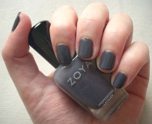
Why? Well if you can bear clicking the photos for enlargements of my battered hands, you’ll see that what, from far away, looks like a nicely neutral nail-elongating shade is actually, up close, a streaky ‘big old mess’.

Despite this, Brizia is a lovely nuanced colour that queens of neutral, Essie, would no doubt die to get their (perfectly-manicured) mitts on. It’s a soft cloudy coffee created way before the current vogue for putty and greige hues arrived. But there are also hints of pearly pink, cool lavender and subtle silver shimmer. Tilt it into the shadows and it’s muted taupe, under natural light it’s a silky mauve, let it hit the sun and it’s a lustrous seashell pink; it would also look great as an irridescent topcoat over other colours. [Pictured, top to bottom: pearly pink in bright sunlight, soft lavender in natural light, cloudy taupe in low lighting.] It’s a lush multi-tasking neutral that’s highly wearable and unobtrusively pretty. Yet it’s not for me.

Firstly, I think it’s just too close to my own skintone. Admittedly, I’d give the Cullens a run for their money in the pale skin stakes, but from some angles, this just seemed to blend in with my fingers. Not a good look.

Secondly, it’s the first and so far, only Zoya lacquer where I wasn’t impressed with the formula. Although application with Zoya’s ‘just right’ brush was a breeze as usual, it went on very sheer, requiring at least three coats to get some semblance of opacity. It was also very streaky, a problem I never managed to fix entirely, and I had particular problems getting an even colour at the tips of the nails, where it pooled oddly, leading to even more streaks. Hence why I’m branding Brizia a full-on Monet!

It could have just been a dodgy bottle, it could just be that I’m not as willing to look past Brizia’s Monet properties because I wasn’t sold on the colour, it could even be that I was too desperate to get to use that line from Clueless – either way, Brizia isn’t one of my must-have shades. But what I am certain of is that, with its subtle kaleidoscope of different looks, it will definitely be on plenty of other people’s hit lists. Indeed, I am reliably informed that it’s one of Cher2’s biggest sellers.

So if you’re after a versatile nude with more bang for your buck, or if you’re another Clueless fanatic dying to give the Monet line an airing, Brizia might just be the nail polish for you. Like… whatever! I’m outie!

Looks good with: office-wear, ladylike cool, the Impressionist movement
Drying time: 3 mins
Coats required: 3-4
Chips: +7 days

Zoya Brizia nail polish, Suede Collection, $80, Cher2

Frites restaurant review – a meal to moule over

UPDATE: Frites’ Central location has now closed – but their other branches in Quarry Bay and Wan Chai are still just as good! See their full addresses at the bottom of this post.

Concept Creations is definitely one of my favourite restaurant groups in Hong Kong. Whilst they’re somewhat dwarfed by dining behemoths like King Parrot, Igor’s and Dining Concepts, it’s quality not quantity, right? I’ve already banged on about how great Tapeo is here (and I was a big fan of their homely little Italian in Soho, Mrs Jones, that they sadly decided to shut down earlier in the year) so now it’s the turn of their other flagship restaurant, Frites.

Frites has bagged a prime location in Central (before all those steep slopes, perfect for lazy arses like me) and unlike many restaurants in the area, its premises are larger than a postage stamp. With a lofty, grand but relaxed ambience, it’s frankly nice to enjoy some high ceilings in this city for a change!

There’s a distinctly Bavarian feel to both the place and the menu – think lederhosen, bratwurst and beerhall and you’re not far off. Sturdy wood furniture, long wooden tables, dark green leather, chequered floors and, most importantly, a very big bar! Screw Hong Kong’s interminably long Oktoberfests, it’s like this at Frites all year round!

But the word Frites isn’t German, I hear you cry! So where’s the common ground between French for chips and Bavarian architecture… why, Belgium, of course.

Continue reading

Make-Up Miracles: Nail Tek Foundation II base coat review

Let’s get one thing straight – I am a total non-believer in nail polish upsells. Stuff to make it dry quicker, last longer, chip less, improve the finish – not interested. Why? Because I (naively) believe that given I’m buying supposed premium quality polish, the manufacturers should be trying to make the original product do all those things in the first place! However, there’s one concession I will make – base coat.

Just as I believe it’s vital to begin your make-up routine with a good base, such is the case for nails. Why? Well, you wouldn’t start building a house on unsound foundations, right? I’ve explained most of the benefits of a face primer here and many of the same qualities apply for your base coat. Firstly, since you’re slathering your face/nails in chemicals, having a protective layer in-between seems wise. Admittedly, your protective layer is also made of chemicals, but hopefully chemicals designed with your health more in mind than just a rabid desire to look good.

Secondly, a good base provides a better surface for your cosmetics to sit on. This ensures better coverage, a more even finish and a greater longevity for your make-up. Think of your base as the greaseproof paper between baking tin and cake – yes, the cake will cook fine without it, but with minimum effort, the greaseproof paper not only soaks up the bad stuff, but leaves you with less washing-up and an even better cake at the end. Result!

So, dodgy baking analogies aside, what’s the best nail polish base coat? It has to be Nail Tek Foundation II.

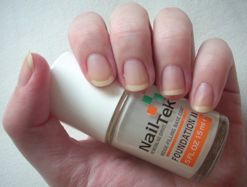
Once again, the lovely people at Cher2 came up trumps, with one girl whisperingly recommending that it was better than any of the bases made by more famous nail varnish brands. Nail Tek Foundation II comes packed to the hilt with conditioners, strengtheners, micro-fibers and natural fillers, meaning it not only fills ridges and smoothes uneven surfaces but also repairs damage and strengthens the nail in the long-run. The final result – somehow, my nails are miraculously in better condition after weeks of ever-changing lacquer than they were before!

It also gives a lovely smooth base for your nail polish to glide onto and makes it a hell of a lot easier to remove, with even the strongest pigments and most steadfast glitters bidding farewell with barely a strain in sight.

Frankly, it would make my life a whole lot easier if every nail varnish company could employ the same formula as Nail Tek. The brush is so easy to use and so obviously just the right size and shape that you barely even notice you’re finished! A few quick and effortless swipes and you’re done – no mess, no fuss, perfect coverage. The end result is a translucent matte milky colour that dries in seconds and strangely, isn’t smooth to the touch but is the obvious secret weapon behind getting super-smooth nails.

Have I sung its praises enough yet?! If you use nail polish, or even if you just want healthier nails, Nail Tek Foundation II is a no-brainer. This secret weapon just had its cover blown!

Drying time: <1 min
Coats required: 1-2 (depending on the health of your nails)
Chips: doesn’t!

Nail Tek Foundation II ridge-filling nail strengthener, $80, Cher2

Zoya Charla nail polish review

What could be better than a true turquoise nail varnish? Why, a sparkly turquoise nail varnish, of course!

Zoya’s Charla is an entirely different kettle of fish from Essie’s Turquoise & Caicos though. Whilst Turquoise & Caicos conjured up images of sun-kissed summer beaches enjoyed with an exotically-coloured cocktail in hand, Charla dazzles from the ocean’s depth. It’s pure mermaid’s tail, which has always been one of my ultimate favourite colours.

Sparklier than a star-strewn night sky, this is the definition of iridescence in a bottle. It’s the perfect balance between shimmering blue and glittering green, giving that exact shade of fantasy fish scales that’s straight out of fairy tales.

As ever with Zoya, the brush was a pleasure to work with, ensuring smooth even coverage with just a few strokes (so far, Zoya has a 100% hit rate in leaving no air bubbles). Glittery nail polishes tend to be quite sheer but it built to an intense opacity after three coats, or two wetter-than-normal ones. Similarly, although I find glittery nail polishes also tend to chip easier, Charla was in it for the long haul – staying put with as much longevity as Gaga on the charts. Normally, glitters reserve their non-budge properties for when you’re trying to remove them and although Charla did require a little more elbow grease, I was pleased that a colour as strong as this didn’t stain my nails or fingers afterwards.

This is definitely a colour for nights out, partying and bringing out your inner sparkle. However, I adore the mermaid shade Charla makes in the daytime so it would be criminal to waste it on the midnight hours alone (incidentally, it becomes much more of a forest green under artificial light, as I’ve tried to show with the photo on above – as always, click for enlargements).

Dazzling, enchanting and just that little bit magical, Charla is everything a glittery nail polish should be. Just don’t tell the mermaids you stole their mojo, Zoya!

Looks great with: bright colours, black, smile set to stun
Drying time: 3 mins
Coats required: 2-3
Chips: +5 days

Zoya Charla nail polish, Summer 2010 Sparkle Collection, $80, Cher2

Smitten with Sugar Kisses

I promised Pretty Things for this blog so I’ll introduce you to one of my (many) weaknesses – greetings cards. Specifically, ones that are just too pretty to give away.

I have been known to buy these with absolutely no intention of ever ‘greeting’ anyone with them other than myself. I have also been known to purchase whole sets of any designs I get particularly taken with. These cards – a series called Sugar Kisses by Jeannine – are the result of one such smitten bulk-buy.

I just love this artwork –– the colours, the style, everything! – and find it reminiscent of the similarly gorgeously-girlie stuff by Jeffrey Fulvimari.

They were bought many years ago from a yummy mummy boutique called Indigo on Bramcote Lane in Wollaton, Nottingham, which was always good for a gander, setting your heart and hungry eyes to ‘covet’ mode fairly quickly! Alas, the Internet has failed me by yielding no information about the artist or the designs so if anyone knows anything more about these gorgeous prints do let me know. Otherwise, just enjoy!

China Glaze Midnight Kiss nail polish review

As anyone who’s read any of my previous nail polish reviews will know, I have a habit of being Goldilocks-levels of exacting about colours. So like Turquoise & Caicos was the result of a quest for a true turquoise, Pamplona Purple the quest for a pink-based purple that popped and Bekka the quest for the exact shade of yellow that Pixie Lott wore in a music video (bloody hell, I really don’t make it easy for myself, do I?!), China Glaze’s Midnight Kiss was the end result of a quest for the perfect gold.

Metallic nail varnishes are ten-a-penny, glittery nail varnishes dozen-a-dime, but a good gold is hard to find. I didn’t want a simple shiny gold gloss or a lacquer that looked like a kindergarten’s craft cupboard had exploded in it but for it to seem as if I had coated my nails in gold leaf. Like the gilt edging you get on fancy encyclopaedia pages or the sheets of stuff that Lawrence Llewelyn Bowen was always advocating we apply to just about every hard surface on Changing Rooms, it had to be dense, shimmery and stunning. Midnight Kiss was spot on.

Did I also mention that I didn’t want it to be too yellow either? I wanted a champagne-infused sparkle rather than brassy Bet Lynch glare. Midnight Kiss delivered that too.

A pale buttercup foil that built to a glittery but not gaudy intensity, Midnight Kiss was pure tinselly brilliance (it is part of their Holiday Collection after all, hence the nice touch of the brushed silver lid). I’d experienced some problems with the finish of a previous China Glaze polish but had no such issues this time. It applied and dried super-smooth and super-fast. Although I find glittery polishes have a tendency to get streaky, China Glaze’s brush fanned out nicely to ensure a beautiful even finish, with two (or even one) coats proving sufficient.

What I loved was how evenly and densely-packed the sparkle was. None of this kiddie glitter-glue type effect but a pure hit of genuine gold. It might be a bit too full-on for traditionalists to consider it for everyday wear, but its mellow blonde qualities mean it isn’t overly flamboyant. And the great thing about gold is it goes with literally everything. This would look absolutely amazing with black, or even chocolate brown tips (if only I had the nail polish skillz to achieve such a look).

If Midnight Kiss were a Christmas bauble, it would be a proper posh M&S sparkler, rather than a cheap and cheerful Primark wonder. Midnight Kiss delivers a hefty dose of grown-up glamour for the nails, any time of the year.

Looks (especially) great with: black, chocolate brown, all-year round festive spirit
Drying time: <5 mins
Coats required: 1-2
Chips: 3 days

China Glaze Midnight Kiss nail polish, Winter 2010 Tis The Season To Be Naughty Or Nice Collection, $60, Cher2

G. Field Lavender Hand Cream review

You’ve seen the upside of being minorly obsessed with the smell of lavender – striking upon a product as nice as this. So now here’s the downside – G. Field Lavender Hand Cream.

You might be used to supermarkets cramming the area by the checkouts with sweeties and chocolates, trying to entice you into a quickie impulse buy. This hand cream was the beauty junkie’s equivalent, located temptingly by the tills at Bonjour (HK’s one stop beauty-shop where it’s probably best not to ask how they manage to get their branded cosmetics so cheaply). At just $18, it was a case of buy now, regret it later – literally.

In Hong Kong, it’s pretty common to carry a tube of hand cream around in your handbag. Be it the drying effects of spending too much time under air-cons, finding a use for the Crabtree & Evelyn box sets that are invariably bandied about at Christmas or just pure vanity, who knows but ever since my hands fell apart after a year at kindergarten, I’ve found myself joining the hand cream crowd. These pocket-sized tubes seemed perfect for that very purpose and as soon as I saw the lavender scent, I was sold.

G Field also reckoned it was manufactured in France. I was optimistically crossing my fingers for a budget-style L’Occitane experience but sadly, this was pure bargain-bin, with the emphasis on ‘bin’, stuff.

The consistency of the lotion was watery, took a while to sink in and once it did, felt like it had never been applied in the first place. What’s more, the lavender scent was distinctly unpleasant. Artificial and pungent, I was getting comments about it all day – for the wrong reasons! The ingredients list maintained that real lavender oil was used in the formula, but it smelt like detergent that had seen better days. And my hands felt no less dry than they had to begin with.

Only $18? Alas, it’s only a bargain if you actually use it. My G. Field Lavender Hand Cream is now busy moisturising cockroaches in a landfill somewhere and, what with there being plenty of cheaper, more effective and more pleasantly scented lotions on the market, I’ll definitely be thinking twice before making my next checkout impulse grab. Unless there’s something lavender-scented, of course…

G. Field Lavender Hand Cream, $18 for 38ml, Bonjour

Zoya Kelly nail polish review

You may remember that my nail polish quest began with OPI’s Over The Taupe and the current craze for greiges. Since then, this trend has spread from muted minks into any shade vaguely reminiscent of fungus, mould or decay. Zoya’s Kelly is one such colour.

This, of course, makes it sound much yuckier than it is. There’s a reason Kelly has been picked up as a must-have shade by the likes of Vogue, Italian Elle and Daily Candy – it’s beautiful.

A unique blend of slate grey, pewter blue and smoky purple, it’s classically cool, wonderfully wearable and fantastically flattering. It’s the kind of colour I could imagine an aloof Hitchcock heroine wearing, fitted suit and all.

The formula is creamily consistent, richly pigmented and dries to a high-shine gloss. Two coats is pretty perfect and Zoya’s brush continues to do the business for me – somewhere between Essie’s too thin and OPI’s too fat, it’s just right.

I never thought that I’d be declaring grey a totally tempting colour choice for nails, but Kelly is just that. Clean, chic and minimalistic, it manages the trick of being sophisticated and edgy, whilst remaining absolutely alluring from any angle (sometimes pure charcoal, others almost navy blue).

Looks like Kelly lives up to its Hermes handbag namesake – an instant classic. Let the shameless knockoffs roll in!

Looks great with: smart/casual, tweed suits and just about everything else
Drying time: 5 mins
Coats required: 2
Chips: +5 days

Zoya Kelly nail polish, Fall 2010 Wonderful Collection, $80, Cher2

Essie Sexy Divide nail polish review

MAC Cosmetics recently produced a collection called Venomous Villains, inspired by Disney’s most notorious baddies… And sorry to say, this isn’t a review of any of those products!

Great idea for a collection, gorgeous packaging but sadly, I wasn’t impressed with the execution. By the time I fought my way to a MAC counter, most of the products had sold out. I tried a few that had impressed me from photos – the Mineralize duo eye shadows were murky and dull, the glittery duochrome nail varnishes gritty, grotty and way too sheer (though I’ve since picked up a newer release of Mean & Green and it’s pretty badass). Oh well, at least I left with my wallet untouched – sadly, never an issue I have at my beloved Cher2!

So following on from nail polishes inspired by a Pixie Lott music video and an accidental finger in a photo, here’s my latest lacquer inspiration:

Isn’t she magnificent?! It’s no coincidence that her actual name, Maleficent, is only one syllable out. The most fierce of all Disney villains, primarily because she was evil just for the sake of it. No tortured childhood, no ulterior incentives, she decided to wreak havoc just because she was pissed she didn’t get a party invite. Fabulous.

So, given that MAC’s interpretation of Maleficent’s make-up didn’t impress me, I set about to find my own. Enter Essie, Sexy Divide, stage right.

A deep dark mysterious purple, it’s the kind of colour I could totally envisage coating Mal’s claws. Consistency was great, pigmentation strong and it dried quickly to a smooth glossy finish. It also had a gorgeous iridescence from some angles, a golden pinky shimmer that showed in either strong natural sunlight or bright artificial light (as I’ve tried to show in the photo with flash, above left; normal natural light, above right; click for enlargement).

However, from other angles or in the wrong lighting, it looked a little dull and flat. So whilst it was fun to vamp about in for a while, it probably won’t enter the pantheon of my favourite polishes. But here’s an evil cackle just for good measure: mwahahaha!

Looks good with: dark colours, bad girl attitude, a raven
Drying time: <5 mins
Coats required: 1-2
Chips: +7 days

Essie Sexy Divide nail polish, Winter 2008 Collection, $60, Cher2

You’re Wellcome

Who says good art in Hong Kong is hard to find? (I don’t think anyone has actually ever said that but…)

We picked up these super-pretty canvas paintings in Wellcome. Yes, that’s Wellcome as in the supermarket. Somehow I don’t think you would be finding stuff like this in Tesco.

For just $49.90 each, these proper hand-painted pieces are a bit of a bargain. They’re supposed to represent seasons – I’ve decided these two are summer and autumn (spring was green whilst winter had more implausibly-coloured blue trees). They have a sprinkling of gold glitter on them and I love how the brush-marks are still so obviously visible. The subtle differences between the two mean they look great displayed together. They really brighten up the room and have such a fresh, charming quality. Bargain!

It’s not just Swedish pop music I love. Ikea is my homegirl. I’d guess that 1 out of 3 restaurants over here has Ikea stuff in it and with good reason. They just do fantastically-designed, high-quality stuff at really reasonable prices and further prove my notion that everything Scandinavian is amazing by default.

These art prints of Sweden by Maria Dahlgren are just gorgeous. Funky, brightly-coloured geometric designs, they pop wherever you put them and again, look fabulous displayed together. This set of five postcards (entitled Kort) costs just $29.90 (you can see the other design that I couldn’t fit in, Norrland, here). They also probably represent the closest I’ll be getting to Scandinavia for some time!

Finally, not found in Hong Kong, but I couldn’t resist posting these striking international teaser posters for the new Darren Aronofsky flick, Black Swan. For those that haven’t seen the trailer, it seems to involve a tormented ballerina morphing into a swan.

There’s a bit of a communist art vibe going on with these designs but, as well as being stunning pieces of art in their own right, don’t they also really whet your appetite for the film? Intriguing, captivating and downright beautiful.

Whilst not available to buy commercially yet, you might as well pimp up your desktop in the meantime. Certainly makes your average film poster look rather lazy, right?

As ever, click for enlargements.