Chanel Blue Boy nail polish review

Since you all seemed to love Chanel’s Coco Blue as much as I did, I have another little treat in store for you from the Les Jeans de Chanel Collection – Chanel Blue Boy!

Blue Boy is the medium blue of the trio and the most jeans-esque of the lot.  What makes it just that little bit more special than your average teal (apart from the fact it’s a Chanel, of course!) is that it has a lovely dusty quality to it – and rather than making it look faded or old, it simply makes it even prettier! In fact, it reminded me of fields of gorgeous dusty blue cornflowers.

At this point, I have to thank my BFF Mirander for lending me Blue Boy in the first place. I’m sure you remember my tales of woe surrounding trying to get hold of the Les Jeans de Chanel Collection and by the time I knew this was even in HK stores, it was already sold out! Luckily for me, Mirander had already bought Blue Boy for herself and very generously, let me give Blue Boy a spin – and I’m very glad she did!

Application-wise, it was just as easy as every Chanel nail polish I’ve tried to date, although it’s finish was a little less glossy than Coco Blue. What I love about all the Chanel lacquers I’ve used so far is that they’re really easy to get even and opaque, and whether it’s something about the brush, the polish itself or some special Chanel mojo that overcomes my fingers, I seem to be able to achieve a really beautiful neat and clean finish!

I didn’t love Blue Boy quite as much as I did Coco Blue – though maybe this is a coping mechanism because I know I can’t have the polish for myself! Nevertheless, it really is a lovely wearable and versatile colour and a gorgeous in-between shade of blue for those neither wanting a pastel nor a navy.

Blue Boy really is like the perfect pair of boyfriend jeans – goes with everything and looks great too! Now if only someone would swap me a pair of jeans for a Blue Boy polish of my own..!

Looks good with: jeans!
Drying time: 5 mins
Coats required: 2
Chips: 5 days

Read my review of another Les Jeans de Chanel polish, Coco Blue here (it’s lush!)

Chanel Le Vernis Blue Boy, Fall 2011 Fashion Night Out Les Jeans de Chanel Collection

Beauty Spot: MAC Viva Glam makeover for World Aids Day plus giveaway!

How many companies make a huge fuss about ‘giving something back’ only for you to read the small print and discover charitable donations are limited to a small percentage of profits or a tiny fraction of the selling price?

Well, not MAC. I was invited to be part of their World Aids Day initiative to coincide with the launch of two new Viva Glam lip products fronted by Lady Gaga – where I discovered that every single penny/cent from the SELLING PRICE of their Viva Glam items goes directly to the MAC Aids Fund. Pretty impressive… and in Hong Kong alone, they’ve raised over $5.3 million over the past five years.

But a bit more about that later. On December 1, World Aids Day itself, MAC artists around the world gathered to distribute red ribbons and condoms to raise awareness about HIV – and I was amongst them! Alongside two of my beauty besties, Danielle and Jenn, we braved the elements (and the indifference of the general public) to hand out condom packs to passers-by outside iSquare in Tsim Sha Tsui.

An interesting experience to say the least. Given I generally get ogled if I expose just one inch of general chest area, I knew we’d be in for a bumpy ride – Danielle even more so when she decided to station herself outside Chungking Mansions! The high/lowlight was one man coming up to ask for seven packs ‘one for each day of the week… every time I change my clothes, I change my women’; oh well, at least he was planning on using condoms! Then there was the man that put his arm round Dani and asked if they were for use with her (balk)… and then there were the Muslims we managed to insult by insinuating they might have sex before marriage.

Having done the best we could, we were then led into the much safer waters of the MAC Training Studio, for a Viva Glam masterclass and make-up demo by MAC artiste extraordinaire, James Molloy.

I think I may love this man. In the past, I’ve found MAC staff somewhat scary and intimidating with their wild make-up looks, but James was so down-to-earth, lovely to chat to (gotta love hearing a Northern accent in HK!) and, most importantly, a dab hand with make-up! He demonstrated three looks using different Viva Glam lipsticks and lipglasses – the latest, Viva Glam Gaga 2, a creamy peachy nude lipstick with an ‘amplified finish’ and a matching beige-nude lipglass; mine and Dani’s favourite, Viva Glam I, a classic matte old-Hollywood scarlet and the very first creation in the Viva Glam line; and Viva Glam V, a neutral pink with a slight shimmer.

He stressed the importance of priming the lips first (using Mac’s Prime & Prep, a soft lip balm-like product that smoothes the surface and makes the colour last longer), advocated the use of blotting and reapplying to create a colour that stays put and generally made Queenie, the model, look rather fabulous (even if she doesn’t look too happy about it in the photos!)… and made it all look very easy!

We also had a chat about Viva Glam in general – in case you didn’t already know, Nicki Minaj and Ricky Martin are the most recently announced spokespeople (and I’ll put money on Minaj doing a bubblegum pink) for the line and Gaga had definite creative input into her choice of colours. I also learnt that ALL of Viva Glam sales, not just profits and not just some piddling percentage of the price, goes towards the MAC Aids Fund, which supports HIV sufferers worldwide and helps fund direct care, prevention and global fight against the disease. Whatever you think about MAC and its products, I don’t think anyone can doubt that this is a really brilliant initiative for such a worthy cause.

No-one else being up for it, I offered myself as guinea pig to James’ capable hands for a quick make-up demo! I rarely wear lipstick (instead going all out on the eyes front), so if I do, I want to make a splash with it – hence my choice of the Hollywood red Viva Glam I! We learnt from a Chinese journalist that local women generally steer clear of such bright lip colours, as they think their lips are too big, and that the colloquial phrase for wearing this lipstick colour is ‘a big basin full of blood’ (血盤大口, ‘huut pun dai hau’), like a monster who’s gorged on some animal! Great!

I personally loved what James did. It might be a little bit more vampire than vamp given how pale my skin is and how long my very dark Morticia Adams hair has become, but it was such a striking look that immediately made me feel gorgeous, glammed-up and red-carpet ready! I usually have difficult finding a red that doesn’t lean pink or orange on me, yet Viva Glam I seemed to do the trick nicely! I will say that I do think you need real confidence to wear bright red lipstick as it tends to magnify any other blemishes or flaws in your complexion and in Hong Kong especially, I’ve noticed it gets you many more stares than usual (or maybe I just notice them more?!).

Dani mentioned that whenever she wears red lipstick, it never lasts the distance and instead, ends up all over her face (what’s she been doing?!). So I decided to put Viva Glam I to the test and wore it for the rest of the day post-makeover. My photos show it after two hours wear, where it’s clearly as strong and saturated as ever. I then went to the Jack Wills opening party later that night; it was still very obvious, if not quite as freshly bloody, so I spruced it up with a slick of Lanolips Lip Tint (in Apple, an amazing product that I will be reviewing properly later) – you can check out some photos of me at the event on Jasmine’s fab blog here, which shows how Viva Glam I was holding up some 4-6 hours after application. If you can’t be bothered to look, the answer is pretty bloody well! By 8-10 hours, it was wearing off, but my boyfriend was still able to detect I had some red tint to my lips. Viva Glam I is obviously intensely-pigmented and boasts a gorgeous matte finish, but the downside to this is that it’s slightly drying – one coat of Prep & Prime beforehand does help matters significantly!

I’ll have separate swatches and full reviews for the two new Gaga Viva Glam lip products, but first I have a fantastic MAC giveaway for you all! You lucky devils can win the MAC goodie bag shown below for your make-up pleasure – including a fluid line gel eyeliner, mascara, mineralize blush, duo eyeshadow, lipglass, lipliner and a MAC World Aids day t-shirt. All you have to do is leave a comment saying who would be your ideal Viva Glam spokesperson and make sure you enter a valid email address in the comment form (so I can contact you if you win!).

The winner of the giveaway was Miss ChicMcMuffin – congrats girl, and enjoy the make-up!

Chanel Coco Blue nail polish review

It’s been far too long without a nail polish review on here for my liking! So what better than some sneaky Chanel action to get back into the swing of things?! May I present to you Chanel’s Coco Blue.

Coco Blue was from the very limited-edition Les Jeans de Chanel Collection, a trio of denim-inspired blue nail polishes released for Vogue’s 2011 Fashion Night Out. After staking out my nearest Chanel cosmetics store for what seemed like weeks on end, I resigned myself to the fact they weren’t going to be released in Hong Kong… until the lovely Carmen told me they had in fact already been released, but only in certain stores! Argh! Of course, by then, they were long sold out… but luckily for me, I had the gorgeous Vicky on the case, who managed to snag me Coco Blue from duty-free on her trip here.

And it really was an extreme case of lucky (very rare where I’m concerned, as you all know by now!), because Coco Blue was the colour I had deemed the fairest of them all! So mega-thanks to Vicky for helping me lay claim to this blissful blue beauty!

Lots of photos have made Coco Blue look like an Easter-egg baby blue, but actually it’s a heavenly shade of super sky blue – and utterly gorgeous with it! It also has a subtle but noticeable pink shimmer running through it, giving it an enchantingly glossy finish whilst still maintaining its creamy dreamy lusciousness. This secret shimmer (and its not a dreaded case of ‘so secret you can’t see it’, as with many Essies!) also prevents it from looking too chalky and harsh, as I have often seen with paler blue nail polishes in the past. It’s the idyllic cloudless summer sky straight from a milkmaid’s dreams.

You may remember me waxing lyrical about Chanel’s Graphite and its magical self-applying formula; well, Coco Blue wasn’t quite as miraculous but it wasn’t far off. Again, my photos show my nails ‘no clean-up required’ so Chanel’s combination of formula and brush shape must be doing something right! The first coat was a little streaky but it evened out beautifully and easily by the second, to leave the divine blue-sky dream you see here!

This really is such a lovely, charming and uplifting colour. It’s a total fairytale blue – the colour of Cinderella’s gown (you shall go to the ball!) but with the pearly shimmer of her glass slippers and the magic touch that only a fairy godmother (Coco herself?!) could bring.

The only major issue? Well, I don’t know about you, but Coco Blue sure don’t look like any pair of jeans I ever owned! It’s waaaaaay too pretty for that!

Looks good with: glass slippers, pumpkin carriages, being home by midnight
Drying time: 5 mins
Coats required: 2
Chips: 5-7 days

Read my review of another Les Jeans de Chanel polish, Blue Boy, here

Chanel Le Vernis Coco Blue, Fall 2011 Fashion Night Out Les Jeans de Chanel Collection

Beauty Spot: Cosmoprof Hong Kong 2011

I had heard of a mystical wonderland called Cosmoprof on other beauty blogs.

This mystical wonderland was a magical place where you could get sneak previews of new nail polish lines, discover secret cool cosmetics brands, get to try products so new they didn’t even have names, hob-nob with the great and the good of the make-up world and generally hang out with other beauty addicts. So I was extremely excited when an invitation to Cosmoprof landed in my letterbox!

Unfortunately, Cosmoprof turned out to be less a Wonderland and more a ‘Wonder what the hell I’m doing here’ land. Although at least I got this awesome visitor pass – yes, ‘Through The Looking Glass Blog’ is famous! Well, sort of.

Just for those not in know, Cosmoprof is a super-huge-massive-enormous beauty trade show that lands in the HKCEC once every year – with numerous other high-profile international destinations too. There are booths and exhibitors for every beauty product and machine you could think of (and probably a few you wish you couldn’t) but really, it’s for brands to find distributors/buyers and for businesses to find products. So quite how bloggers started coming along for the ride I’m not entirely sure!

Luckily, I went along with the gorgeous Georgie, who as a beauty salon owner actually had a valid reason for going. She was great company and her proper business credentials meant that I didn’t feel such a fraud!

Georgie ended up visiting Cosmoprof on all three days that it ran – and may I extend my deepest sympathies to her feet, which are probably bloodied stumps by now. Seriously, I can’t remember the last time I walked so much! The booths were spread over three or four floors, jam-packing each huge stadium-sized room like sardines in a tin (where I saw Kylie a few months before and where my position remained relatively stationary!)… suffice to say, I won’t be doing a fun-run, let alone a marathon, anytime soon! After just a few hours, I was knackered – the things I’ll do for make-up!

I was actually invited to Cosmoprof by the gorgeous Clara of MOR Cosmetics, an Australian brand I had never previously heard of. And, despite everything, I’m SO glad Clara did invite me because MOR Cosmetics are a definite keeper!

I was totally wow-ed by this brand and it was by far the highlight of the day – which had I known when I set out to visit them first thing, I might have planned to end things on a high instead! All of MOR Cosmetics’ products look and smell totally deluxe-ly divine and I wanted them all! They specialise mainly in bath and body care, with a few cute lip products too, but encased in the most beautiful, classical ancient Greek and Roman-inspired packaging.

Just look at this packaging and tell me it isn’t irresistible?! I honestly don’t know if I’d ever be able to rip off that beautiful embossed wrapping paper to use the stuff inside! The scents were just utterly delicious too – Georgie and I really loved the Lychee Flower Soap, whose light fresh fruity scent was near enough edible!

Unfortunately, MOR Cosmetics aren’t yet available in Hong Kong – although that might be a good thing as I’m sure large chunks of my bank balance would disappear into an MOR shaped hole! I think these perfectly-packaged pretties would go down a storm here (they remind me a little of Fresh, which is sold in Lane Crawford) and if you do live somewhere where MOR is available, the gift sets would make absolutely wonderful Christmas presents *hint hint*.

The ladies at MOR were also really lovely and welcoming, which unfortunately cannot be said of most of the booths I visited. I encountered plenty of really interesting and gorgeous products but sadly, once vendors found out that I didn’t have a business to stock, the conversation was over. Could I take photos? No. Could I read the brochure? No. Could I look more closely at the products? Take a guess what the answer was.

I instead took to snapping ninja photos, so excuse the poor quality!

Gosh Cosmetics had a fabulous display of their range – and I was both excited and disappointed to see they had so much that wasn’t available in Hong Kong. They had SO much make-up, much of it looked fabulous and, when I swatched some, the quality seemed good too. They also had a much more extensive range of skincare and body products, which I hope they bring over as all my Gosh experiences have been pretty great so far.

Of course, I had to get a photo of these nail glitters. I’ve read about them somewhere before and think this is such a fun idea! Basically, it’s a pot of dazzle dust that you stick your freshly-painted fingernail into for a glitzy glamorous glittering look! I asked and these WILL be coming to Hong Kong, sometime in 2012, and the price (as with all Gosh stuff) sounded very reasonable indeed!

Australian drugstore brand BYS also had a huge display of their cosmetics, which I pored over happily. Of course, I wasn’t allowed to take photos, but I’d already snapped a few so never mind! They had a massive range of nail polish, which I was salivating over, with some really innovative (and competitively-priced) products. There were tonnes of shatters, of course, but I was more interested in these Colour Change Polishes (which takes me back the days of my mood stone… and even further back to my childhood Barbie whose dress changed colour in different temperatures!) and UV Polishes that glow under UV lights in clubs, which is a totally awesome concept. [And you can just see to the left some very glittery and highly covetable Wonderland Polishes, no doubt inspired by OPI’s sell-out Alice In Wonderland collection.]

Meanwhile, these Animal Instincts palettes were just too pretty not to show you! I did learn that BYS do international shipping, so I’m currently sorting through their enormous online catalogue to sift through what I want!

I also spotted Barielle Nail Polish, which had a few standout colours (Georgie and I were obsessed with Falling Star, a lush sky blue with copper glitter), and Palladio Beauty, whose herbal lipsticks intrigued me – but again both aren’t sold here!

My other major lust moment of the day came with Golden Rose, who have some of their nail polishes in the Colormix vats here (and alas, none of their really cool stuff, like flakies and holos), but nothing else. Well, we are missing out BIG TIME. As you know, I’m obsessed with mineralised baked cosmically awesome eye shadows – and Golden Rose has a whole galaxy of these Terracotta Eyeshadows available! These were a huge range of stunning swirls of marbleised colour, glittery, shimmery, intensely-pigmented, multi-dimensional and super-soft to the touch. I bet they’re a hell of a lot more affordable than the MAC ones I keep being conned into buying!

I also really liked the gorgeous retro packaging of these Coca-Cola cosmetics. These were at the same booth as the Coca-Cola Lip Smackers that are currently available at Sasa/Watsons/Mannings so I’m hopeful these will be brought to HK. The line consisted of lip balms, glosses and body cream – the left is Vanilla Coke, the middle regular Coke and the right Cherry Coke. Vanilla was the one that smelt the most divine, whilst regular was my ultimate favourite packaging. [Note: I have a vested interest in these as my boyfriend is a Coca-Cola fiend and I bought him a framed vintage poster, very similar to these, last Christmas!]

And well, we all love Swarovksi-encrusted nail files and Hello Kitty cuteness, right?! I particularly love Geek Chic HK!

And finally, a few shots to show yow just how random Cosmoprof was. This is a poorly-attended yoga display, happening right in the middle of all the action with absolutely no-one but press paying attention!

And here is a man having a crazy-ass treatment done to his face. At the next stall, there was a woman with a dripping face-mask being (badly!) applied. Georgie and I pondered the purpose of an egg-shaped cocoon, only to walk round and discover a model wearing nothing but a bikini and glum expression slumped inside. No-one talking or interacting with her… too miserable a scene to take a picture of!

So there you have it! Cosmoprof – not quite the mystical wonderland of my wildest dreams but a mix of interesting and exhausting nonetheless! Even if non-one wanted to talk to me!

Cosmoprof Hong Kong 2011, 9-11 November, HKCEC.
Cosmoprof HK 2012 will be held on 14-16 November.

Jack Wills is opening in Hong Kong… and it’s Fabulously British!

Amidst all the new international store openings in Hong Kong (Abercrombie & Fitch, Hollister, American Eagle, Gap, Forever 21), one store has quietly sneaked in under the radar… and may just eclipse them all. Ladies and gents, may I introduce you to Jack Wills.

And it definitely is an introduction. When I mentioned Jack Wills to most of my HK friends, the resounding response was ‘Who?!’. Having lived, attended school and gone to university in the UK, I was very familiar with Mr Wills. It was just getting big when I left around 4 years ago; Nottingham, the big university town where I spent far too many of my formative years, had just got its own store and had basically become THE uniform of choice for nearly everyone from my old school and uni.

The typical Jack Wills wearer then was:

In case you don’t know, that’s JP (played by Jack Whitehall) from  Fresh Meat (and do watch it, it’s hilarious), who basically epitomises near enough every person I went to school and uni with. JP would probably pronounce Jack Wills as “totally rape”… but enough Fresh Meat in-jokes!

Back then Jack Wills was very much a preppy British A&F, beloved by poshos and public schools (their tagline is ‘University Outfitters’, after all). Round my parts, we call these people ‘rah’s – for girls, think Ugg boots, sweat pants, all-enveloping scarves and big artfully-tousled bed-hair; for guys, think rugby shirts with collars never anything but up, lived-in jeans or board shorts determinedly worn in a country and climate that really doesn’t warrant having your hairy legs out for 8 months of the year.

Seriously, I could spot people from my school long after I’d left from the fact their hair was fluffed up to about five times the size of their body and that they were slouching about in sweats with ‘Jack Wills’ emblazoned on their arse. And as you’re probably now realising, I might just be a bit of a rah too. Like blates. But sadly, without the budget!

So I was already more than interested in Jack Wills opening in Hong Kong and the chance for me to relive my rah days. But, having attended a preview of their new store, I am now no longer interested, but EXTREMELY BLOODY EXCITED.

What became clear, especially after chatting to the fabulous Rachel Johnson, head of womenswear (and with a totes awesome first name, may I just add), is that Jack Wills has come on leaps and bounds since my time in the UK. Yes, there’s still rugby shirts, sweatpants and checked shirts galore, but now there’s so very much more too.

I was blown away by their range of dresses, all of which were immediately covetable, absolutely gorgeous and yet still had that signature Jack Wills feel about them. My heart did a little hop, skip and jump of delight when one of the models came out in the spotted black dress above – the very dress I pointed out to my friend a few moments before from the lookbook, stating ‘It must be mine.’

I was also rather enamoured with their fur capes, sparkly cardigans and fabulous tweed-y outdoors coats (with adorable metal anchor-embossed buttons – its the little details that count!) – here’s hoping HK actually gets cold enough to wear them! I’m also going through a cute print underwear and legwarmer obsession, so you can imagine what I made of the box of treasures below!

I loved the way the outfits were styled too – classic but still fashionable and in a way that felt distinctly British. I was also smitten by this Liberty-style print dress (most prints are bespoke to JW), paired with a slouchy knit cardigan, the perfect mix between dressed up and dressed down; all I have to say is, yes, yes YES! And this mannequin, showcasing sparkly sequinned shorts matched with a plain tee and statement-outfit making red blazer (I’m getting Claudia Winkleman vibes off this look) – even more YES! Even if I’d probably never be able to pull it off myself…

The great thing, especially for someone like me who buys what I like rather than paying close attention to whatever’s in fashion, is that Jack Wills doesn’t slavishly follow trends but rather forages its own distinctive path. I’d describe it as British heritage with a modern twist but with clothes classic and well-designed enough to last far more than a few seasons. However, unlike other shops that have an easily-identifiable signature look (*cough A&F cough*), Jack Wills doesn’t feel like a one-trick pony stuck in a major sartorial rut.

The other cause for major excitement – they’re doing BEAUTY. I think I totally freaked out Rachel, JW’s lovely brand coordinator Lauren and gorgeous PR extraordinaire Elle with my extreme excited squealing when they told me! It seems, in my time away, that Jack Wills have branched into nearly everything – home décor, mugs, iPhone accessories, jewellery and, obviously much to my delight, cosmetics too. The packaging, in their signature pink and navy stripes, is absolutely beyond cute and everything looks really affordable too. Obviously I can’t wait to get my grubby little mitts onto some of the product to give them a test drive – but that Union Jack tin stuffed with nail polishes?! It may as well have my name written on it!

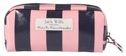
I also NEED the following make-up bags – well, you can never have too many make-up bags, right?!

The lookbook is basically the cast of Skins having had a shower and minus the hipster posing, mini Rosie Huntington-Whiteleys and Prince Harrys. A sense of quintessential Britishness is as intrinsic to the brand as with Burberry or Mulberry, but at high street prices. (Though not that High Street – I’d say prices are on the more premium side, comparable to Ted Baker or Club Monaco here, but not unreasonable for the quality and with some more affordable basics. Rachel assured me they wouldn’t be jacking up the price tags for the HK market either, and my wallet thanks them hugely). There’s an emphasis on heritage prints, old-school Arran knits and little details, like embossed buttons and vintage-style labels sewn into each piece, that give it a sense of much-loved tradition but with a youthful twist.

I was also totally in love with the store itself. In HK, home to the mega-mall, store anonymity is the norm. The Jack Wills flagship, housed in Leighton Centre (behind G.O.D) in Causeway Bay, is anything but.

Firstly, it’s huge. Two floors, high ceilings, practically a mansion by Hong Kong standards. Yes, A&F may have got the press inches by forcing out Shanghai Tang but, unless they’re going to work wonders, this is actually the much better shop space.

Secondly, it’s amazing. No longer will wandering through M&S be my only port of call when pangs of homesickness strike – I can now go stroke some Jack Wills stuff too! There are so many idiosyncratic little touches, just the right mix between quirky and cool whilst being distinctively and delightfully British, that I can imagine people (especially Mainland tourists) will be popping into the shop just to take photos – and no doubt, grab a few Union Jack emblazoned souvenirs whilst they’re at it. So there’s a fireplace, vintage luggage cases, huge pre-loved Union Jack sofas, sweeping staircases, dazzling chandeliers, walls of haphazardly placed but perfectly-thought-out pictures, neon antlers, stuffed animals (didn’t take any pictures of these, slightly creepy)… oh and did I mention the big Jack Wills-striped Range Rover too?!

In a place where stores rarely have such a quirky sense of individuality expressed in their décor, this makes Jack Wills a very exciting… and enticing… prospect indeed. Their unique brand identity is just so cohesive (even their business cards have the pink and navy stripes!)… flick through their lookbook and everything just goes. It’s a study in easy fluidity yet without trying too hard.

Honestly, I really can’t think of anywhere that could compare to it in HK, which can only be a good thing. For me, another British chain with a similarly strong (though totally different) brand identity would be All Saints – in Notts, its store was an old bank kitted out to feel cutting-edge cool and rock-star gothic; meanwhile, another brand that has the quirky Brit thing would be Ted Baker, although I feel this has pretty much been entirely lost in HK stores (they used to give away condoms in my local one… can’t see that ever happening here!), whilst on the whole cool word-of-mouth front they’re totally doing a Superdry… but with a slightly posher accent!

A verrrry English tea… complete with too pretty to eat cupcakes!

Jack Wills is famous ‘in the industry’ for not doing billboards and conventional advertising, but going by word-of-mouth and viral marketing campaigns; they used to hire pretty young things to wear their clothes (and no doubt look stunning on them) and have Jack Wills beach and pub parties in the UK, all the time promoting the brand and handing out freebies.

I had a little chat about their marketing strategy here, as I was concerned that with all the new stores opening that would be aggressive about their marketing (seen those huge Gap adverts taking over the whole of Central MTR yet?!) and with very little brand recognition to work on, they might get somewhat lost. However, it sounds like they do have some cool tricks up their sleeves (involving HK’s iconic trams and some fab Facebook competitions) and they’ve created a bit of social media buzz already by inviting so many bloggers to check it out – and from what I’ve seen so far, response has been really positive, myself included!

I brought my friend Aurora along, a hot local twenty-something with a shopping addiction almost as bad as mine (i.e. totally JW’s demographic) and no previous knowledge of JW. She was won over within minutes. What she saw even from a half-finished store and a few racks of clothes had her almost as excited about the store as I was. (And here she is above, rocking her Jack Wills goodies far better than I ever could).

Her – and my! – final thoughts? Forget A&F! Head to Jack Wills instead!

Jack Wills will open two stores in HK – at Leighton Centre, Causeway Bay (see artist’s impression above!) and LCX (Ocean Terminal), Tsim Sha Tsui – at the beginning of December. Thanks to Elle and the whole Jack Wills team for inviting me and being so very welcoming and lovely throughout.

I’ll see you all at the launch party!

Beauty Spot: Becca Skin Perfecting Make-Up System Makeover review

I usually approach makeovers at make-up counters with wariness.

Take advice from overly orange sales assistants who seem to think the best way of advertising their products is to wear as much on their face as possible? No thanks! And, when I have succumbed, it’s been a case of too too much – plastered on like a mask (and feeling almost as heavy as one!) in whacked-out colours and with an emphasis on whatever products they’re currently trying to promote, regardless of whether they suit your skin tone.

However, I bring you one notable exception to the rule – Becca.

Too too much is a notion that isn’t really in this Aussie cosmetics brand’s arsenal. They’re all about natural, effortless beauty – admittedly not much use if you’re seeking crazy colours and glitzy glitters, but great for your go-to day-to-day make-up. Becca wasn’t around where I used to live in the UK but as soon as I came over, I made my way over to one of their counters quick-start – and the fact I’m now onto my third bottle of their Tinted Moisturiser should tell you all you need to know!

The guy in charge of my Skin Perfecting Make-Up System Makeover was the very lovely Jan. Ladies, ask for him and you need never fear of the makeover foundation force-field again! He asked about my general make-up look, what colours I preferred and paid close attention to my skin (verdict: good but after a really poor facial, currently extremely sensitive) and skin-tone. I’m vampire levels of fair but Jan picked and applied all my products expertly to create a light, natural make-up look that I was really happy with!

I think you’ve seen enough pictures of me on here to know my general look by now so you’ll have to make do with the after shots only – and the pout is more through effort of trying to take a decent photo of myself, rather than through model aspirations, trust me!

As I knew I was getting made over, I only applied a quick base with SPF and a slick of eyeliner (I rarely leave my neighbourhood without it!) so the first stage was a quick make-up removal. ‘Wow, this eyeliner is good!’ Jan commented, as he moved onto his third cotton wool square for just my left eye… of course, it was a good old Urban Decay’s 24/7 Eye Pencil, one of my bona fide make-up miracles. Jan had heard of Urban Decay’s magical mystical properties but, UD not being sold in HK, had never tried them, so I told him to recruit someone to go haul for him in Sinagpore’s Sephora… and the rest of the makeover breezed by in make-up gossip and easy chatting!

First, there was a primer, then onto their Luminous Colour Tinted Moisturiser, one of my favourite Becca products. It has a really gorgeous consistency and applies silkily smooth, whilst also offering pretty good coverage for a tinted moisturiser (which often tend to be on the sheer side). The best thing about Becca’s Tinted Moisturiser is that it comes in 13 different shades – so you’re bound to find one that matches and blends in seamlessly with your skin-tone, rather than making do with one of the regulation ‘light, medium or dark’ that most brands (and BB Creams) manage. Factor in an SPF of 25, a light and dreamy texture and that a little goes a long way (one bottle generally lasts me around 18 months), and it’s no surprise this is a total stalwart in my make-up bag!

I also loved what Jan did with my eyes, a slightly smoky look but still subtle enough for day-to-day wear. He used a matte taupe shadow from the Lost Weekend Palette and then added extra depth with an eye pencil, but without going heavy on the waterline – and I am absolutely loving those flicks (no Benefit Get Bent Brush required!)!

What’s more – Jan didn’t use mascara. Is he my guardian make-up angel or what?! My eyes are pretty sensitive as the best of times, but following crap facial, have been bugging out more than ever. He took one look and, rather than ploughing on regardless, said there was no way he was using mascara (and even then, went light and gentle with the rest of my eye make-up). You’ll know it’s a super-special occasion if you see me in my mascara, that’s how much I hate wearing it (it always makes my eyes feel heavy, they invariably start watering at some stage and the hassle of taking it off is enough to kill the ‘oooo fluttery’ joy of initial application) so this really cemented it as a perfect make-up look for me.

After finding out I preferred corals to pinks, he went that way for the rest of my look. He used one of Becca’s best-selling Lip & Cheek Crèmes as a blush (Tuberose I think) and I was really surprised with the results. Cream blushes often come off rather intense and feel heavy on my skin-tone yet with Jan’s dab hands, he managed to create a pretty, delicate and effortless coral flush!  I only wish I had enough confidence in myself to know I could work it just as well at home!

IFC’s toilets – home to decent lighting!

After trying a few lip looks, we eventually settled on one I really loved using another cult Becca product, Beach Tint in Grapefruit, a pretty pinky-coral. I’d heard lots of good things about their Beach Tints, which can be used on both lips and cheeks, and because of that, had been expecting them to have the same kind of watery liquid stain consistency as Benefit’s Benetint/Posietint/Cha Cha Tint/whatever new Tint retread they’ve brought out. Actually, the Becca Beach Tint is more like a light cream (intensely bright out the tube but easily blended in) and in my books, work far better as a lip tint than Benetint’s moisture-sapping stain ever did!

I absolutely loved the light coral colour, plus the deliciously unexpected fresh fruity scent, but what I loved even more was the finish. It’s pretty much the most natural lip finish I’ve seen, but which still made an obvious colour difference to my smackers. It’s definitely not a gloss, glaze or satin finish but definitely far away from being a matte or balm look either; basically, it’s a totally gorgeous, natural lip look, the ultimate ‘my lips but better’ and has immediately gone down on my wish-list!

Finally, a few judicious dabs of concealer for any red patches, a finishing powder (another Becca best-seller with a feather-light texture and radiant finish) and a highlighter and I was good to go!

Do not fear… I will be getting a new camera soon!

I absolutely loved my makeover – and Jan! It’s a really natural but pretty make-up look that totally suits my lifestyle, which for me, is exactly what a good makeover should be – one that took into account my style and my needs, rather than those of the make-up assistant! This is a look that I would wear without hesitation in my day-to-day life; I loved how light and non caked-on it felt and it stayed picture-perfect for a good eight hours, with the eye make-up holding up especially well. Plus, with Jan talking me through it the entire way, it’s one I feel I could manage to do myself too.

Proof positive that this makeover was a good ‘un through and through? I, control freak and beauty addict, would happily entrust Becca and Jan with my make-up again… and again… and again…!

Becca counters are available at Times Square, Pacific Place and IFC Lane Crawford.

London Show Rooms HK: Spring Summer 2012

Regular readers may remember my Red Carpet Rundowns from awards ceremonies of yore, which generally consisted of me writing in the throes of passion to some stunningly beautiful designer dress. Well now, I’ve actually been and gone and seen and TOUCHED these dresses in person. And they are all SO MUCH MORE AMAZING in person!

But also, in a way, not that much more amazing too. At the end of the day, they are just body-part shaped bits of material, much the same as the body-part shaped bits of material you’d find at H&M, Primark or even the local wet market. Celebs, models and the beautiful people have a way of making you think their garments are some sort of magical mystical cloaks of wonder, elevating them to minor divinity status. But actually, having handled the very garments I’ve swooned at on a pixelated level, I can now tell you – it really is just a dress. No pixie dust, no ethereal glow, no heavens opening sound when you touch them… just a dress after all.

But still exceedingly pretty dresses after all!

Enough rambling and onto the point… I was lucky enough to be invited to the London Show Rooms, a British Council initiative to showcase the work of some of Britain’s hottest designers. Having pored over the recent pics from London Fashion Week, it was honestly like a dream come true!

I went with the lovely Hester from Sassy Hong Kong, and tried to keep my ridiculous squeeing in check in case she realised what a fashion fan-girl I am – especially for someone who generally looks such a state in person!

The event itself was a little weird – I saw someone toting a giant papiermâché hand, which just about says it all. Apart from the fact that no-one bothered to introduce themselves so I had no idea who worked there or who was just wafting around to cover the event like myself, the biggest downfall was that very few of the dresses were displayed on a body – either real or plastic. These dresses come alive shown on people, yet there were fewer than 10 models standing around the room, strutting their insolent stuff (and yes, I did totally feel like I was in an episode of Next Top Model!). A fashion show, or even a small presentation about the designers (or even just better lighting!), would have done more justice to these wonderful garments.

On the plus side, you were allowed to handle the garments to your heart’s desire. I’m far too intimated by snobby shop assistants to ever try and go into the retail shops myself (Pretty Woman syndrome!) so it was great to be able to enjoy a leisurely swoon and sigh, without feeling like my grubby mitts would be shoo-ed off at any moment!

My favourite – Mary Katrantzou. I loved these dresses in print, I loved these dresses in pixel and I LOVED these dresses in person!

Katrantzou’s calling card is colourful, mental, full-on floral prints – as you can see from her rail (banner photo), which is just a riot of rainbow! The dress on the model was just exquisite – the flow, the shape, the way it sat on her body, that gorgeous train and most importantly, the fabulous print itself. You can appreciate how precisely thought-out the colours and shapes are by the way each different print begins and ends so crisply and beautifully – the fact the model looks gift-wrapped is a Brucie bonus! – but this is a perfect example of why high street knock-offs will never quite cut it. There is no way you could get as complex and crazy a print that still looks expensive, flattering and elegant for el cheapo prices!

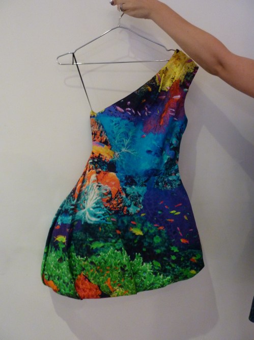
I also loved this tropical-coloured coral reef asymmetric dress from The Katrantzou (held by Hester!). What you can’t really see in this photo is the gorgeous stiff full skirt, which pouffed out uber-cutely, and it’s such a shame I didn’t get to see this on a model, where it really would have come alive. Again, this isn’t the kind of tailoring you can get for high street prices – and that’s coming from someone that has been looking for that proper pouffy structured full skirt for ages! (Or alternatively, tell me where and I’m there!)

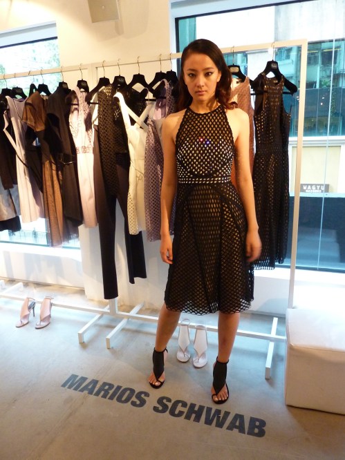
My next favourite, somewhat surprisingly, was Marios Schwab. His pieces were SO much more beautiful in person; on the catwalk, they can look a little plain – especially compared with all the other crazy colours and vibrant prints that come out to play for Spring/Summer. What I’ve always loved about his designs is how they always perfectly combine the tough with the sensual, the sexy with the soft. Despite the corsetry and cut-out elements to many of his dresses, they’re the very antithesis of the tired old trollope standby, the bandage dress.

It’s an overtly sexy, tight-fitting silhouette, but muted with netting, overlays and veiling. It’s lattice-work that actually reveals very little at all. It’s tough shapes and colours, but then a sprinkling of Swarovski crystals. And what amazed me most was how soft these were to the touch. Many bandage dresses I’ve handled before felt hard, rigid and constricting – that’s how they suck you in all the right places – but these were meltingly fluid, like a buttery soft fluid leather. I really loved the pretty lilac and blush coloured ones, which often lose out on the red carpet stakes to the more obvious black, white or nude numbers.

I also adored the work of Peter Pilotto. Pilotto’s digital prints were really hot a couple of seasons ago, where everyone and their ice-cream man was seen in his colourful abstract numbers (or a high street knock off of them!) but I feel he’s since been overshadowed by the likes of Katranzou and Erdem. Well, this collection showed me that he’s definitely still alive and kicking… with a vengeance! These were ultra-colourful, but in much less whimsical way – I’m gonna call it future-tribal! These were also some of the more complex dress shapes on show with lots of intricate cutting and plenty of those full structured skirts I love. Here’s the red dress I was eyeing for my wardrobe!

I was expecting to be wow-ed by Roksanda Ilincic and Jonathan Saunders, two of my other favourites on the red carpet (especially the divine Ms Roksanda, as worn by my ultimate girl crush, Kate Middleton) yet I ended up being a little disappointed.

Ilnicic’s pieces for me have always been about stunning cutting, draping and folding and an effortlessly tactile structured but unstructured elegance that enlivens her essentially simple and classic shapes. On coat-hangers, this just wasn’t evident. The colour palette was gorgeous – vivid turquoise and fuchsia jewel tones playing off muted mustards and grey but I needed to see these on a person! I’m still lusting after her Debenhams collection though!

Saunder’s rail was pretty delicious from afar – a cool ice-cream coloured rack of spring sorbets, especially to the right of my picture where my favourite of his pieces sat. As worn by Samatha Cameron and another one with a Debenhams collaboration under his belt, I felt his outfits were a lot more mainstream than most of the other designers here, though would probably look lovely on (Thandie Newton is another fan and I always think she looks amazing), but unfortunately they didn’t do much for me on the hanger either. Some of his prints were surprisingly acid-y, Pucci-esque and Mystery Machine-worthy though – I guess we just don’t get to see those on the red carpet as much.

David Koma was another surprise – him of dressing Cheryl Cole on X Factor in dustbin lids fame. As expected, lots of chunky embellishments (see the 3D Persplex on what I believe was a miniskirt yet which was so short I wouldn’t even wear it as a scarf!) but I saw some more mature designs in there too.

I loved the model’s outfit, which was decorated with awesome iridescent panels of sequins, shimmering and gleaming like insects wings in the light, which just looked intensely flattering yet still different. Expect to see more of Koma on the red carpet – and with a Topshop collaboration on the way (as has Katranzou, by the way), his time is definitely now.

Holly Fulton is another ‘one to watch’, who apparently revels in bad taste. Not really my style but nice to see some unashamedly happy designs (she’s supposedly influenced by Versace and most of these would fit right in with their H&M partnership) – but I have to admit, the model does look amazing!

Finally, some shoe porn of the highest order from Nicholas Kirkwood. I could have spent half an hour playing with these alone. If ever there was a case for shoes as art work, here it be. I once called Kirkwood’s designs ‘pure joy on a hoof’ and after seeing them in person, I stand by that description!

Of course, they’re far too beautiful for me to ever actually want to wear, as opposed to bring out the closet to stroke lovingly in times of sadness – as if I’d ever be able to afford a pair anyway!

So there you have it… amazing designer dresses are amazing. Not that amazing. But still amazing enough.

Forgotten Fine Art: The Cityplaza Copper Suite

In Hong Kong, you can often find pretty things in the strangest places… which often means discovering fine art in the most mundane of anonymous corporate offices.

Such was the case with this stunning series of plaques entitled The Cityplaza Copper Suite by Australian sculptors Joan Walsh Smith and Charles Smith in Tai Koo’s Cityplaza complex of buildings.

I was taken aback by the level of detail in these – you could spend ages poring over these still find even more interesting and clever little vignettes revealing themselves in the copper artwork. The style reminds me a little of Jan Pieńkowski’s silhouette illustrations for the Joan Aiken books I used to read when I was little. Click on each photograph to enlarge and zoom in  and you can check out some of the detail for yourselves!

Each ‘Rondo-Progression’ has a different theme (unfortunately, I forgot to note them down, bad blogger, slaps wrist!) but I believe they were The Arts, Food, Leisure and Work. My favourite is probably The Arts with its striking centre-piece of the two Chinese theatre masks and loads of other dynamic pictures surrounding it – it’s almost like it’s alive with movement!

You can’t really tell from the pictures (which have distorted the light reflections weirdly) but these are made from copper, which is even more stunning and vivid in real life – and I loved the way the light reflected and bounced off these pieces, making them even more vibrant.

It seems a shame that these are tucked away in a place most people wouldn’t even notice so hopefully this post does its bit to show them off to the rest of the world!

Chanel Graphite nail polish review

It’s been a while since I posted – but this is the perfect polish to break the rut… Chanel Graphite.

Oh, Le Vernis Graphite… j’adore.

After using Graphite, my first Chanel polish, I was completed consumed by the desire to buy as many of their lacquers as possible, without care for cost or availability or anything else similarly level-headed – THAT is how good it was. However effusive I am in the rest of this review, trust me, it isn’t enough!

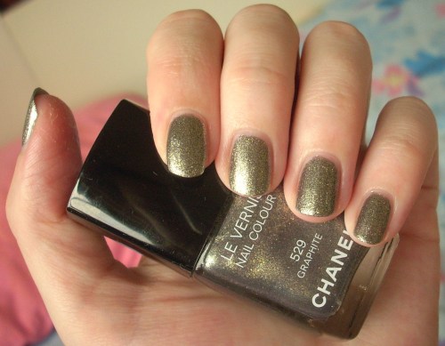
Graphite is just amazing. I’ve seen lots of posts that make it look like a charcoal silver, which it most definitely isn’t. Instead, it’s a gorgeous glittering green gold, burnished blackened and utterly brilliant. In some lights, it flashes a shimmering silvery khaki but this dirty dazzling delicious fool’s gold is by far the more dominant colour. It’s simply a joy to behold and I make abslutely no apologies for the abundance of photos that follows as a result!

The other amazing aspect of Graphite is its finish. It’s a cross between a foil and a glitter but is obviously neither and yet more than both put together. It looks amazingly textured but is totally smooth to the touch. It’s Extra Special in a way that words that also name an expensive supermarket ready-meal just cannot do justice to. In my collection, it’s also utterly breathtakingly unique.

I was also blown away by the pure quality of it. I felt I didn’t need to do anything. It just flowed perfectly from the bottle to the brush and onto my fingernails in a neat perfect shape. I always hear the term on polish blogs ‘applied like butter’ and have never really had cause to use it – but this stuff really seemed to melt like magic onto my talons.

For those not familiar with Chanel nail polishes, the chunky square cap lifts off to reveal a small round screw cap that allows better grip for application. The brush itself is slightly short but medium-sized in thickness and I encountered no problems with it whatsoever. However, by this stage, I was in such a state of general giddiness that the brush could have been starfish-shaped for all I’d have known – I just could not stop staring at my nails!

If you look up images of graphite itself, it’s amazing to see how Chanel have managed to transform the mineral’s exact qualities and shading to a polish. It also reminded me of another mineral – pyrite, also known as fool’s gold – and the colour is just this wonderful textured mixture of gold, silver, green, charcoal and black, with shadows and shimmers in all the right places. It’s gorgeous from up-close, it’s gorgeous from far away… I imagine it would almost be gorgeous with your eyes shut too!

It’s so glittery, it pretty much glows in the dark but despite it’s glitz factor, it absolutely never feels obtrusive, ostentatious or OTT. It also reminded me of a shimmering sheath of snakeskin – slinky, glitzy, totally divinely luxe.

Wonderful colour, fabulous quality, a sense of sophistication, a luxurious glamour that’s still tasteful… It’s basically everything I ever hoped and expected from Chanel but had been afraid to believe was true. Well, it all was!

Looks good with: black, sophistication, The Look
Drying time: <5 mins
Coats required: 1-2
Chips: 2-3 days

Shimmering in the shade!

Chanel Le Vernis Graphite, Fall 2011 Illusion D’Ombres Collection, $180, Chanel

I wish all atlases looked like this!

One of my favourite Pretty Things posts on here is still my blog on the gorgeous travel posters by Brazilian illustrator, Fernando Volken Togni – the colour, the detail, the style, everything! (And I updated it to feature his most recent additions to the series so do check it out!)

Inspired by these, and also the somewhat similar Scandinavian postcards I featured from Ikea, I wanted to share with you these lovely pictorial maps by Canadian artist, Marisa Seguin that I discovered via Design Work Life – and just as I wanted Togni’s work on my walls, I want Seguin’s right up there with it!

What sets these apart for me are the strict but stunning colour palettes she has used for each piece. Again, it’s hard to pick a favourite – the icy cool blues and purples of Vancouver, the strikingly vibrant pinks and turquoise of Venice, the dreamy romantic pastels of Paris, the vivid riot of brights that makes up San Francisco or the dusty sepia tones of Seguin’s current base, Milwaukee.

I also love the level of detail that’s gone into illustrating each of the landmarks; sadly, I haven’t visited any of the cities in question (apart from Paris, which I honestly think looks far more charming here than it does in real life!) but if I do, I’ll be toting one of these and navigating my way in style!

Hope you enjoy these as much as I did – and you can check out more of Seguin’s work on her website or buy these as prints from her Etsy shop.

And I loved the Jellyfish one so much, I couldn’t resist sticking it on here too!