Tag Archives: dresses

Jack Wills is opening in Hong Kong… and it’s Fabulously British!

Amidst all the new international store openings in Hong Kong (Abercrombie & Fitch, Hollister, American Eagle, Gap, Forever 21), one store has quietly sneaked in under the radar… and may just eclipse them all. Ladies and gents, may I introduce you to Jack Wills.

And it definitely is an introduction. When I mentioned Jack Wills to most of my HK friends, the resounding response was ‘Who?!’. Having lived, attended school and gone to university in the UK, I was very familiar with Mr Wills. It was just getting big when I left around 4 years ago; Nottingham, the big university town where I spent far too many of my formative years, had just got its own store and had basically become THE uniform of choice for nearly everyone from my old school and uni.

The typical Jack Wills wearer then was:

In case you don’t know, that’s JP (played by Jack Whitehall) from  Fresh Meat (and do watch it, it’s hilarious), who basically epitomises near enough every person I went to school and uni with. JP would probably pronounce Jack Wills as “totally rape”… but enough Fresh Meat in-jokes!

Back then Jack Wills was very much a preppy British A&F, beloved by poshos and public schools (their tagline is ‘University Outfitters’, after all). Round my parts, we call these people ‘rah’s – for girls, think Ugg boots, sweat pants, all-enveloping scarves and big artfully-tousled bed-hair; for guys, think rugby shirts with collars never anything but up, lived-in jeans or board shorts determinedly worn in a country and climate that really doesn’t warrant having your hairy legs out for 8 months of the year.

Seriously, I could spot people from my school long after I’d left from the fact their hair was fluffed up to about five times the size of their body and that they were slouching about in sweats with ‘Jack Wills’ emblazoned on their arse. And as you’re probably now realising, I might just be a bit of a rah too. Like blates. But sadly, without the budget!

So I was already more than interested in Jack Wills opening in Hong Kong and the chance for me to relive my rah days. But, having attended a preview of their new store, I am now no longer interested, but EXTREMELY BLOODY EXCITED.

What became clear, especially after chatting to the fabulous Rachel Johnson, head of womenswear (and with a totes awesome first name, may I just add), is that Jack Wills has come on leaps and bounds since my time in the UK. Yes, there’s still rugby shirts, sweatpants and checked shirts galore, but now there’s so very much more too.

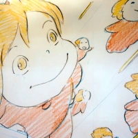
I was blown away by their range of dresses, all of which were immediately covetable, absolutely gorgeous and yet still had that signature Jack Wills feel about them. My heart did a little hop, skip and jump of delight when one of the models came out in the spotted black dress above – the very dress I pointed out to my friend a few moments before from the lookbook, stating ‘It must be mine.’

I was also rather enamoured with their fur capes, sparkly cardigans and fabulous tweed-y outdoors coats (with adorable metal anchor-embossed buttons – its the little details that count!) – here’s hoping HK actually gets cold enough to wear them! I’m also going through a cute print underwear and legwarmer obsession, so you can imagine what I made of the box of treasures below!

I loved the way the outfits were styled too – classic but still fashionable and in a way that felt distinctly British. I was also smitten by this Liberty-style print dress (most prints are bespoke to JW), paired with a slouchy knit cardigan, the perfect mix between dressed up and dressed down; all I have to say is, yes, yes YES! And this mannequin, showcasing sparkly sequinned shorts matched with a plain tee and statement-outfit making red blazer (I’m getting Claudia Winkleman vibes off this look) – even more YES! Even if I’d probably never be able to pull it off myself…

The great thing, especially for someone like me who buys what I like rather than paying close attention to whatever’s in fashion, is that Jack Wills doesn’t slavishly follow trends but rather forages its own distinctive path. I’d describe it as British heritage with a modern twist but with clothes classic and well-designed enough to last far more than a few seasons. However, unlike other shops that have an easily-identifiable signature look (*cough A&F cough*), Jack Wills doesn’t feel like a one-trick pony stuck in a major sartorial rut.

The other cause for major excitement – they’re doing BEAUTY. I think I totally freaked out Rachel, JW’s lovely brand coordinator Lauren and gorgeous PR extraordinaire Elle with my extreme excited squealing when they told me! It seems, in my time away, that Jack Wills have branched into nearly everything – home décor, mugs, iPhone accessories, jewellery and, obviously much to my delight, cosmetics too. The packaging, in their signature pink and navy stripes, is absolutely beyond cute and everything looks really affordable too. Obviously I can’t wait to get my grubby little mitts onto some of the product to give them a test drive – but that Union Jack tin stuffed with nail polishes?! It may as well have my name written on it!

I also NEED the following make-up bags – well, you can never have too many make-up bags, right?!

The lookbook is basically the cast of Skins having had a shower and minus the hipster posing, mini Rosie Huntington-Whiteleys and Prince Harrys. A sense of quintessential Britishness is as intrinsic to the brand as with Burberry or Mulberry, but at high street prices. (Though not that High Street – I’d say prices are on the more premium side, comparable to Ted Baker or Club Monaco here, but not unreasonable for the quality and with some more affordable basics. Rachel assured me they wouldn’t be jacking up the price tags for the HK market either, and my wallet thanks them hugely). There’s an emphasis on heritage prints, old-school Arran knits and little details, like embossed buttons and vintage-style labels sewn into each piece, that give it a sense of much-loved tradition but with a youthful twist.

I was also totally in love with the store itself. In HK, home to the mega-mall, store anonymity is the norm. The Jack Wills flagship, housed in Leighton Centre (behind G.O.D) in Causeway Bay, is anything but.

Firstly, it’s huge. Two floors, high ceilings, practically a mansion by Hong Kong standards. Yes, A&F may have got the press inches by forcing out Shanghai Tang but, unless they’re going to work wonders, this is actually the much better shop space.

Secondly, it’s amazing. No longer will wandering through M&S be my only port of call when pangs of homesickness strike – I can now go stroke some Jack Wills stuff too! There are so many idiosyncratic little touches, just the right mix between quirky and cool whilst being distinctively and delightfully British, that I can imagine people (especially Mainland tourists) will be popping into the shop just to take photos – and no doubt, grab a few Union Jack emblazoned souvenirs whilst they’re at it. So there’s a fireplace, vintage luggage cases, huge pre-loved Union Jack sofas, sweeping staircases, dazzling chandeliers, walls of haphazardly placed but perfectly-thought-out pictures, neon antlers, stuffed animals (didn’t take any pictures of these, slightly creepy)… oh and did I mention the big Jack Wills-striped Range Rover too?!

In a place where stores rarely have such a quirky sense of individuality expressed in their décor, this makes Jack Wills a very exciting… and enticing… prospect indeed. Their unique brand identity is just so cohesive (even their business cards have the pink and navy stripes!)… flick through their lookbook and everything just goes. It’s a study in easy fluidity yet without trying too hard.

Honestly, I really can’t think of anywhere that could compare to it in HK, which can only be a good thing. For me, another British chain with a similarly strong (though totally different) brand identity would be All Saints – in Notts, its store was an old bank kitted out to feel cutting-edge cool and rock-star gothic; meanwhile, another brand that has the quirky Brit thing would be Ted Baker, although I feel this has pretty much been entirely lost in HK stores (they used to give away condoms in my local one… can’t see that ever happening here!), whilst on the whole cool word-of-mouth front they’re totally doing a Superdry… but with a slightly posher accent!

A verrrry English tea… complete with too pretty to eat cupcakes!

Jack Wills is famous ‘in the industry’ for not doing billboards and conventional advertising, but going by word-of-mouth and viral marketing campaigns; they used to hire pretty young things to wear their clothes (and no doubt look stunning on them) and have Jack Wills beach and pub parties in the UK, all the time promoting the brand and handing out freebies.

I had a little chat about their marketing strategy here, as I was concerned that with all the new stores opening that would be aggressive about their marketing (seen those huge Gap adverts taking over the whole of Central MTR yet?!) and with very little brand recognition to work on, they might get somewhat lost. However, it sounds like they do have some cool tricks up their sleeves (involving HK’s iconic trams and some fab Facebook competitions) and they’ve created a bit of social media buzz already by inviting so many bloggers to check it out – and from what I’ve seen so far, response has been really positive, myself included!

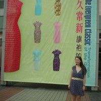
I brought my friend Aurora along, a hot local twenty-something with a shopping addiction almost as bad as mine (i.e. totally JW’s demographic) and no previous knowledge of JW. She was won over within minutes. What she saw even from a half-finished store and a few racks of clothes had her almost as excited about the store as I was. (And here she is above, rocking her Jack Wills goodies far better than I ever could).

Her – and my! – final thoughts? Forget A&F! Head to Jack Wills instead!

Jack Wills will open two stores in HK – at Leighton Centre, Causeway Bay (see artist’s impression above!) and LCX (Ocean Terminal), Tsim Sha Tsui – at the beginning of December. Thanks to Elle and the whole Jack Wills team for inviting me and being so very welcoming and lovely throughout.

I’ll see you all at the launch party!

London Show Rooms HK: Spring Summer 2012

Regular readers may remember my Red Carpet Rundowns from awards ceremonies of yore, which generally consisted of me writing in the throes of passion to some stunningly beautiful designer dress. Well now, I’ve actually been and gone and seen and TOUCHED these dresses in person. And they are all SO MUCH MORE AMAZING in person!

But also, in a way, not that much more amazing too. At the end of the day, they are just body-part shaped bits of material, much the same as the body-part shaped bits of material you’d find at H&M, Primark or even the local wet market. Celebs, models and the beautiful people have a way of making you think their garments are some sort of magical mystical cloaks of wonder, elevating them to minor divinity status. But actually, having handled the very garments I’ve swooned at on a pixelated level, I can now tell you – it really is just a dress. No pixie dust, no ethereal glow, no heavens opening sound when you touch them… just a dress after all.

But still exceedingly pretty dresses after all!

Enough rambling and onto the point… I was lucky enough to be invited to the London Show Rooms, a British Council initiative to showcase the work of some of Britain’s hottest designers. Having pored over the recent pics from London Fashion Week, it was honestly like a dream come true!

I went with the lovely Hester from Sassy Hong Kong, and tried to keep my ridiculous squeeing in check in case she realised what a fashion fan-girl I am – especially for someone who generally looks such a state in person!

The event itself was a little weird – I saw someone toting a giant papiermâché hand, which just about says it all. Apart from the fact that no-one bothered to introduce themselves so I had no idea who worked there or who was just wafting around to cover the event like myself, the biggest downfall was that very few of the dresses were displayed on a body – either real or plastic. These dresses come alive shown on people, yet there were fewer than 10 models standing around the room, strutting their insolent stuff (and yes, I did totally feel like I was in an episode of Next Top Model!). A fashion show, or even a small presentation about the designers (or even just better lighting!), would have done more justice to these wonderful garments.

On the plus side, you were allowed to handle the garments to your heart’s desire. I’m far too intimated by snobby shop assistants to ever try and go into the retail shops myself (Pretty Woman syndrome!) so it was great to be able to enjoy a leisurely swoon and sigh, without feeling like my grubby mitts would be shoo-ed off at any moment!

My favourite – Mary Katrantzou. I loved these dresses in print, I loved these dresses in pixel and I LOVED these dresses in person!

Katrantzou’s calling card is colourful, mental, full-on floral prints – as you can see from her rail (banner photo), which is just a riot of rainbow! The dress on the model was just exquisite – the flow, the shape, the way it sat on her body, that gorgeous train and most importantly, the fabulous print itself. You can appreciate how precisely thought-out the colours and shapes are by the way each different print begins and ends so crisply and beautifully – the fact the model looks gift-wrapped is a Brucie bonus! – but this is a perfect example of why high street knock-offs will never quite cut it. There is no way you could get as complex and crazy a print that still looks expensive, flattering and elegant for el cheapo prices!

I also loved this tropical-coloured coral reef asymmetric dress from The Katrantzou (held by Hester!). What you can’t really see in this photo is the gorgeous stiff full skirt, which pouffed out uber-cutely, and it’s such a shame I didn’t get to see this on a model, where it really would have come alive. Again, this isn’t the kind of tailoring you can get for high street prices – and that’s coming from someone that has been looking for that proper pouffy structured full skirt for ages! (Or alternatively, tell me where and I’m there!)

My next favourite, somewhat surprisingly, was Marios Schwab. His pieces were SO much more beautiful in person; on the catwalk, they can look a little plain – especially compared with all the other crazy colours and vibrant prints that come out to play for Spring/Summer. What I’ve always loved about his designs is how they always perfectly combine the tough with the sensual, the sexy with the soft. Despite the corsetry and cut-out elements to many of his dresses, they’re the very antithesis of the tired old trollope standby, the bandage dress.

It’s an overtly sexy, tight-fitting silhouette, but muted with netting, overlays and veiling. It’s lattice-work that actually reveals very little at all. It’s tough shapes and colours, but then a sprinkling of Swarovski crystals. And what amazed me most was how soft these were to the touch. Many bandage dresses I’ve handled before felt hard, rigid and constricting – that’s how they suck you in all the right places – but these were meltingly fluid, like a buttery soft fluid leather. I really loved the pretty lilac and blush coloured ones, which often lose out on the red carpet stakes to the more obvious black, white or nude numbers.

I also adored the work of Peter Pilotto. Pilotto’s digital prints were really hot a couple of seasons ago, where everyone and their ice-cream man was seen in his colourful abstract numbers (or a high street knock off of them!) but I feel he’s since been overshadowed by the likes of Katranzou and Erdem. Well, this collection showed me that he’s definitely still alive and kicking… with a vengeance! These were ultra-colourful, but in much less whimsical way – I’m gonna call it future-tribal! These were also some of the more complex dress shapes on show with lots of intricate cutting and plenty of those full structured skirts I love. Here’s the red dress I was eyeing for my wardrobe!

I was expecting to be wow-ed by Roksanda Ilincic and Jonathan Saunders, two of my other favourites on the red carpet (especially the divine Ms Roksanda, as worn by my ultimate girl crush, Kate Middleton) yet I ended up being a little disappointed.

Ilnicic’s pieces for me have always been about stunning cutting, draping and folding and an effortlessly tactile structured but unstructured elegance that enlivens her essentially simple and classic shapes. On coat-hangers, this just wasn’t evident. The colour palette was gorgeous – vivid turquoise and fuchsia jewel tones playing off muted mustards and grey but I needed to see these on a person! I’m still lusting after her Debenhams collection though!

Saunder’s rail was pretty delicious from afar – a cool ice-cream coloured rack of spring sorbets, especially to the right of my picture where my favourite of his pieces sat. As worn by Samatha Cameron and another one with a Debenhams collaboration under his belt, I felt his outfits were a lot more mainstream than most of the other designers here, though would probably look lovely on (Thandie Newton is another fan and I always think she looks amazing), but unfortunately they didn’t do much for me on the hanger either. Some of his prints were surprisingly acid-y, Pucci-esque and Mystery Machine-worthy though – I guess we just don’t get to see those on the red carpet as much.

David Koma was another surprise – him of dressing Cheryl Cole on X Factor in dustbin lids fame. As expected, lots of chunky embellishments (see the 3D Persplex on what I believe was a miniskirt yet which was so short I wouldn’t even wear it as a scarf!) but I saw some more mature designs in there too.

I loved the model’s outfit, which was decorated with awesome iridescent panels of sequins, shimmering and gleaming like insects wings in the light, which just looked intensely flattering yet still different. Expect to see more of Koma on the red carpet – and with a Topshop collaboration on the way (as has Katranzou, by the way), his time is definitely now.

Holly Fulton is another ‘one to watch’, who apparently revels in bad taste. Not really my style but nice to see some unashamedly happy designs (she’s supposedly influenced by Versace and most of these would fit right in with their H&M partnership) – but I have to admit, the model does look amazing!

Finally, some shoe porn of the highest order from Nicholas Kirkwood. I could have spent half an hour playing with these alone. If ever there was a case for shoes as art work, here it be. I once called Kirkwood’s designs ‘pure joy on a hoof’ and after seeing them in person, I stand by that description!

Of course, they’re far too beautiful for me to ever actually want to wear, as opposed to bring out the closet to stroke lovingly in times of sadness – as if I’d ever be able to afford a pair anyway!

So there you have it… amazing designer dresses are amazing. Not that amazing. But still amazing enough.

Atelier Versace Exhibition, Pacific Place: Gonna dress you up in my love!

I love beautiful dresses. I love seeing them, buying them, wearing them and, as this blog proves, writing about them too! Sadly, with the most beautiful designer dresses worn by the most beautiful celebrities, that’s about as close as I get – seeing them on a computer screen and then detailing my lust in writing afterwards. But not anymore…

Kawai Wong, the lovely Shopping & Style Editor of Time Out Hong Kong, tipped off her followers on Twitter that there would be a mini Atelier Versace exhibition in Pacific Place shopping mall. I made a mental note and promptly forgot all about it but as chance would have it, I just happened to be in Pacific Place that weekend – and thank God I was. Because I got to see some of those beautiful dresses that I had previously only written about IN PERSON. And they were BREATH-TAKING.

Apologies for all the caps but as you can see from the photos, upper-case in this case is totally deserved!

I squealed with delight when I saw this stunning  gown that I adored on Charlize Theron at the Vanity Fair Oscars Party standing there in all its glory right in front of my eyes! This was my favourite gown of the lot simply because I remembered writing how much I loved it – and there it was!

Even on the mannequins, everything draped just so and looked utterly beautiful. This gown was worn by Eva Mendes at the Rome Film Festival last year. I didn’t really like the dress in photos but up-close, all the detailing was just exquisite. What was missing was the gorgeous sense of movement that Eva managed to create but I think this proves just how much a million flash bulbs wash out a dress, as it was much more of a vibrant tan colour in person.

This cobalt beauty was worn by Jessica Alba at this year’s Baftas and was another one I wrote about! She worn it sans feathers but this was every bit as vividly gorgeous in person. I love how effortlessly flowing it is.

This cascading grey ombre dress hasn’t been worn by anyone famous – yet! Love the cut-out detail on the back too. Stunning. By now, I was nearly going into seizure at being close enough to touch these gowns. Waaaah… just one stroke!

Fan Bing Bing’s ruffled purple gown (as worn at the Cannes Film Festival, which marked the beginning of many of our style crushes on The Bingster) was probably the true show-stopper of the collection. It was just so big, pouffy and spectacular in real-life. Again, the detail of all those flounces was just amazingly lush up-close. It was so delicate yet dramatic and that skirt looked like it was made up of crush flower petals. Divine.

There was lots of ‘oh my God’-ing and longing sighing that my boyfriend didn’t totally understand but ugh, I need more of these exhibitions in my life! Just five dresses isn’t enough! Hurry up and get that Alexander McQueen Savage Beauty show on the road to Hong Kong please!

Atelier Versace Exhibition, Pacific Place mall, Admiralty

Red Carpet Rundown: I ♥ Kate Middleton/Duchess of Cambridge/Princess Kate

There was a time when I didn’t even like Kate Middleton much. I even preferred Prince Harry’s spunkier beau, Chelsea Davy, because she actually seemed to be doing something with her life, as opposed to just hanging around with immaculate hair waiting for her boyfriend to pop the question.

How times have changed.

Now I can’t get enough of Princess Kate. Thankfully, the media can’t either, so I have been happily gorging on photos of her daily thanks to Wills & Kate’s Great North American Adventure. And now I don’t just want her hair… I want her wardrobe too!

Kate’s style has been criticised as ‘boring’, but I can’t remember the last time I didn’t think she looked lovely. Isn’t it refreshing to see a young woman in the public eye who isn’t slavishly following every trend going or trying to reveal as much boob as possible? Kate’s style is elegant, refined and obviously, totally her own. No stylist required.

Obviously, being a royal means there’s some element of conservatism to her look – yes, wah wah wah, she has to wear skin-coloured tights but frankly, she wears them so well that I’m considering buying some! Yet she still looks young and fresh, un-stuffy and gorgeous – and I suppose being in love with the future King of England helps too.

My favourite looks from the North American tour are numerous… so this post is as much for my personal squee-ing viewing pleasure as for yours.

I knew it was going to be a good few weeks when Kate’s first look was this navy lace shift dress from Erdem. Subconsciously, I’d been longing for Kate to wear Erdem since… well, forever. Erdem does lacy florals in a way that is so far away from grannie’s doilies and cushion covers that you’ll forget chintz even existed; instead, they’re contemporary, chic and oh-so-breathtakingly pretty dresses every time. I LOVE this dress. I want it. You’ll hear this phrase a lot this post.

The marriage made in heaven (and I’m talking Kate & Erdem, not Kate & Wills!) continued with this second Erdem dress. This time it’s a more vibrant shade of royal blue, a colour we’ve seen Kate wear a lot recently, obviously purely coincidentally setting off that engagement ring. Again, I love it. I want it less than the navy one though. The navy was just SO effortlessly classy yet still a little bit sexy. This is beautiful though. See what I mean? Modern yet conservative and still young and fresh. Delightful.

Another designer that Kate should wear more of is Jenny Packham. Packham is actually British-born, yet has so far received more attention from young American starlet types who are drawn magpie-esque to her sparkly feminine designs (see Emma Roberts, Ashley Tisdale, Miley Cyrus, Jayma Mays and Sandra Bullock). This is also an excuse for me to shoehorn in my second-favourite Princess Kate look of all time (second to THE wedding dress, obvs) courtesy of Ms Packham from the ARK Gala – delicate blush colour, shimmering silver sequins, a floating romantic princess dream topped off with ribbons on her shoes. She looked stunning in every single photo, from every single angle – the power of a totally magical dress.

But back to the dresses from the tour. They’re just such a perfect fit for Kate. Delightful, charming and pretty, simple yet with an easy sophistication. She got a bit windswept in the primrose yellow frock so I’m hoping this will get another Reiss engagement dress re-run because it’s utterly gorgeous. Easy and breezy without a Covergirl advert in sight. It’s a shame Kate tends towards nudes and neutrals as colours like this really light her up. She looks years younger. Adorable.

Similarly, she should totally wear more prints. She can carry them off – and so easily too! Ideally, she needs to amalgamate these two looks and do *quelle horreur* a bright print! Baby steps, I know… This is yet another effortlessly gorgeous outfit and the print, in an array of pale neutral hues, is just beautiful, light and chic. I love the way those butterfly-like sleeves fall too. It’s the little details!

Onto the Alexander McQueens, forever destined to be overshadowed by THE wedding dress. Part of her duty as a royal is to champion British fashion so well done Kate for finding McQueen pieces that work with her sensibilities – and not only work, but weeerk (you know, said with a Tyra hip thrust or Mr Jay finger wag). This vaguely nautical-themed cream cable-knit dress is just that little bit quirkier than Kate’s usual choices; it was worn for her visit to the place where Anne Of Green Gables was set and she just looks… delightful. What’s the word count for that adjective already? Classic but cute. Hair up looks good too, huh?!

The biggie of the tour was this full-length lavender ball-gown with a crystallised waistband worn for the Baftas Brits To Watch event. If this isn’t a princess dress, I’m not sure what is. It looks like it was designed by Disney artists for that final romantic waltz in the clouds accompanied by the Disney choir reaching crescendo. The sparkly waist reminds me of the after-wedding McQueen gown, whilst accessories are strictly from the school of sparkly princess stuff too. It’s so soft and silky and swooning. On a night when Hollywood’s A-List were out strutting their stuff (and, in celeb anecdote gold, J.Lo was apparently shoving Mary Louise Parker out the way), Princess Kate wafted down the red carpet like she’s been doing it for years. Beautiful.

So these dresses are the proof why Kate should give colour a few more spins. Look how much brighter and vibrant and youthful she looks in these bold eye-popping shades. The purple Issa and green Diane Von Furstenberg are both very simple shapes that let the colour do all the talking – but it’s one hell of a conversation! Issa’s speciality is flattering shapes in vivid colours (remember the engagement announcement dress?) and this is no exception. I just wish I could make unforgiving jersey look this easy! Meanwhile, it’s always been one of my aims in life to buy myself a DVF – the designer has a reputation for making flattering, quality clothing for women of any age in all kinds of lively prints and colours. This is just selling the brand to me even more.

One of my other favourites from the tour was rather understated and underrated. I’ve loved Roksanda Ilincic’s designs for a long time now – there’s just something about the way she drapes her fabrics that’s artful, interesting, tactile and feminine; structured but unstructured, if that makes sense. She isn’t afraid of a bright colour either and most of her pieces have an effortless grace to them, yet are still very modern. In short, Kate should be wearing this British designer much more! And also in short, I obviously want this lavender pale blue grey Peridot dress for my own. See that twist at the neckline? The way the material folds so beautifully around the figure? The way it just feels feather-light and delicate and dreamy yet could see you through practically any occasion? LOVE.

I have to mention the Reiss Nanette dress re-run too. It’s always endearing to see celebs wear outfits again – Camilla recently trotted out her entire wedding guest garb! – and it feels a very British thing too. It’s such a high-profile dress to recycle (worn for one of the official engagement photos) yet shows how much new life can be breathed into an outfit through stylish accessorising… and of course there’s the whole Canadian flag, red-and-white theme going on. The Lock & Co red maple leaf fascinator is charmingly quirky, the Lulu Guinness fan clutch is AMAZING and I want one, the maple leaf brooch borrowed from Her Majesty herself is a lovely touch and the ruby heels tie everything together. And the dress is still the very gorgeous clean crisp and modern thing it always was.

Finally, the Catherine Walkers, my least favourite of the favourites. For me, these are a little too mature for Kate yet still have some exquisite features about them. The dress-coat feels a little old-fashioned for Kate (I think it’s that heavy collar) but the shape of that full skirt is rather wonderful and I’m getting a cute Mary Poppins vibe off the whole outfit. Kate’s colouring actually suits red very well and I’d love to see her wear it more often.

The grey pencil dress is a little too formal – it feels too much like work-wear and consequently feels a little uptight. But the collar is very cute on Kate and from the back – well, it’s a whole much nicer, more interesting, more modern dress.

For those that can’t be bothered to traipse through 1500-odd words of fawning, here’s the short version: Princess Kate, I love you, can I have your clothes now please?

Awwwww…

Photos: Daily Mail, Just Jared, Go Fug Yourself, My Hollywood Life

The Evergreen Classic: Transformation of the Qipao @ HK Museum of History review

Warning: picture-heavy post!

So eager was I to see Hong Kong Museum of History’s exhibition about the qipao (also known as cheongsam), my boyfriend and I showed up a month early and trotted along to the special exhibition hall on the ground floor – only to discover a display about some ancient Chinese tribe instead. Yawn. Whilst my history geek boyfriend was delighted that we got to spend a lazy day in the regular exhibition (The Hong Kong Story – review of that here), it gave us a chance to scope out the space that the qipao would be shown in – and we weren’t impressed. It seemed small, cramped and my boyfriend predicted that we’d be in and out within an hour. How wrong he was!

Having managed to turn up in the right month, The Evergreen Classic: The Transformation of the Qipao proved to be a stunning surprise. I had worried that it would pale in comparison with the wonderful couture exhibition (loaned from The V&A) at The Heritage Museum last year; in some ways, it managed to be better. Some 280 qipao, of all shapes, sizes, colours and textures were displayed (apparently, some with waists so tiny that custom-made mannequins had to be ordered in!), with the exhibition flowing along nicely as it detailed the evolution of the qipao from its origins in the 17th century to the modern designs we’re now more familiar with – and, despite the amount of dresses, as well as information boards, 400 pictures and videos, it didn’t feel cluttered, cramped or messy. The best part – you could really get up close to the dresses (only the oldest were displayed behind glass), marvel at the exquisite detailing and take lots and lots and lots of photos! All things you couldn’t do at the couture exhibition, in case you’re wondering.

Look but don’t touch!

So what did we learn? The qipao originated amongst the Manchu nobility of the Qing Dynasty in China, where they were long, wide and loose. Looking oddly unisex in appearance, with only fingers and the tips of the toes visible, it wasn’t exactly flattering to the female form! Even so, the detailing, embroidery and vivid colours and patterns are beautiful today, hundreds of years later.

Gradually, the form moved with the times – the dress became shorter, the fit became tighter, the famous Mandarin-style collars got higher, short bell sleeves became popular and slits were introduced to make walking easier (and show off some skin!).

Between the 1920s and 1960s, various elements came and went according to fashion – long or short skirts, plain or patterned, revealing slits, one or two pieces (like a tailored suit), being worn with Western-style fur capes or cardigans – all these trends came and went depending on whatever was “in” at the time. As with everything great and good in the world, the Chinese communists attempted to ban it – it’s figure-hugging form doubtlessly decreed too sexy for their austere tastes.

As women entered the workforce and discovered the need for more practical clothing, the tight-fitting qipao fell out of favour, making way for comfortable outfits from the West, although it survived as everyday dress in Hong Kong for a little longer, until the 1970s. Nowadays, the cheongsam is mostly famous as a national dress, worn by Asian beauty contestants, waitresses in Chinese restaurants, students at old-fashioned schools and Oriental stereotypes in movies. However, elements of design still live on in many modern garments and contemporary designers constantly play about with the form to create new, inventive takes on the qipao – with the Museum of History commissioning Hong Kong Polytechnic’s Institute of Textiles and Clothing to create some pieces for the show.

As you can see, I have dealt with the history of the qipao in a few short paragraphs and although the information boards provide a running commentary, the dresses practically speak for themselves. Because there is such little relevant information, reading these boards quickly becomes repetitive and boring, especially towards the end where there’s only so much you can write about a waitress’ uniform or a Miss Hong Kong costume. But skip these at your peril – they often include fascinating photographs, whether of the strange Manchu people with their hair piled high in some precursor to Princess Leia or more contemporary images, showing glamorous Chinese women in qipao with film-starlet hair and art-deco styling.

I was also disappointed that the exhibition failed to make much of the qipao’s strong showing in films. In the 1960s, The World of Suzie Wong and its qipao-clad star Nancy Kwan made a strong cultural impact, making the cheongsam fashionable amongst Westerners – the name Suzie Wong is still a cultural checkpoint today. More recently, in Wong Kar-Wai’s multi award-winning In The Mood For Love, Maggie Cheung wears a different custom-made cheongsam in each scene (46 in total). It’s not just for beauty’s sake either – the outfits deliberately play into Kar-Wai’s sensual evocation of mood and time, whilst the constricting nature of the cheongsam is symbolic of the theme of the moral and social restrictions placed upon the characters. It would have been nice if The Evergreen Classic had acknowledged the impact of these films on the qipao and its place in the Western mindset, with stills and video clips even if they couldn’t get hold of the costumes themselves.

But these are minor quibbles – seeing the qipao up close, in all their glorious intricate detail, is just breathtaking. You can see the fragility of the fabrics, how the striking embroidered buttons often mirror an element of the pattern, the individual stitches on the sleeves. Amazing stuff. I guess the average person, owing to their exposure to the cheongsam in its more traditional forms, views the qipao as a timeless classic yet it’s fun to see how it adopted the fads and trends of the time – especially in the 60s and 70s, where some of the garish patterns are just as headachingly horrid as they are on Western clothes!

I also loved the modern constructions near the end (like the one shown earlier being fingered by a visitor), although some of these felt like advertorials for their designers.  The ones above were some of those designed by PolyU – the one on the left reminds me of something Vivienne Westwood would design (cutesy gingham print combined with the rock edge given by the back detail) whilst the ones on the right, entitled ‘Deconstruction of the Qipao’, look fit for Xena: Warrior Princess! I love how the designer has taken elements of the qipao, like the collar or the typical floral embroidery, and transformed into something totally new and modern. It would be amazing to see these kind of dresses on the red carpet, whether on Chinese or Western stars, or as stage outfits for some of the more outlandish performers out there (need I mention Gaga?!) – the quality, workmanship and sheer show-stopping quality of these outfits had needs to be seen to be believed.

Only one question remains – why oh why hasn’t a catalogue been produced? And, since it ends on 13 September, why oh why haven’t you been there yet?! [Although a lot of the pieces are on loan from real people, I’m hoping a more permanent form of this exhibition eventually makes it to The Heritage Museum – you’d best be reading LCSD!] For just $10 (and that includes the main exhibition as well), it’s a must for anyone who basically appreciates nice stuff. My boyfriend’s not into fashion at all (as his wardrobe attests, ho ho) but even he seemed to enjoy it. Go forth and qipao! And if it’s too late… here’s a few dozen of my best photos to make up for it (click for enlargements).

P.S. My favourites were from the 1950s and 60s, so there may be a slight bias. Apologies, fans of ye olde qipao.

Collar detail on some of the older qipao

Love how glam these Shangainese girls look – traditional clothes but hair and make-up that would make any 1930s Hollywood starlet proud. And check out those cheeky side-slits!

Both red (it’s our lucky colour after all) but look at the contrast between old and new – from loose to fitted,via tailored business suit and seemingly Art-Deco print.

These were my favourite qipao of the exhibition; they belonged to 1950s’ HK film star, Lin Dai. The photo does not do the black cheongsam in the first picture justice – up close, you can see the lace embroidery overlay and its a subtly elegantly sexy effect. The design and prints of these are so clean and simple that they still look amazing today.

Put your sunglasses on! As I mentioned, some of the prints are very ‘of their time’ i.e. hideous now (ok, the blue florals aren’t too bad – they just look like china and give me a bit of a headache). But the detail is still gorgeous up-close.

No such prints on the school uniforms! Apparently, a lot of students who have these uniforms complain vociferously about it – and once you’ve had a tight Mandarin collar round your neck in a typical HK summer, you’ll understand why!

Close-ups of the button clasps used at the collar.

I love these photos. They ‘capture a moment’ – a time when the cheongsam was everyday wear in HK.

I guess these are the simpler kind of qipao you could imagine for everyday wear – but even then, the lace embroidery is still so beautiful and complex up close. I’d be constantly worried about damaging them at work!

I’m a big fan of fashion sketches and found these fascinating – they’ve been drawn in that typical 50s’ style and show how the Chinese woman could Western up her outfit with a cardigan, fur wrap or jacket. It’s really unusual to see obviously Asian women being drawn in fashion sketches as well, rather than just a generic silhouette.

From just looking at these, you’d say 1970s right?! The frilly sleeves on the left are a new detail and the one on the right reminds of the classic Missoni print and colours, matched with the green contour lines, which are reminiscent of the whole Christopher Kane body-con thing that is happening now.

I imagine the ones on the left are more for evening wear – the midnight blue one with the sprig of glittery embellishment just looks so sleek and modern, it’s unbelievable it was made decades ago! I liked the one on the right just because the print was so subtle (squint hard to see it!) yet really lovely, fresh and youthful.

I’m also a fan of these retro drawings of stylish qipao-clad ladies that were often used in advertising in the 1930s (famous now for featuring on the Two Girls line of toiletries and cosmetics products). It’s something that the HK Museum of History has capitalised on with this very clever series of adverts, showing these traditional drawings alongside modern qipao, which look very like the ones in the pictures, that are part of the exhibit.

The dress on the left was worn by Michelle Yeoh at the 2002 Cannes Film Festival – a beautiful, fluid, elegant take on the qipao (love how the lines of colours emphasise the shape of the body). The middle one was worn by HK film star Josephine Siao in the 1970s – the traditional embroidered borders were taken from her mother’s collection from the 1930s! And I just liked the watercolour-style print of the one on the right, ok?!

Occasion-wear qipao! The one on the right was worn by hostesses at the 2008 Beijing Olympics Opening Ceremony (red and gold, classic combination!). I believe the one on the left was Siao’s wedding dress – it’s interesting that the typical qipao details are not on the dress itself but on the cape thing over it – and the cute flower appliques on the (bridesmaid’s?) dress are so pretty!

The qipao worn by Miss Hong Kong 1977, Loletta Chu. Beautiful unusual colour and floral design – definitely a stand-out at the exhibition.

This is where it gets fun, as modern designers try and put contemporary twists on the qipao whilst remaining true to the design. I think these were stage costumes for one of HK pop queen, Anita Mui’s, concerts. That cape design on the far left is so gorgeous and wintry feeling, the floral design of the second one is composed of thousands of beads (probably pain-stakingly sewn on by hand!) and the leaf detail on the other one is actually rather risque – it’s see-through! The one on the far right, again with some transparent details, is designed by Blanc de Chine and the rest may well be too but I can’t remember.

More modern qipaos, with some close-ups of the stunning details (far right is of the train of one of the dresses). I think these would make amazing wedding dresses.

And after all those photos, I hope your brower’s still working!

The Evergreen Classic: The Transformation of the Qipao is on at the Special Exhibition Gallery (on the ground floor), Hong Kong Museum of History, 23 June-13 September, 2010, $10 per person. 100 Chatham Road South, Tsim Sha Tsui, Kowloon, 2724 9402.

Exhibition pamphlet available here.

All photos taken by me or from the museum’s website.

After the exhibition has finished, you may be able to find some of the qipao either in the museum’s regular exhibition or at The Heritage Museum in Shatin.