Tag Archives: silver

MAC Shimmerfish nail polish review, Alluring Aquatics Collection

mac shimmerfish nail polish

Couldn’t get enough of the a-ma-zing packaging for MAC’s Alluring Aquatics Collection? Yeah, me neither… so I thought I’d bring you another shamelessly covet-worthy post on the collection’s other nail lacquer, MAC Shimmerfish, for you to drool over! [Polish geek side-note: the third lacquer from MAC’s Alluring Aquatics Collection, Neptune, was not released in Hong Kong.]

mac shimmerfish

Shimmerfish is a super shimmery (surprise!) silver with teeny-tiny flecks of light copper also swimming in the mix. It has the same kind of mottled glittery foil finish (a la Chanel Graphite, OPI Warm & Fozzie and Butter London Wallis) that is absolutely my favourite kind of complex molten metallic; in fact, it reminds me of OPI’s Designer De-Better, which was from the same Muppets Collection as Warm & Fozzie – check out my friend Eugenia’s swatches of that here for comparison.

Just like the sun sparking on ocean waves, Shimmerfish totally dazzles when the light hits it – resulting in brightly glistening flashes of silver at your fingertips. But those coppery flecks keep things equally awesome in the shadows too, delivering a coolly complex shade that you just can’t quite put your finger on – is it a silvery bronze… a bronzy silver… a rusty rose-gold… a champagne-taupe… or some equally intriguing new shade that doesn’t even have a name invented for it yet?

Continue reading

MAC Screaming Bright nail polish review

mac screaming bright swatch

Metallic polishes are ten a penny and dime a dozen these days (phrases which would both make for decent metallic nail polish names actually!), so it takes something pretty special for me to sit up and take notice of one. And with a name like Screaming Bright – and a colour that lives up to it – MAC have achieved just that!

MAC’s Screaming Bright is part of their recent permanent collection of polishes – a pale yellow gold that is SO bright, it almost starts to look silver… if that even makes sense! This is some seriously SHINY shizzle.

Continue reading

Nicole By OPI Nicole’s Nickel nail polish review

In the States, Nicole by OPI is apparently easier to get hold of than OPI itself. Not the case in Hong Kong! Its sole point of distribution here is Sasa – and even then, it’s a case of a limited number of colours in a limited number of Sasas… and as for new collections, forget it!

However, from these slim pickings, I spotted what looked like a pretty awesome glitter amongst the multitude of boring pinks and reds – Nicole by OPI Nicole’s Nickel, a Target exclusive in the States (whatever that means!). Call it the needle in the haystack, the wheat amongst the chaff or whatever other convoluted idiom you choose to come up with, Nicole’s Nickel is a winner.

Continue reading

China Glaze Lorelei’s Tiara nail polish review

Over Christmas, my make-up inevitably turns to bling. Oh, who am I kidding, it turns to bling nearly all the time! And, of course, where else to start with the sparkles than the nails?!

My manicure over Christmas fell into the silvery sparkly hands of China Glaze’s Lorelei’s Tiara, part of their Eye Candy 3D Glitters Collection. You know you’re onto something special once China Glaze busts out those silver caps – as seen on their Kaleidoscope and OMG collections of holographic polishes, need I say more!

Continue reading

Chanel Graphite nail polish review

It’s been a while since I posted – but this is the perfect polish to break the rut… Chanel Graphite.

Oh, Le Vernis Graphite… j’adore.

After using Graphite, my first Chanel polish, I was completed consumed by the desire to buy as many of their lacquers as possible, without care for cost or availability or anything else similarly level-headed – THAT is how good it was. However effusive I am in the rest of this review, trust me, it isn’t enough!

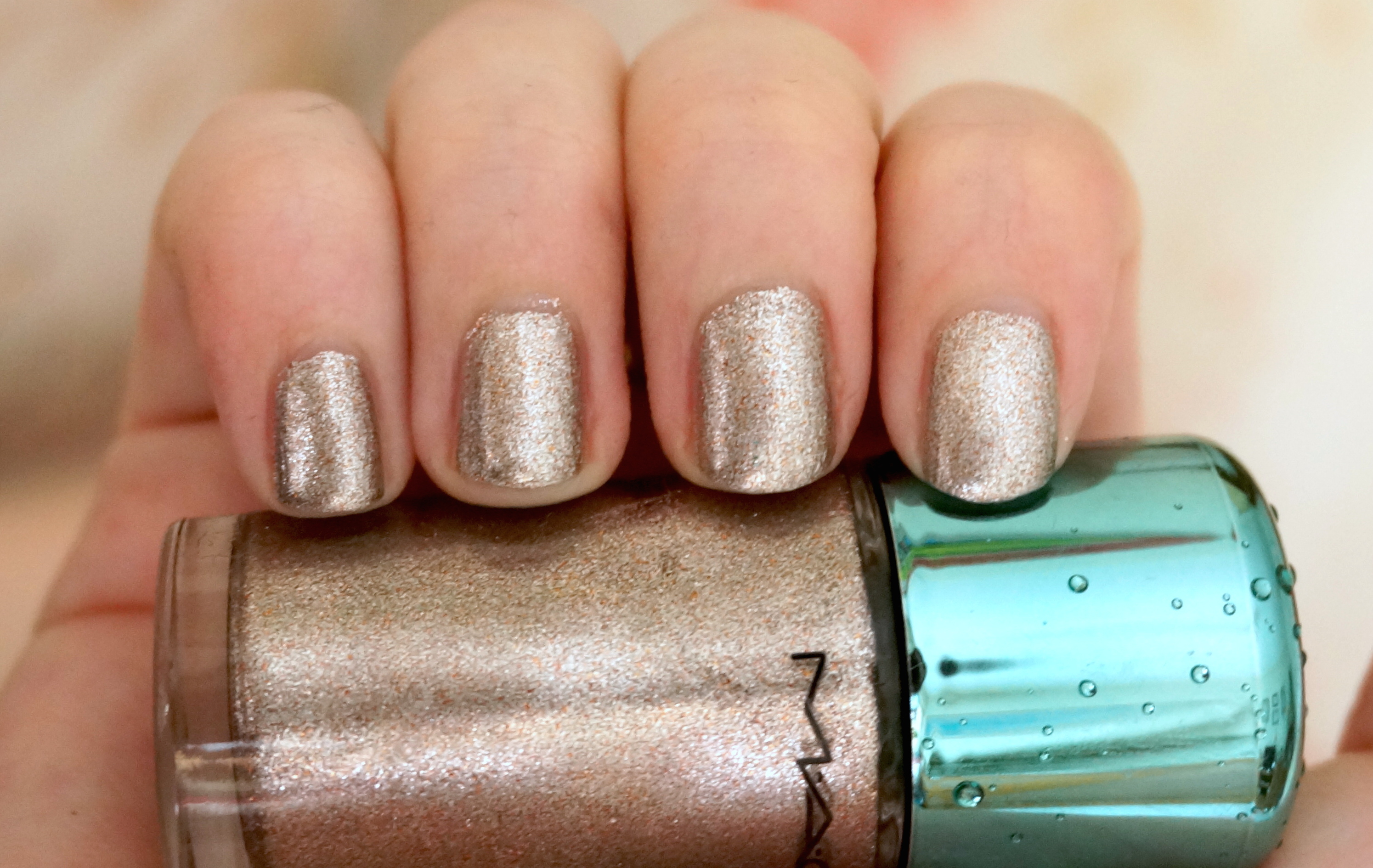
Graphite is just amazing. I’ve seen lots of posts that make it look like a charcoal silver, which it most definitely isn’t. Instead, it’s a gorgeous glittering green gold, burnished blackened and utterly brilliant. In some lights, it flashes a shimmering silvery khaki but this dirty dazzling delicious fool’s gold is by far the more dominant colour. It’s simply a joy to behold and I make abslutely no apologies for the abundance of photos that follows as a result!

The other amazing aspect of Graphite is its finish. It’s a cross between a foil and a glitter but is obviously neither and yet more than both put together. It looks amazingly textured but is totally smooth to the touch. It’s Extra Special in a way that words that also name an expensive supermarket ready-meal just cannot do justice to. In my collection, it’s also utterly breathtakingly unique.

I was also blown away by the pure quality of it. I felt I didn’t need to do anything. It just flowed perfectly from the bottle to the brush and onto my fingernails in a neat perfect shape. I always hear the term on polish blogs ‘applied like butter’ and have never really had cause to use it – but this stuff really seemed to melt like magic onto my talons.

For those not familiar with Chanel nail polishes, the chunky square cap lifts off to reveal a small round screw cap that allows better grip for application. The brush itself is slightly short but medium-sized in thickness and I encountered no problems with it whatsoever. However, by this stage, I was in such a state of general giddiness that the brush could have been starfish-shaped for all I’d have known – I just could not stop staring at my nails!

If you look up images of graphite itself, it’s amazing to see how Chanel have managed to transform the mineral’s exact qualities and shading to a polish. It also reminded me of another mineral – pyrite, also known as fool’s gold – and the colour is just this wonderful textured mixture of gold, silver, green, charcoal and black, with shadows and shimmers in all the right places. It’s gorgeous from up-close, it’s gorgeous from far away… I imagine it would almost be gorgeous with your eyes shut too!

It’s so glittery, it pretty much glows in the dark but despite it’s glitz factor, it absolutely never feels obtrusive, ostentatious or OTT. It also reminded me of a shimmering sheath of snakeskin – slinky, glitzy, totally divinely luxe.

Wonderful colour, fabulous quality, a sense of sophistication, a luxurious glamour that’s still tasteful… It’s basically everything I ever hoped and expected from Chanel but had been afraid to believe was true. Well, it all was!

Looks good with: black, sophistication, The Look
Drying time: <5 mins
Coats required: 1-2
Chips: 2-3 days

Shimmering in the shade!

Chanel Le Vernis Graphite, Fall 2011 Illusion D’Ombres Collection, $180, Chanel

Deborah Lippmann Today Was A Fairytale nail polish review

Here’s a polish to appeal to everyone’s inner magpies – Deborah Lippmann’s Today Was A Fairytale.

Today Was A Fairytale is an absolutely breathtaking silver glitter that leaves all other silver glitters in the dust. Featuring tonnes and tonnes of small silver glitter and larger hexagonal silver glitter suspended in a transparent base, this polish has ‘Virgin Diamond Powder’ amongst its ingredients (how that differs from non-virgin diamond powder, I’m not sure!). I don’t think things could get much sparklier unless this used actual whole diamonds, right?!

One thing’s for sure – Ms Lippmann certainly knows her way around glitter! Across The Universe was nothing short of spectacular and this is every bit as amazing. It’s so beautifully blingy, so sensationally sparkly, that it just looks like you’ve dipped your fingers into a bowl of crystals. It’s just jewel-drippingly gorgeous.

Today Was A Fairytale is also entirely befitting of the name (a Taylor Swift song, since you ask) as it does have an exquisite fairytale charm to it. Even though it’s such a show-stoppingly glamorous polish, it’s still pretty rather than overpowering, ethereal rather than overblown; the perfect polish for princesses, fairies and other magical beings. It’s also not just a silver glitter – from some angles, the silver takes on an enchanted steely blue cast that’s totally bewitching.

What’s great about Today Was A Fairytale is that you get lots of bling for your buck. Unlike many other glitter polishes, the sparkles here are plentiful so you can get opaque coverage pretty easily (and the consistency of the varnish itself is pretty thick), although it could be easily used a layering polish too. The nature of the glitter pieces means that you’re better off with thick coats, so that the glitter sits and swims nicely in the transparent base as opposed to sticking out all over the place.

The difficulties with chunky glitters such as these are always the same however. They’re uneven, rough to the touch and chip and flake off easily without a top coat, which I never use! And they’re absolute hell to remove scrub off – although you will definitely want to keep this stunner on for as long as possible!

Despite this, Today Was A Fairytale did perform better than expected. Many glitter polishes seem to gobble up their base liquid, meaning they look sort of dull and flat without a glossy top coat. But, if you can cope with quick tip-wear and snagging bits of glitter on your tights occasionally, Today Was A Fairytale does look absolutely divine just on its own, which is how it’s shown in all my photos.

Gorgeous enough for ten nail polishes, romantic enough for twenty and dazzling enough for at least fifty, Today Was A Fairytale looks like someone distilled a magic spell into a bottle. Like all the best fairytales, it’s a certain case of love at sight. As for a happy ending? Well, with a polish this beautiful, that was never in doubt!

Blurry for mega-watt sparkliness!

Looks good with: tiaras, magic wands, princess dresses
Drying time: 5-7 mins
Coats required: 2 (thick)
Chips: 2 days

Deborah Lippmann, Today Was a Fairytale, Holiday 2010 Collection, Joyce Beauty

OPI Not Like The Movies nail polish review

Remember when I said that China Glaze’s IDK nail polish reminded me of what you imagined butterflies’ wings to be when you were little? Well, we can also file OPI’s Not Like The Movies into the Ethereal Wings Collection. Except that its iridescent mix of shimmering silver, pink, green and purple is clearly a fairy’s wing instead.

Alas, no nail polish company has actually created an Ethereal Wings Collection (though they can bill me for it later!). Not Like The Movies is instead part of OPI’s much-hyped collaboration with Katy Perry, who is at least famous for her colourful and crazy nails, as opposed to another of their recent tie-ins Justin Bieber, who is not. Since this is my first post about one of the Katy Perry colours, I’m going to give in to my rant about how uninspiring this potentially exciting range ended up.

The four colours in OPI’s Katy Perry line are named after songs from her second album – Teenage Dream (a soft pink glitter), Last Friday Night (a blue glitter), The One That Got Away (a bright fuchsia) and Not Like The Movies (silver). Firstly, when you think about the rest of her album, you can instead mourn for the colours that could have been (as invented by me and if KP does another line, she can mail me the royalties later!):

  • California Gurls (bright Smurf blue, like her hair in the video, or vibrant beach-y yellow)
  • Firework (multi-coloured sparkly glitter)
  • Peacock (blue/green peacock’s feathers)
  • Pearl (barely-there pearlised shimmer)
  • Hummingbird Heartbeat (tropical coral or turquoise)
  • Who Am I Living For (angsty edgy blackened purple)

Secondly, the existing colours are ALL WRONG. Although the pale pink glitter does suit the romance of Teenage Dream, the mention of ‘skin-tight jeans’ (plus shots of frolicking in the sea in the video) means it should have been the blue glitter, which applies much paler and dream-like than the bottle colour anyway. This opens up the pale pink glitter for The One That Got Away (which is basically Teenage Dream Part 2 and therefore does not suit a bright colour at all), leaving Last Friday Night to morph into a party colour befitting its feelgood vibe – the fuchsia if you must, yet anything bright and glittery would do. This means the only one OPI actually get right is Not Like The Movies – and get it right they most certainly do!

It’s a wistful shimmering silver that OPI’s PR and photography department aren’t doing any justice to whatsoever. They’re labelling it a ‘sultry silver’ with photos that make it look like your average gun-metal grey. Which it most definitely is not.

With a spectrum of colours almost as difficult to capture as a fairy itself, it’s a beautiful blend of dreamy shimmers and glimmers that casts a spell on all who look at it. It’s rather sheer, taking three to four coats to build up opacity, and since I bought the mini nail lacquer set, I found the simultaneously tiny-yet-fat brush really hard to work with. But it was very much worth it.

A pale iridescent silver flecked with tiny sparkles of silver micro-glitter, it also becomes a romantic pink, a metallic lavender and a sea-foam green whenever the mood takes it. It’s an absolutely enchanting effect that shows up better in the bottle than on my nails in some of my photos but it’s ridiculously captivating in real-life.

The only possible explanation for it so beautiful? Well, I’m settling for a sprinkling of fairy dust, of course!

Looks good with: princess dresses, pretty things, believing in magic
Drying time: 5-7 minutes
Coats required: 3-4
Chips: +5 days

Read my reviews of the rest of the OPI Katy Perry Collection:
     The One That Got Away
     Teenage Dream

OPI Not Like The Movies nail polish, Spring 2011 Katy Perry collection, $168 for set of four minis, selected Mannings