Tag Archives: duochrome

Christian Louboutin Scarabee II nail polish review

louboutin scarabee II

I love blue nail polish at the best of times… but there’s something about it that just seems so much better in summer. So with the first hints of an autumn breeze swirling through the air here in Hong Kong, I thought I’d better bust out Christian Louboutin Scarabee II before our long hot summer was over for yet an other year (*insert lament about how quickly time flies here*).

Scarabee II is another colour from the limited edition Christian Louboutin Scarabee Collection of gorgeous duochrome polishes inspired by the iridescent shell of an Egyptian scarab beetle – and it might just be the most instantly striking of the three. Or it might just be that I’m an eternal sucker for blue nail polish!

christian louboutin scarabee ii

Continue reading

Christian Louboutin Scarabee I nail polish review

christian louboutin scarabee I

Do you believe in magic? Well, if not, may I present you with Christian Louboutin’s Scarabee I.

Duochrome colours – metallic shades that shift different colours in different lights – are certainly nothing new in the nail polish world, but that certainly doesn’t stop me feeling a giddy sense of wonder every time I wear one… and Scarabee I is no exception.

christian louboutin scarabee I polish

Continue reading

MAC Submerged nail polish review, Alluring Aquatic Collection

mac submerged alluring aquatic

As soon as I saw the amazing packaging for MAC’s Alluring Aquatic Collection – turquoise (squee), metallic (double squee), gorgeous pretend water droplets sprayed onto the casing (stop, seriously, can’t breathe) – I already knew I needed all of it in my life. In fact, I barely even bothered to look at the colours of the make-up itself before snapping each piece up, as every single synapse in me was squealing “BUY, BUY, BUY”.

Thankfully, the colours are all actually very nice, and my top nail polish pick – MAC Submerged – very much leads the flotilla of fabulous!

mac submerged

Submerged is absolutely the kind of stunning colour you would hope to find in a collection inspired by all things seductively sea-like. A deep metallic ocean-blue that flashes brilliant teal and dark indigo-violet in different lighting and angles, it’s what us nail polish folks call a duochrome (or more accurately here, a multichrome) – lacquer geek speak for a polish that shifts colour in a similar way to an oil slick. For Submerged, I’d say the colour shift is a bit brighter and more obvious in the bottle, but it’s still very pretty on the nail too.

Continue reading

Chanel Bel Argus nail polish review

chanel bel argus 1

Nail polishes often make me feel like I have butterflies in my tummy (hint: they usually involve either turquoise or glitter!)… but here’s one that takes things to a more literal level!

Chanel’s Bel Argus nail polish is from their Summer 2013 L’Ete De Papillon De Chanel Collection – and like Le Vernis Azure before it, it’s named after a type of butterfly. Unlike Azure, Chanel has actually got the colour right this time though!

Continue reading

Chanel Azure nail polish review

chanel azure

I already wrote about Chanel’s Stylo Eyeshadows from their L’Ete Papillon de Chanel Summer 2013 Collection – but c’mon, do you really think the range could have passed me by without picking up a polish or two?!

First on my nail polish hit list – obviously, it’s turquoise – was Chanel Azure.

Continue reading

Zoya FeiFei nail polish review

zoya feifei

Zoya FeiFei is absolutely one of my favourite polishes of last year.  It’s blue, it’s silver, it’s black, it’s gold… ugh, screw it, it’s just awesome!

FeiFei is such an amazingly multi-faceted colour – like a sexy sparkling chameleon. It’s even good enough to make me overlook the fact that its name sounds like Canto for fat; in fact, “Fei Fei” literally was the nickname given to a chubby Hong Kong TV personality of yore, Lydia Shum… and I’m pretty sure my auntie has been know to call me it a few times too!

Continue reading

Mac Mean & Green nail polish review

DUOCHROME ALERT! DUOCHROME ALERT!

Today, I have one of the most beautiful nail polishes ever to show you – MAC’s Mean & Green. Originally released with their Disney Venomous Villains Collection, and promptly selling out quicker than you can say ‘Mirror mirror on the wall’, this beauty was one of MAC’s most highly coveted polishes, much-duped and much swindled for on eBay after it was consigned to the deep dark depths of the MAC vault.

But rejoice! MAC have just launched a permanent nail polish line of thirty lacquers, bringing back many of their much-loved favourites to sit on the stands full-time… and Mean & Green is one of them! That’s right, this iconic duochrome is now available permanently for your purchasing pleasure (a pleasant change from cosmetics companies discontinuing items for them never to see the light of day again) – so suck on that, eBay hawkers!

Continue reading

OPI The Show Must Go On! nail polish review

I seem to have been on a bit of a roll with OPI lately – my recent-reviewed Not Like The Movies, Miami Beet and most of all, Parlez-Vous OPI, now rank as some of my favourite polishes period. So let’s usher in another OPI instant classic – The Show Must Go On!

I’ve read lots of posts comparing The Show Must Go On to Mac’s Bad Fairy from its Disney-themed Venomous Villains collection, a magical glittering red-orange-pink concoction in everyone’s photos yet, from when I tried it at a Mac counter, a streaky gritty hellish mess to apply. Whilst The Show Must Go On and Bad Fairy are certainly not identical judging from the pictures, by my reckoning, The Show Must Go On is a simply beautiful colour in its own right.

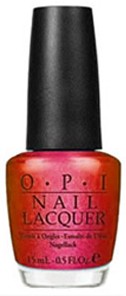
Not that OPI would have you know. Never have I seen bottle pictures more inaccurate. Google Image this baby and you’ll more than likely see a bright but boring fuchsia staring back at you. The bottle photo at the top of this post is slightly more accurate but still doesn’t nearly capture the depth and brightness of colour, nor the brilliance of its foil-like sparkle.

The Show Must Go On is primarily a metallic pink-based red, with a gorgeous shimmer that seems to come bursting from within the polish itself. It has a fantastically clean and bright finish, jumping straight off your fingers to instantly work its way into any nail polish lovers’ heart. But what makes this polish truly incredible are the subtle shifts in colour that flash at you throughout the day. Red, scarlet, coral, pink, copper, orange, gold – practically every colour from the warm end of the spectrum is there, winking at you like you’re sharing a particularly juicy secret. Needless to say, I couldn’t capture it in photographs, though I’ve tried to compensate with quantity over quality for the sake of this review (though I urge you to click and check them out close up)!

I was also quite impressed with the formula, despite a thin first coat that gave me bald patches all over. Somehow, it worked out its problems by the second coat to give me a truly flawless finish, as clean bright and shiny as a child all smartened up for her first day of school. Sadly, it did the trademark OPI thing of chipping slightly by the third day of wear, but I find their polishes self-levelling enough to fix relatively easily.

This is definitely one of my favourite polishes so far. It’s slightly reminiscent of Zoya’s Gloria, except warmer-toned, multi-coloured and with a more low-key approach to glitter (so not that similar at all then!). Whilst The Show Must Go On definitely boasts a certain shimmer, it doesn’t feel like an additional ingredient, more that it was an inseparable part of the polish all along. It’s festive without being singularly so and unusual enough to distinguish it from the stocking-load of other red foils out there.

Like a flickering flame of the most entrancing candle you’ve ever seen – we’d all be moths if flames were this gorgeous! – The Show Must Go On is a must-see. Get your tickets now!

Looks good with: your inner diva
Drying time: 5-7 mins
Coats required: 2
Chips: 3 days

OPI The Show Must Go On nail polish, Winter 2010 Burlesque Collection, $168 for pack of four Mini Teasers, selected Mannings

OPI Not Like The Movies nail polish review

Remember when I said that China Glaze’s IDK nail polish reminded me of what you imagined butterflies’ wings to be when you were little? Well, we can also file OPI’s Not Like The Movies into the Ethereal Wings Collection. Except that its iridescent mix of shimmering silver, pink, green and purple is clearly a fairy’s wing instead.

Alas, no nail polish company has actually created an Ethereal Wings Collection (though they can bill me for it later!). Not Like The Movies is instead part of OPI’s much-hyped collaboration with Katy Perry, who is at least famous for her colourful and crazy nails, as opposed to another of their recent tie-ins Justin Bieber, who is not. Since this is my first post about one of the Katy Perry colours, I’m going to give in to my rant about how uninspiring this potentially exciting range ended up.

The four colours in OPI’s Katy Perry line are named after songs from her second album – Teenage Dream (a soft pink glitter), Last Friday Night (a blue glitter), The One That Got Away (a bright fuchsia) and Not Like The Movies (silver). Firstly, when you think about the rest of her album, you can instead mourn for the colours that could have been (as invented by me and if KP does another line, she can mail me the royalties later!):

  • California Gurls (bright Smurf blue, like her hair in the video, or vibrant beach-y yellow)
  • Firework (multi-coloured sparkly glitter)
  • Peacock (blue/green peacock’s feathers)
  • Pearl (barely-there pearlised shimmer)
  • Hummingbird Heartbeat (tropical coral or turquoise)
  • Who Am I Living For (angsty edgy blackened purple)

Secondly, the existing colours are ALL WRONG. Although the pale pink glitter does suit the romance of Teenage Dream, the mention of ‘skin-tight jeans’ (plus shots of frolicking in the sea in the video) means it should have been the blue glitter, which applies much paler and dream-like than the bottle colour anyway. This opens up the pale pink glitter for The One That Got Away (which is basically Teenage Dream Part 2 and therefore does not suit a bright colour at all), leaving Last Friday Night to morph into a party colour befitting its feelgood vibe – the fuchsia if you must, yet anything bright and glittery would do. This means the only one OPI actually get right is Not Like The Movies – and get it right they most certainly do!
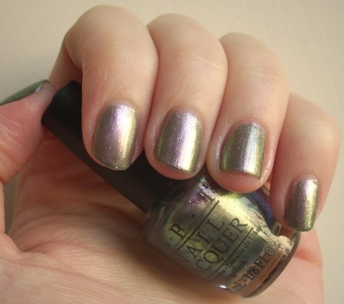
It’s a wistful shimmering silver that OPI’s PR and photography department aren’t doing any justice to whatsoever. They’re labelling it a ‘sultry silver’ with photos that make it look like your average gun-metal grey. Which it most definitely is not.

With a spectrum of colours almost as difficult to capture as a fairy itself, it’s a beautiful blend of dreamy shimmers and glimmers that casts a spell on all who look at it. It’s rather sheer, taking three to four coats to build up opacity, and since I bought the mini nail lacquer set, I found the simultaneously tiny-yet-fat brush really hard to work with. But it was very much worth it.

A pale iridescent silver flecked with tiny sparkles of silver micro-glitter, it also becomes a romantic pink, a metallic lavender and a sea-foam green whenever the mood takes it. It’s an absolutely enchanting effect that shows up better in the bottle than on my nails in some of my photos but it’s ridiculously captivating in real-life.
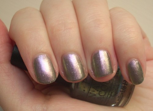
The only possible explanation for it so beautiful? Well, I’m settling for a sprinkling of fairy dust, of course!

Looks good with: princess dresses, pretty things, believing in magic

Drying time: 5-7 minutes
Coats required: 3-4
Chips: +5 days

Read my reviews of the rest of the OPI Katy Perry Collection:
     The One That Got Away
     Teenage Dream

OPI Not Like The Movies nail polish, Spring 2011 Katy Perry collection, $168 for set of four minis, selected Mannings