Tag Archives: nail varnish

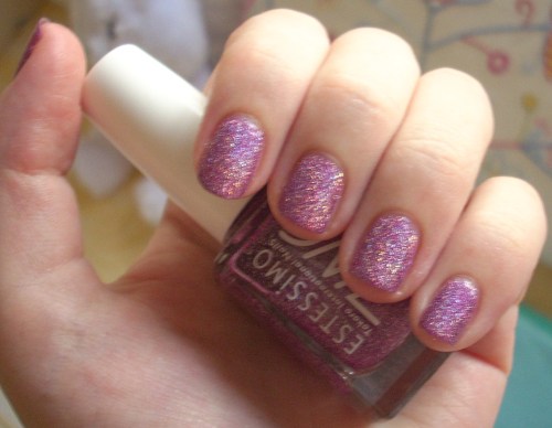
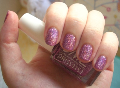
Estessimo Tins Seductive Amethyst nail polish review

Regular readers may be aware of my quest to find every single holographic nail polish in Hong Kong. I just can’t enough of my rainbows in a bottle – it’s such a magical concept that taps into my inner holographic-sticker loving child. The latest on my hit list to show you: Estessimo Tins Seductive Amethyst.

I’ve already told you a bit about Estessimo Tins (known to my boyfriend as Snils and who knows, he may be correct!), a Japanese brand that specialise in creating glitter bombs for the nails. Most of their polishes are the old-fashioned type with pieces of actual glitter sparkling away inside them – like The Neptune and The Splash Blue which I have previously showed you – but they do have a few holos hiding in the wings too.

Seductive Amethyst is one such specimen and it is GORGEOUS. It’s a medium purple colour, slightly pink-leaning, that on its own is the exact colour I picture amethysts being in the first place. Tip in those holo rainbows and it becomes an even more magical prospect.

Unlike the famous China Glaze OMG holographic polishes, which produce a strong rainbow effect that sort of radiates round the nail in ripples (nail geeks call these ‘linear holos’), Seductive Amethyst produces a ‘scattered’ holo effect – little bursts of rainbow scattered all over the shop.

Holographic polishes are different from the old glitter polishes because, through some nail polish magic, they don’t actually feature glitter pieces submerged in the lacquer – even though the scattered ones, like these, really look like they should! Instead, the rainbow glitter seems to just exist as part of the polish itself, meaning you get a smooth (and easy to remove) finish but with a just as beautiful bling to your buck. It really is totally reminiscent of those kaleidoscopic rainbows I saw in stickers in my childhood; substitute Pokedex cards or Pogs or whatever was your childhood magpie equivalent!

I find Estessimo Tins’ longer handle easy to control and its brush is nicely-sized – somewhat equivalent to China Glaze’s but a little bit thiner – and spreads nicely. Seductive Amethyst was super-easy to apply in two quick-drying coats and delivered a flawless holographic finish. It’s a rainbow-dusted amethyst purple that looks like it belongs in fairytales.

But where this beauty really comes alive, when all the rainbows come out to play, is in super-bright sunlight… and thankfully, that’s one thing Hong Kong does well! It’s like rainbows are dancing off your nails! It’s searingly, blindingly, mind-blowingly brilliant. I could not stop staring in awe at my claws.

Beautiful, bountiful, bouncing rainbows at my very fingertips and in my fave shade, purple – seriously, what more could I ask for? Seductive Amethyst didn’t even need to bother with a chat-up line, it had me at hello… or should that be holo!

Looks good with: bright sunlight, not minding if you bump into stuff because you’re staring at your nails
Drying time: 5 mins
Coats required: 2
Chips: 2 days

Estessimo Tins Seductive Amethyst, Winter 2006 More Jewellist Collection

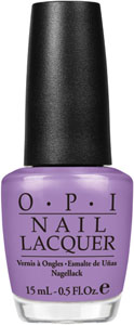
OPI Planks-A-Lot nail polish review

It’s been a while since a nail polish review right? Well, let’s get back on the Pirates Of The Caribbean galleon with OPI’s Planks-A-Lot.

Firstly, what a name! Fun and tongue-in-cheek enough not to feel like you got dumped with a huge side order of cheese.

Planks-A-Lot is probably the brightest colour in the Pirates Collection, which mostly specialised in muted muddied pastels that weren’t at all what you’d associate with the gypsies of the seven seas. It’s a medium perfect purple, veering slightly to the lavender side yet still bright enough to not quite sit at home amongst pastels. It does have a touch of dustiness to it too and is noticeably darker than the pale lilac of the bottle, but nothing near as greyed-out as the grurple explosion (best exemplified by all-time favourite, Parlez-Vous OPI). And obviously, I love it.

You know this. I love all purples. Grey purples. Matte purples. Flakie purples. Holo purples. Glittery purples. Rock star purples. Purple, purple, purple (thought I’d just say it a few more times to make sure). So it’s no surprise that I now love Planks-A-Lot, a fairly straightforward lavender purple crème, too.

What I didn’t love was the formula. I had similar problems with OPI’s Mermaid’s Tears and Planks-A-Lot was even worse. Thick, gloopy, uneven first coat… and once again, I tried to over-compensate, forgetting about OPI’s self-levelling properties, meaning I didn’t get quite the lovely smooth finish I hoped for. But even then, Planks-A-Lot is still super-glossy, lushly creamy and just a gorgeous dreamboat of a colour through and through.

So I know I’m not surprisingly anyone by declaring my outright love for Planks-A-Lot, but she really is a beauty. Yo ho ho and all that too.

Looks good with: muted crèmes, florals, grey
Drying time: 10 mins
Coats required: 2-3
Chips: +7 days

OPI Planks A Lot nail polish, Summer 2011 Pirates of the Caribbean Collection, $70, Cher2

OPI Mermaid’s Tears nail polish review

I’m usually a bit dubious about the current vogue for nail polish celebrity cash-ins tie-ins, yet OPI’s Summer 2011 Pirates of the Caribbean collection struck gold… or should that be pieces of eight?!

Overall, it was an unusual collection for summer, filled with murky muddied pastels that didn’t exactly scream adventures on the seven seas. Yet for that reason, it was probably one of my favourite OPI collections to date and I snapped up the whole collection quicker than you can say ‘Yo ho ho and a bottle of rum’!

I was instantly drawn to Mermaid’s Tears, a dusty turquoise (and you know how much I love turquoise!). Firstly, what a gorgeous evocative name! OPI are known for their cute-but-cheesy names so I was expecting this to be pun city but they actually managed to keep it classy – classier, in fact, than the film itself!

Unfortunately, I found this polish quite difficult to work with. It was gloopier than most OPIs and the first few coats went on thickly and unevenly – partly my own fault as I spent too much time trying to correct it, forgetting that OPI lacquers are actually amazingly self-levelling on their own. Consequently, drying time was longer than usual and the finish was a bit lumpy up-close.

What I can’t complain about is the colour. Gorgeous! It’s an almost vintage take on turquoise; classy but murky, delicately dusty, but still straight-up beautiful (although a shade darker than the bottle colour). You could well imagine it being the tears of a siren, prettily magical yet refined. There aren’t many turquoises that suggest sophistication, but this is definitely one.

Compared to my other top turquoise creme, Essie’s Turquoise & Caicos (on the middle finger), Mermaid’s Tears is noticeably less bright, dustier and perhaps more obviously green-leaning – a pale green tea, or pretty slate green rather than the tropical island turquoise of the Essie. Both, however, are creamily lush and look great on.

Mermaid’s Tears – Lorelei loveliness in a bottle. No pirate puns needed.

Looks good with: other muted pastels, floral tea-dresses, grey
Drying time: 10 mins
Coats required: 2-3
Chips: +7 days

OPI Mermaid’s Tears nail polish, Summer 2011 Pirates of the Caribbean Collection, $70, Cher2

Zoya Dannii nail polish review

I actually forgot I had swatched Zoya’s Dannii, that’s how uninspiring it was.

Which, if you know me and my love for all things purple, is a massive surprise. After all, Zoya’s official description of a ‘metallic purple orchid with pink and champagne highlights and flecks of silver metallic shimmer’ sounds positively purple perfection. But for me, the best description of Dannii would have to include the word ‘anticlimax’.

What I thought would be a vibrant pink-toned orchid turned out to be a much darker murkier almost brown-toned purple that just didn’t stand out at all. The champagne shimmer that I’d thought would give a beautiful glimmering glow to the polish was barely evident and when it was, it didn’t even look nice combined with the muddy purple. I could see the silver shimmer more often, but it wasn’t an appealing effect at all; the combination of that purple plus those shimmers just did not work. Zoya’s glitters are usually stunning shining stars in the nail polish firmament, but this flat murky finish was a dim flickering light bulb at best.

The formula was also not at all what I expect from Zoya – thick and gloopy, making application difficult. Basically, me and Dannii didn’t get on at all – it didn’t look nice with my skin tone, it didn’t look nice with my clothes and it didn’t look nice with my high expectations.

I think this polish was named after former X-Factor judge Dannii Minogue, but frankly, it’s more of a Sharon Osbourne. And that just about says it all.

Looks good with: good question
Drying time: 8-10 mins
Coats required: 2
Chips: +7 days

Zoya Dannii nail polish, Spring 2011 Intimate Collection, $80, Cher2

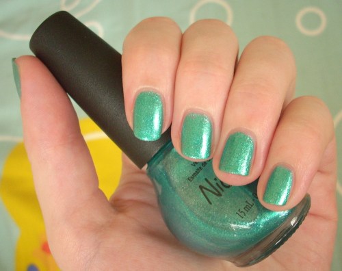
Nicole By Opi Diva Into The Pool nail polish review

Believe it or not, I have been wearing nail polishes other than coral this summer. My next pick has instantly become one of my favourite polishes full stop, summer or otherwise – Nicole By OPI’s Diva Into The Pool.

Nothing’s as bad as a pun that doesn’t quite work right?! Even Diva In The Pool would make more sense. But don’t let that put you off. Anyone with a weakness for turquoises – see my responses to Zoya’s Charla and Essie’s Turquoise & Caicos to see which camp I’m in – will definitely want to dive headlong into this colour. It’s a shimmering tropical aqua, as cool and refreshing as dip in the water.

It’s a little green-leaning but has an immaculate crystal-clear finish, with a finely-milled glitter that’s similar to Zoya’s trademark foil effect. I was initially worried at the extremely sheer first coat, but you get a gorgeous wash of colour after just two coats, although you could go for three for extra opacity if you wish. The polish was a nice consistency, extremely easy to work with, and I have to say I prefer Nicole By OPI’s flatter brush to OPI proper’s fat one – I’d say it’s most similar to China Glaze’s brush, though Nicole’s seemed to fan out even more nicely.

As my first Nicole By Opi, I do have to rant about the bottle shape though. Whoever designed this is clearly not a person with a make-up stash! One bottle of polish taking up the space of two – madness! As anyone with nail polish bulging out of their drawers will tell you!

I just love how clear, clean and crystalline Diva Into The Pool looks – as beautiful as the tropical oceans you always see on holiday programmes and heavily-photoshopped brochures. It’s a glowing aqua that got me tons of compliments; you can see how exquisite that fine-shimmer finish is even in close-up.

Sparkling without being a show-off and in such a stunning shade of turquoise too… is it any wonder I was won over by Diva Into The Pool? And after these pictures, I fully expect you to be too!

Looks good with: summer, swimming pools, sunglasses
Drying time: 7 mins
Coats required: 2-3
Chips: 3 days

Nicole by OPI Diva Into The Pool nail polish, $75, selected Sasas

Zoya Rica nail polish review

You may have worked out that I’ve been on a bit of a coral binge lately. And whilst probably not the truest coral in the colour wheel, Zoya’s Rica is too amazing not to include.

Rica didn’t even register with me when I looked at Zoya’s 2011 Sunshine Collection online. Yet in person, on a hot summer’s day, it proved irresistible. I don’t think it could get more summery unless it came wearing shades!

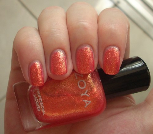
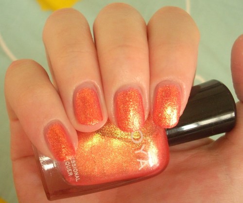
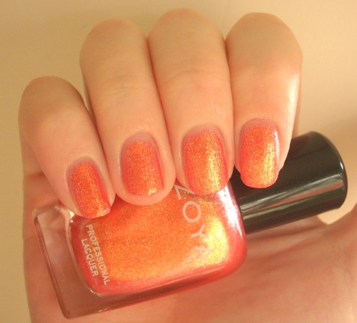
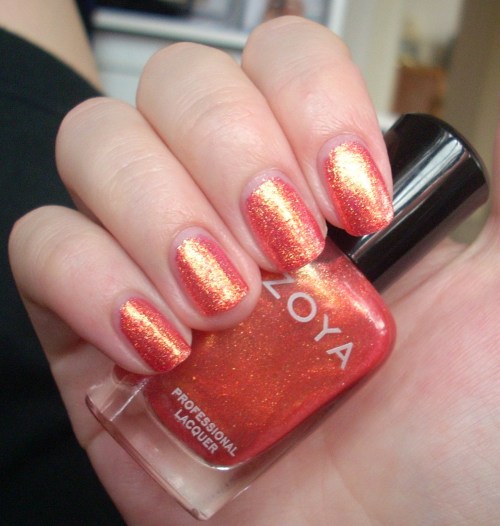
Rica is a super-sparkly, super-summery, super-super pink-tinged sunny orange topped off with a liberal dose of golden sunshine glitter. It just about fits into the coral scheme of things but when I gazed at its loveliness, all I could think of were ripe mouth-watering summer fruits. It’s like someone squeezed together the juiciest aspects of a watermelon, grapefruit, tangerine, apricot and mango, and the result was Rica.

Meanwhile, that golden sunshine sparkle is the trademark Zoya way of doing glitter. You can see further examples of it in my posts on Charla and Gloria, but it’s basically a very fine glitter that positively saturates the polish, but completely evenly and consistently, giving it an almost foil-like effect. It’s completely smooth to the touch and as such, is a very grown-up take on glitter – unmistakeably Zoya and unmistakeably awesome.

Such is the awesome sunshine of Rica, it practically glows in the dark! As you can see from this photo in the shade, that glitter really does look like sparkle directly transplanted from the sun – the sun shining down on a luscious tropical island, I think you’ll agree! In the shade, it definitely leans more towards a golden orange that reminded me of a goldfish!

As with most Zoyas, it was fantastically easy to apply; at first, the consistency seems a little thin but it’s easy to work with and I had a beautiful smooth even colour after just two coats. As ever with Zoya, it also wears like iron – totally chip-free after over a week.

I honestly don’t think I can sing Rica’s praises enough. It’s gloriously golden, fantastically fruity and so so stunningly summery that it could probably brighten things up in the depths of darkest Antarctica (or, as it’s usually known, a typical British summer in the UK!). Pure sunshine in a bottle – what more could you ask for?!

Looks good with: SUNSHINE, ice lollies, summer prints
Drying time: 5-7 mins
Coats required: 2
Chips: +7 days

Zoya Rica nail polish, Summer 2011 Sunshine Collection, $80, Cher2

China Glaze TMI nail polish review

As you know, I’m really digging coral this season – so what could possibly be better than the eye-popping coral crème that was CND’s Poppyfield? Well, a holographic coral, of course! Skip forward, China Glaze’s TMI.

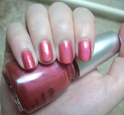
Yes, it’s another one of those oh-so-awesome colours from the OMG Collection. TMI is from the warmer end of the spectrum, a lovely pinky coral that glows in natural sunlight. Those enchanting entrancing rainbow-reflecting properties are still very much present (albeit slightly weaker than the other OMG colours I’ve tried to date), but this time it’s very much the summer end of the rainbow that gleams back at you – all golds, pinks, oranges and red.

For me, TMI is very much an instant winner in the daylight. It’s a really gorgeous colour, very flattering and there’s something about that rosy pink-toned coral that gives you the warm fuzzies inside. However, where it comes unstuck is in the shade or in yellow artificial light, where it turns into a weird dusty salmon, leaning towards rusty orange, which I found really rather nasty. Oh well, you gotta take the rough with the smooth and trust me, that first flush of rosy coral loveliness is definitely worth it.

More rainbows reveal themselves under white artificial light

Application-wise, I found TMI to be a little trickier than the rest of its OMG cousins. The consistency was a tad gloopier and coverage was initially difficult to get even. However, it’s worth remembering that these polishes are now a few years old and when I found TMI, it was sitting unloved, unclean and with a formula that had separated many moons ago, so all this could well be a factor. Add some TLC to TMI and after a careful two coats, it looked fine.

Although TMI is definitely not my favourite from the OMG Collection as it’s definitely a little tamer than its brothers and sisters, that might actually work in its favour for those of you who’d prefer an easily wearable, flattering colour that still boasts that holographic awesomeness. And let’s face it, rainbows are just irresistible, aren’t they?!

Looks good with: summer, natural sunlight
Drying time: <2 mins
Coats required: 2
Chips: 2-3 days

China Glaze TMI nail polish, Spring 2008 OMG Collection, $80, Nail Concept Company

CND Poppyfield nail polish review

The sun has got its hat on, hip hip hooray, the sun has got its hat on, CND Poppyfield’s coming out to play.

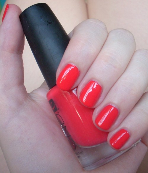
Isn’t coral just such a fabulous summer colour? I’ve been searching for a great coral all year in anticipation of sunny days, blue skies and beach dreams but it wasn’t as easy as I’d thought it would be! A good coral should be the perfect blend of pink, orange and red; you know it’s perfect when it’s definitely not identifiable as being solely any of the colours above but cries out to be called coral! It’s also one of those colours that depends on skintone and surroundings to pull it in different directions, so one woman’s ultimate coral can easily be another’s crash and burn.

Poppyfield’s name doesn’t really do it justice. When I think of poppies, I think of a cheerful bright red, which this polish clearly ain’t. It’s a tangy mostly orange-leaning red that pops with more gusto than an Andy Warhol painting. A Californian poppy at a push, but much more likely a nasturtium, geranium or hibiscus if you must go down the garden path (yes, I did a lot of gardening as a child, what of it?!). In real life, there is a detectable melon sorbet pink tone in there too, but my camera clearly preferred the orange instead (you can see it more in the bottle). So what’s that – mentions of red, orange AND pink? Clear coral territory, for sure.

Poppyfield was the first CND nail polish I’ve tried – and I’m definitely going to be back for more! Unfortunately, Creative Nail Design (to use their full moniker) underwent a revamp a few years back, which overhauled their bottle design for the better, but severely stunted their range of colours in the process. It’s now a mostly uninspiring collection seemingly based on the boring racks in Essie i.e. traditional colours in red, pink and neutral shades.
Such a shame as the formula on this was brilliant. Smooth, creamy, easily opaque in two coats, a high-shine glossy finish and chip-free after well over seven days. I also loved the rubber cap of these bottles, which made such a difference to getting that extra bit of grip and security (my polish-stained blanket bears testament to the number of plastic caps that have slipped through my fingers!). The brush itself was not too memorable (I’d compare it to China Glaze’s in terms of size and thickness) and judging by how relatively neat my nails look here, it must have been pretty good to use.

Poppyfield is a coral that doesn’t just smile – it positively sings. It looks A-MA-ZING (emphasis on the zing) paired with summer brights and it’s the kind of polish that brightens up your whole look. Together with the fabulous formula, Poppyfield is a no-brainer. Flash but not brash, it’s definitely one for your summer stash. Yes, I do rhymes here too.

Looks good with: summer brights, sunnies, shorts
Drying time: 5-7 minutes
Coats required: 2-3
Chips: +7 days

CND Poppyfield nail polish, $60, Nail Concept Company

China Glaze Passion In The Pacific nail polish review

Whilst I was desperately seeking Turned Up Turquoise, I ended up buying a bottle of China Glaze’s Passion In The Pacific to fill the tropical turquoise void in my life. Well, you know, the one that hadn’t already been filled by Essie’s Turquoise & Caicos.

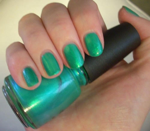
I initially thought Passion In The Pacific would be a shimmery zingy emerald to Turned Up Turquoise’s true turquoise hue – but in fact, they ended up as much closer cousins than I would have imagined. Just like Turned Up Turquoise, Passion In The Pacific becomes a lush jewel-toned turquoise in the brightest artificial white light and just like Turned Up Turquoise, it’s a standard summery palm tree green practically any time otherwise.

The main difference is the finish. Whilst Turned Up Turquoise has that trademark semi-matte finish of most neons, Passion In The Pacific is a definite ocean-in-the-sunlight shimmer. I’d even be tempted to call it a frost, if it didn’t seem utterly strange calling a colour evocative of beaches, summer and sarongs something so cold, stark and wintry.

I had all kinds of problems with it though. I don’t know if this is because Passion In The Pacific is an older polish so has a different formula than the China Glazes I know and love or if I just got a dodgy bottle, but it was dishearteningly difficult to work with. Extremely thin, watery and streaky, prone to air bubbles, looooong drying time and brush-strokey finish when dry. I hated it. As usual with polishes I hate, that meant it decided to stay with a vengeance – I managed a full week chip-free before I finally caved in and ditched those mocking air bubbles.

Under bright artificial light (plus flash)

The colour pay-off is a nice summer bright but probably not that unique – if I’d have known that it was so similar to Turned Up Turquoise, indeed if I’d have known I’d find Turned Up Turquoise in the first place, I probably wouldn’t have bothered. After all, there are enough top coats in the world that could probably recreate that oceanic shimmer, except without all the application problems and maybe look even better.

In short, Passion In The Pacific is a great summer colour – but only if you can’t find any other similar alternatives! Looks like he’ll be enjoying his beach-side cocktail on his own!

Looks good with: tropical brights, bikinis, cocktails with umbrellas in
Drying time: 10 mins
Coats required: 3-4
Chips: +7 days

China Glaze Passion In The Pacific nail polish, Spring/Summer 2006 Fiji Fling Collection, $60, Cher2

China Glaze Turned Up Turquoise nail polish review

Have you cottoned onto the fact that I like turquoise – a lot – yet? It should come as no surprise then that, after seeing pictures of China Glaze’s Turned Up Turquoise on some blogs, I just knew I had to claim that turquoise for my own too!

Part of the Summer 2008 Ink Collection, which were somewhat bizarrely based on the hues of tattoos, it proved pretty difficult to track down – but as you know with me, the journey is half of the fun… or something like that (see tracking down Gosh Cosmetics, flakies and even Waterball Bay for further evidence!). The whole collection is made up of bright buzzing neons that practically jolt you to attention and Turned Up Turquoise is no exception. It’s an intense saturated turquoise colour that floods the senses with its zing. So far, so amazing.
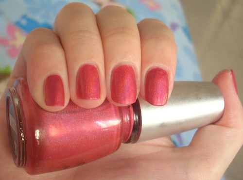
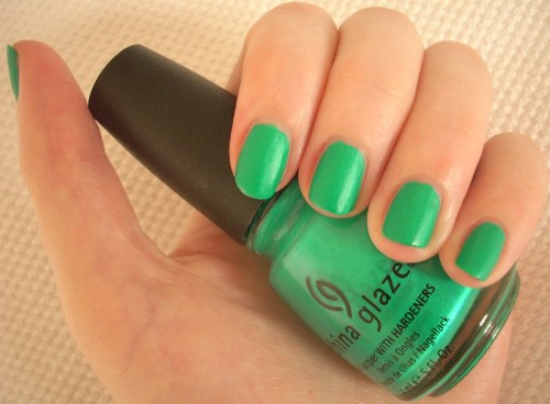
But unlike Essie’s Turquoise & Caicos, I don’t think I can describe this as true turquoise. It’s simply not content to be just one colour! Turned Up Turquoise is a bit of a tropical chameleon in a way that I don’t think most Internet swatches have shown. Sometimes, it really would look like the perfect turquoise adrenaline rush; other times, it leaned massively towards a mouth-watering candy-coated green. All the pictures on this page were taken in daylight (apart from one I’ll mention later), with only minor adjustments to hand positions and the natural variations of sunlight and shade to blame for how differently they all turned out!

The greenest shades remind me of the most vibrant green of cartoon palm trees whilst the most truly turquoise make me think of the clearest, jewel-like tropical oceans. Either way, they’re all violently vivid, although some seem to have had a heftier dose of lime juice than others. As you may guess, my favourite hue is the most traditionally turquoise one… but to guarantee that colour, you have to stay in the brightest sunlight or the whitest lighting possible at all times!

Like many neons, Turned Up Turquoise dries to a semi-matte finish. I think it might look even more awesome glossy, but the matte effect is stopped from falling flat by a slight shimmer that’s been thrown into the mix too. It proves somewhat elusive to catch in photos; the slightly blurry one below taken under artificial light comes closest to capturing the subtle glow that stops it from looking chalky and dull.

Application-wise, I found it a little difficult to work with simply because, like many mattes, it dries quickly. Unlike all those OPI Suedes that I’ve loved, Turned Up Turquoise seems to have a thicker consistency that meant it was difficult to make perfect, without visible brush-strokes, in the short time before the lacquer started setting. Even though the colour was so strikingly strong and intensely-pigmented to only require one coat for opaque coverage in a colour that looked exactly like it did in the bottle, you might need to go for two just to try and clean things up a bit. But like the other matte finishes I’ve tried, this didn’t wear too well, with chips appearing after just one or two days.

Turned Up Turquoise does have its faults, but for that extreme rich colour pay-off, it’s definitely worth it. When it does decide to give you a glimpse of its turquoise side, it’s a turquoise so eye-poppingly amped up to the max that you’re shocked into submission, yet without appearing garishly fluorescent. And hey, those green shades aren’t too shabby either, right?

Looks good with: neons, high contrast, high NRG
Drying time: <2 mins
Coats required: 1-2
Chips: 1-2 days

China Glaze Turned Up Turquoise nail polish, Summer 2008 Ink Collection, $160, Nails From The Heart, Admiralty Centre